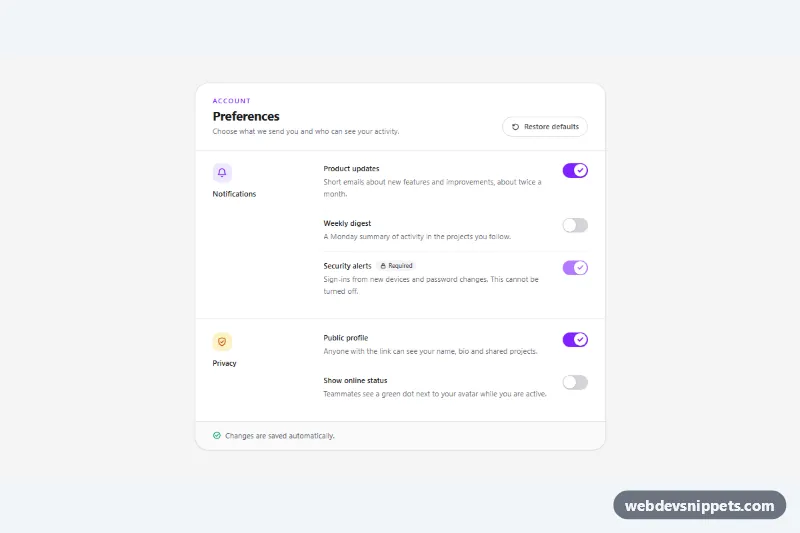
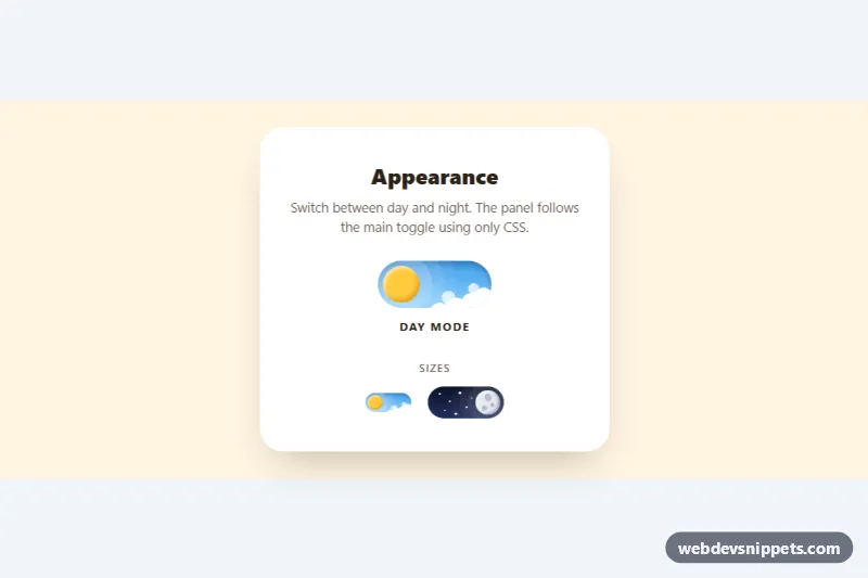
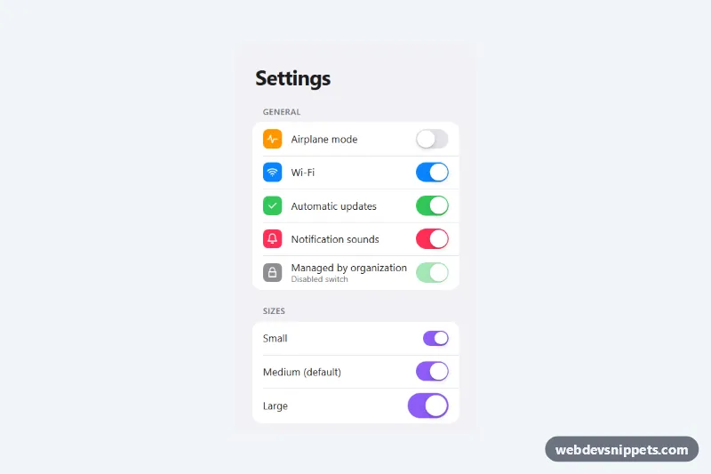
A settings panel built with Tailwind CSS where every preference is an accessible switch with a bold label and a short description underneath. It fits account, notification and privacy pages in SaaS dashboards, and includes a locked "required" setting, a restore-defaults button and an auto-save status message.
How it works
The root element is .tsw-settings. Inside the card, each group is a section with a two-column grid (sm:grid-cols-[11rem_1fr]): an icon and group title on the left, a ul of rows on the right. On phones the columns stack and the icon sits next to the title.
Every row holds a label paragraph, a description paragraph and a button with role="switch". The button points to both paragraphs with aria-labelledby and aria-describedby, so screen readers announce the name, the state and the explanation together. All visuals come from the aria-checked attribute: aria-checked:bg-violet-600 colors the track, and on the thumb group-aria-checked:translate-x-5 slides it to the right while group-aria-checked:opacity-100 reveals the check icon. No extra CSS file is needed.
The script initializes each .tsw-settings on DOMContentLoaded. A click on a switch flips aria-checked, writes a message such as "Weekly digest turned off. Saved." into the data-tsw-status region and dispatches a bubbling tsw:change event with the switch id and new state. Clicking a label marked data-tsw-for toggles its switch, like a native label. The data-tsw-reset button restores every switch to the value in its data-tsw-default attribute. Disabled switches are skipped.
Customization
- Swap
violetinaria-checked:bg-violet-600,text-violet-600andfocus-visible:outline-violet-600foremeraldorskyto change the accent color. h-7 w-12on.tsw-switchandgroup-aria-checked:translate-x-5on the thumb: make the switch larger or smaller; keep the translate equal to track width minus thumb width.data-tsw-defaulton a switch: sets the value used by Restore defaults; remove it to leave that switch unchanged on reset.- Add the
disabledattribute (and a badge like "Required") to lock a setting, as done for#tsw-s-security. - Listen for
tsw:changeon.tsw-settings, or replace theannounce()call inscript.jswith afetch()request, to save preferences on your server. sm:grid-cols-[11rem_1fr]on eachsection: widen the left column or remove it for a single-column list.
Accessibility
Each switch is a real button with role="switch" and aria-checked, so it is reachable with Tab and toggled with Space or Enter. Labels and descriptions are linked with aria-labelledby and aria-describedby, groups are named with aria-labelledby on each section, and decorative icons are aria-hidden. Changes are announced politely through the role="status" footer. Switches show a visible focus outline, the disabled switch uses the native disabled state, and transitions are removed with motion-reduce:transition-none.
Usage notes
The Tailwind v4 browser build is enough; no plugins are required. For several panels on one page, give every label, description and switch unique id values and update data-tsw-for to match.