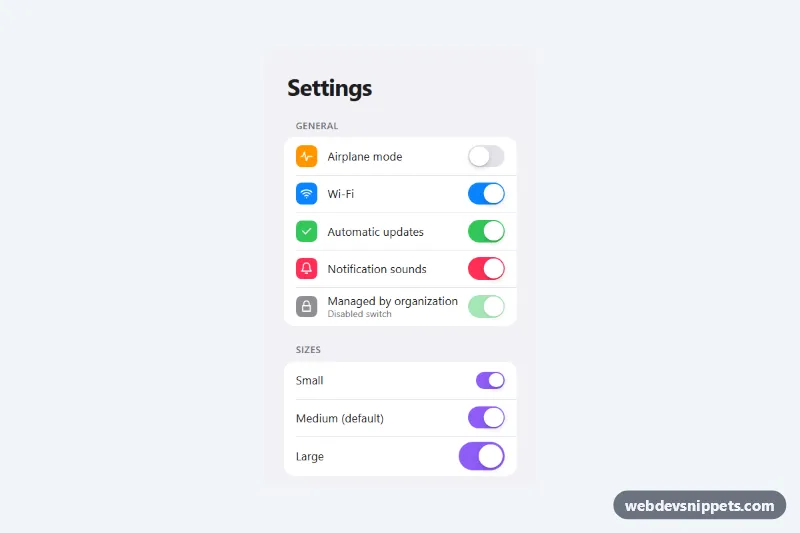
An iOS style toggle switch made with pure CSS on top of a native checkbox, shown inside a grouped settings list with colored row icons. It comes in three sizes and five colors, includes a disabled state and the springy thumb that stretches while pressed. Use it for preferences, notification settings, feature flags or any on/off option.
How it works
The root section.ist-settings contains ul.ist-group lists. Each row is a label.ist-row that wraps an optional .ist-icon, the .ist-text, a real input.ist-input with type="checkbox" and role="switch", and a decorative span.ist-switch right after it. Because the whole row is a label, clicking anywhere on it toggles the checkbox.
The checkbox is hidden with a visually-hidden pattern, not display: none, so it keeps keyboard focus and is read by screen readers. .ist-switch is the track and .ist-switch::after is the white thumb. The adjacent sibling selector .ist-input:checked + .ist-switch fills the track with --ist-on and moves the thumb with translateX(calc(var(--ist-w) - var(--ist-h))), so the travel distance always matches the size. While a row is pressed (:active) the thumb widens slightly, as on iOS. There is no JavaScript; the checked value is submitted with a form like any checkbox once you add a name.
Customization
.ist-switch--blue,.ist-switch--orange,.ist-switch--pinkand.ist-switch--purple: set--ist-on, the track color when checked. Without a modifier the switch is iOS green..ist-switch--smand.ist-switch--lg: change--ist-wand--ist-h, the track width and height; the thumb and its travel scale automatically.--ist-gapon.ist-switch: the space between the thumb and the track edge.--ist-offon.ist-settings: the track color when the switch is off.--ist-speed: duration of the slide and color change, e.g.0.15sfor a snappier feel.--ist-focus: the color of the keyboard focus outline drawn around the track.- Add
disabledto an.ist-inputto lock it; the track fades and the row shows a not-allowed cursor. - Remove the
.ist-iconspan from a row for a plain text list, as in the Sizes group.
Accessibility
Each switch is a native checkbox with role="switch", so assistive technology announces it as a switch with an on or off state, and the wrapping label gives it an accessible name. Space toggles it from the keyboard. The visual track is aria-hidden, and keyboard focus shows a 3px outline around it via .ist-input:focus-visible + .ist-switch. The on state is shown by thumb position as well as color. Transitions are removed under prefers-reduced-motion: reduce.
Usage notes
Keep the .ist-switch span directly after its input, since the styling depends on the + selector. The :has() rule only changes the cursor on disabled rows and can be dropped for older browsers.