A complete avatar set built only with Tailwind CSS utilities: real profile photos in six sizes (24 to 112 px), in circle and rounded-square shapes, plus avatars with presence status, overlapping avatar groups with a counter, and initials fallbacks for users without a photo. Use it as a reference sheet for user lists, comment threads, team pages, chat apps and dashboards.
How it works
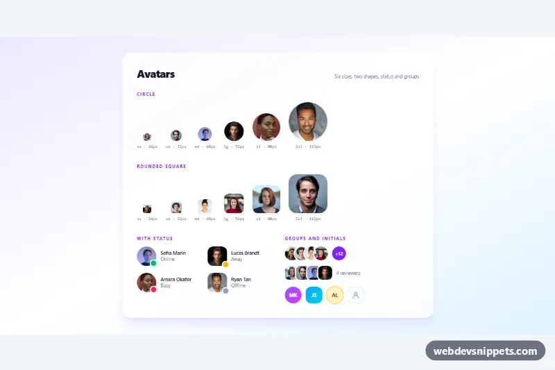
The root is section.av-set, a soft violet-to-sky gradient with a frosted white card inside. Every photo is an img.av-avatar with fixed width/height attributes and object-cover, so faces never stretch. The size scale uses Tailwind pairs h-6 w-6, h-8 w-8, h-10 w-10, h-14 w-14, h-20 w-20 and h-28 w-28, each labelled with its name and pixel size. The first row uses rounded-full; the second row grows the corner radius with the size, from rounded-md to rounded-3xl, so small and large squares look equally soft. A white ring-2 and shadow-md separate the photos from the background.
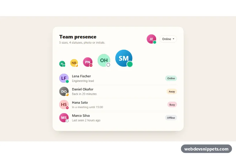
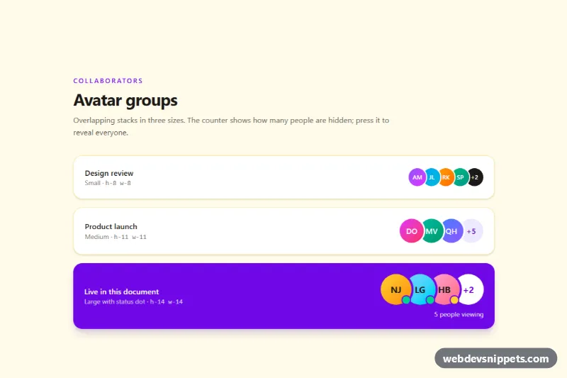
Status avatars wrap the image in a relative span and place a colored dot (bg-emerald-500, bg-amber-400, bg-rose-500, bg-slate-400) in the bottom-right corner with a ring-[3px] ring-white cut-out. The online dot adds an animate-ping halo. Groups are lists with negative spacing (-space-x-3) and white rings, followed by a +12 counter; the round group lifts each face on hover. The .av-initials badges use gradients or tinted backgrounds, and the last one shows an outline user icon for an unassigned slot. There is no CSS file and no JavaScript.
The sample photos come from Unsplash and are requested at twice the displayed size for sharp results on high-density screens; replace them with your own user images.
Customization
- Change the
h-* w-*pair on anyimg.av-avatarand update itswidth/heightattributes to add a new size. - Replace
rounded-fullwithrounded-xl(or the other way round) on an avatar to switch between circle and rounded-square shapes. ring-2 ring-white: usering-violet-400for a highlighted or "selected" avatar.- Status colors: swap
bg-emerald-500orbg-rose-500on the dot, and update the visible status text next to it. -space-x-3on the group list: use-space-x-1for looser overlap or-space-x-5for a tighter stack.from-violet-500 to-fuchsia-500on an.av-initialsbadge: pick any gradient for initials avatars.
Use cases
- User lists and directories: six avatar sizes from 24 to 112 px for rows, cards and profile headers
- Comment threads and chat apps: avatars with online, away and busy status dots show presence
- Team pages: an overlapping group with a plus counter shows members on a project
- Dashboards: initials badges act as a fallback for users without a photo
- Design references: a ready sheet of circle and rounded-square shapes to copy single avatars from
Accessibility
Each photo has the person's name as alt text, and initials badges use role="img" with an aria-label holding the full name, so screen readers never read raw initials. Status dots are decorative (aria-hidden="true") because the status is also written as visible text. The +12 counter includes a visually hidden "more members" label, and groups are lists with an aria-label describing the group. The ping animation and hover lift are disabled with motion-reduce: utilities when the user prefers reduced motion.
Usage notes
Requires only the Tailwind browser build (added automatically). Copy a single avatar or a whole row; nothing depends on the surrounding markup.