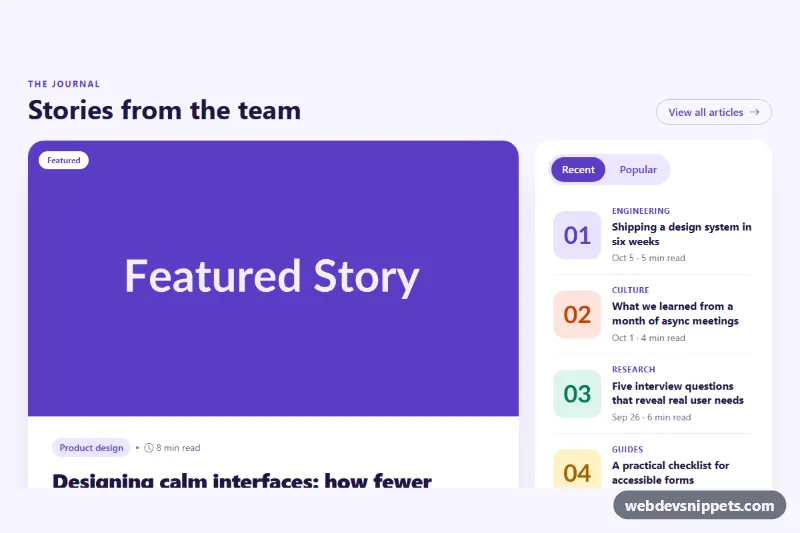
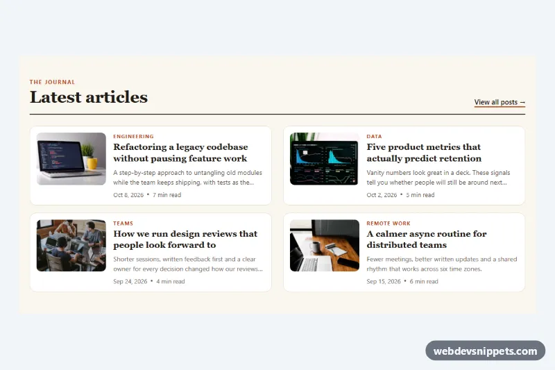
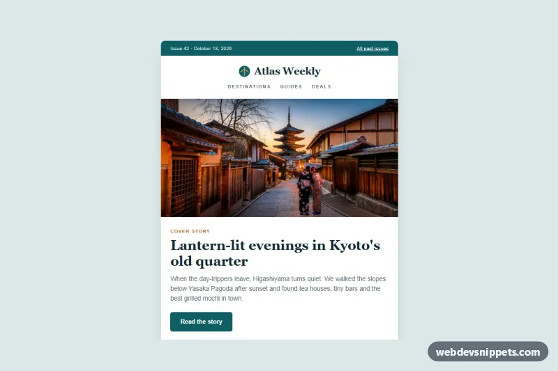
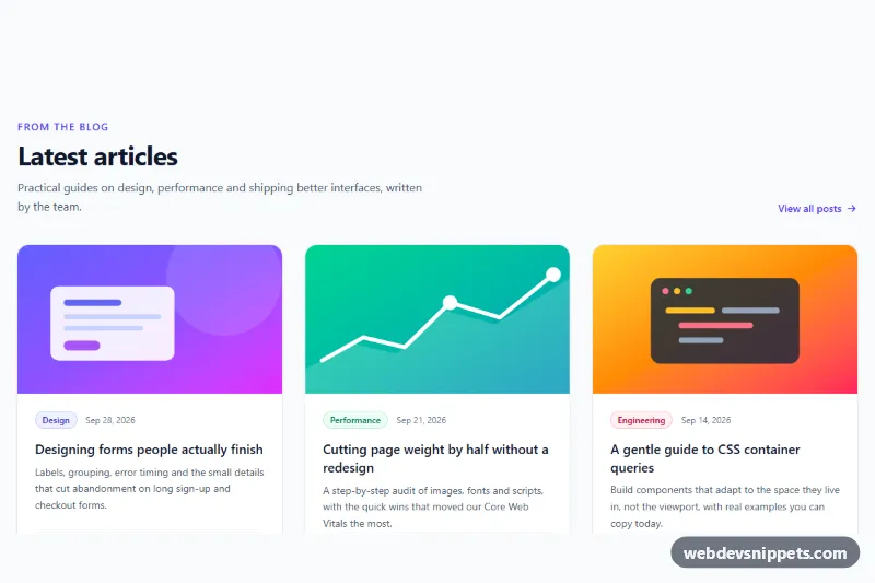
A magazine-style blog section built with Tailwind CSS: one large featured story with a wide photo and a column of four smaller posts with square thumbnails. It suits news sites, travel and food blogs, or any homepage that needs to highlight a cover story above the latest articles.
How it works
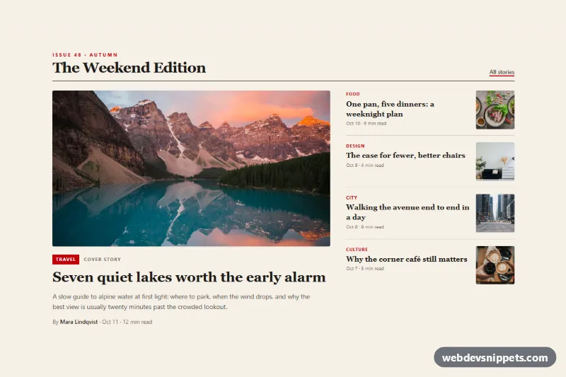
The root is section.tmf-magazine with a warm paper background (bg-[#f5f0e6]). A header with an issue line, a serif h2 title and an "All stories" link sits on a thick border-b-2 rule, which gives the print-magazine feel.
Below it, a grid switches to two columns from the lg breakpoint with lg:grid-cols-[1.65fr_1fr]. The left column is article.tmf-featured: a 16:9 img with object-cover, a red category tag, a large serif headline, an excerpt and a byline with a time element. The right column stacks four article.tmf-side items separated by divide-y; each has a category label, a serif title, the date and reading time, and a square thumbnail on the right.
Every card is fully clickable without extra JavaScript: the heading link carries after:absolute after:inset-0, so its pseudo-element stretches over the relative article. Hovering a card underlines the title through group-hover:underline, and the featured photo zooms slightly with group-hover:scale-105. No script or custom CSS is needed.
The photos come from Unsplash and are placeholders; replace them with your own article images.
Customization
lg:grid-cols-[1.65fr_1fr]on the main grid: give the featured story more or less width than the side column.aspect-[16/9]on the featuredimg: useaspect-[4/3]for a taller cover photo oraspect-[21/9]for a cinematic strip.bg-red-700,text-red-700anddecoration-red-700: swapredforemeraldorindigoto change the accent color of tags and underlines.font-serifon the headings: replace it withfont-sansfor a more modern editorial look.h-20 w-20 sm:h-24 sm:w-24on the side thumbnails: enlarge or shrink the small images, or move theimgbefore the text block to put thumbnails on the left.- Add or remove
article.tmf-sideitems; thedivide-yborders adjust automatically.
Use cases
- News sites: one large cover story sits above a column of four smaller latest articles
- Travel blogs: a wide destination photo leads the section while thumbnail posts list recent trips
- Food and lifestyle blogs: the featured recipe gets a large photo with excerpt and byline
- Blog homepages: highlight a cover story with a category tag and an All stories link
- Online magazines: serif headlines and a thick rule give a print-style look to the front page
Accessibility
The section is labelled by its heading through aria-labelledby. Each story is an article with a real heading, and the single link per card keeps the tab order short. Focus moves to the stretched link and shows an outline around the whole card via focus-visible:after:outline-2. Every image has descriptive alt text, width and height to prevent layout shift, and the side thumbnails use loading="lazy" while the cover photo loads immediately. The hover zoom is turned off with motion-reduce:transition-none, and red and stone text colors keep sufficient contrast on the paper background.
Usage notes
The layout needs only the Tailwind browser build. Several sections can live on one page; change the tmf-title id in each copy.