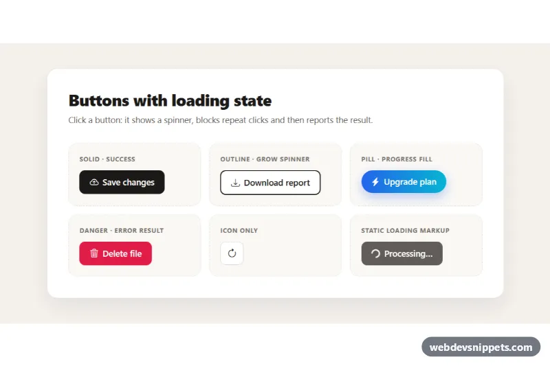
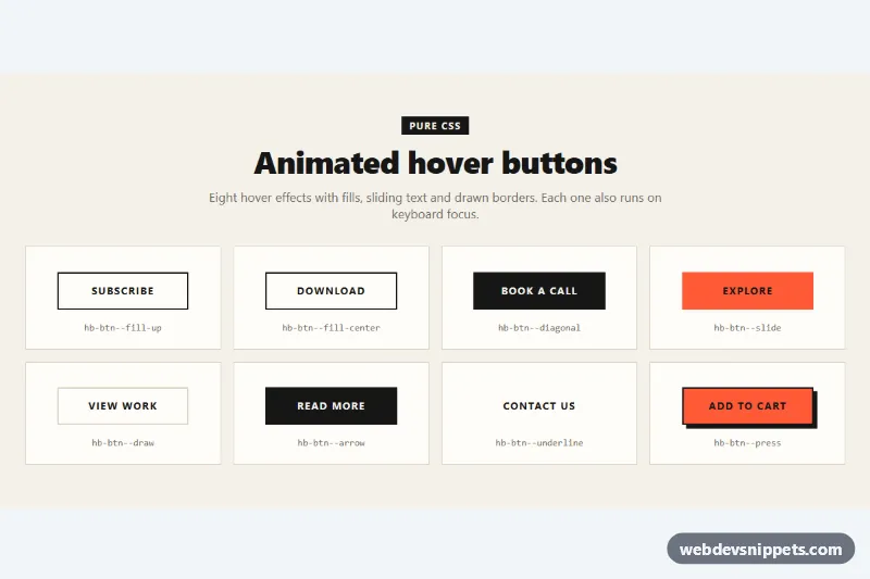
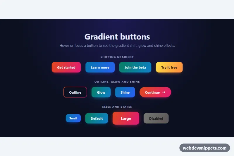
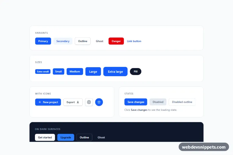
A set of Bootstrap 5 buttons with a built-in loading state: on click they show a spinner and a "working" label, ignore further clicks and then switch to a success or error result before returning to normal. Use them for save, download, upgrade, delete and refresh actions that wait for a server.
How it works
The root is section.lbt-demo, a card with a .lbt-grid of .lbt-cell examples. Every button has the lbt-btn class and the same inner parts: a Bootstrap spinner (.lbt-btn__spinner, either spinner-border or spinner-grow), the normal icon .lbt-btn__icon, a result icon (.lbt-btn__done or .lbt-btn__fail) and the .lbt-btn__label text. CSS shows or hides these parts based on three state classes on the button: is-loading, is-success and is-error.
The script finds every .lbt-btn with a data-lbt-loading attribute and listens for click. It adds is-loading, sets aria-disabled and aria-busy, swaps the label to the data-lbt-loading text and writes it into the shared .lbt-status live region. After data-lbt-duration milliseconds the button gets is-success (green, check icon, data-lbt-success text) or, when data-lbt-result="error", is-error (dark red, warning icon, a short shake, data-lbt-error text). After RESET_AFTER milliseconds it returns to its original label. A busy flag blocks double submits for the whole cycle.
Two variants add extra feedback: .lbt-btn--progress fills the button from left to right with .lbt-btn__fill during the wait, and .lbt-btn--icon rotates its .lbt-btn__icon--spin arrow instead of showing a separate spinner. The last cell shows static markup for a loading button you can render from the server.
Customization
--lbt-inkand--lbt-ink-hoverin.lbt-demo: recolor the solid, outline and icon buttons.--lbt-grad-fromand--lbt-grad-toin.lbt-demo: change the gradient of.lbt-btn--pilland the focus outline color.--lbt-success,--lbt-dangerand--lbt-danger-darkin.lbt-demo: change the result colors.--lbt-radiusin.lbt-demo: make the buttons square or rounder.data-lbt-durationon any button: set the simulated wait; the progress fill uses the same value.data-lbt-loading,data-lbt-successanddata-lbt-error: change the texts shown and announced for each state.RESET_AFTERinscript.js: keep the result visible longer or shorter.- The
window.setTimeoutin the click handler: replace it with afetch()and callfinish(true)orfinish(false).
Accessibility
Buttons keep keyboard focus while busy because they use aria-disabled instead of the disabled attribute, and aria-busy marks the work in progress. Each state change is announced through the visually hidden .lbt-status element with role="status". The icon-only button has an aria-label, and all icons and spinners are aria-hidden. Focus is shown with a thick outline. With prefers-reduced-motion: reduce the shake, fill and icon rotation are turned off and spinners slow down.
Usage notes
Requires Bootstrap 5 and Bootstrap Icons. Always guard against duplicate requests on the server as well.