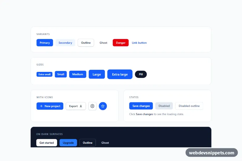
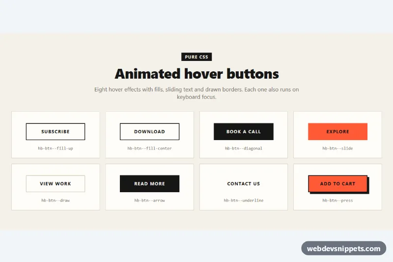
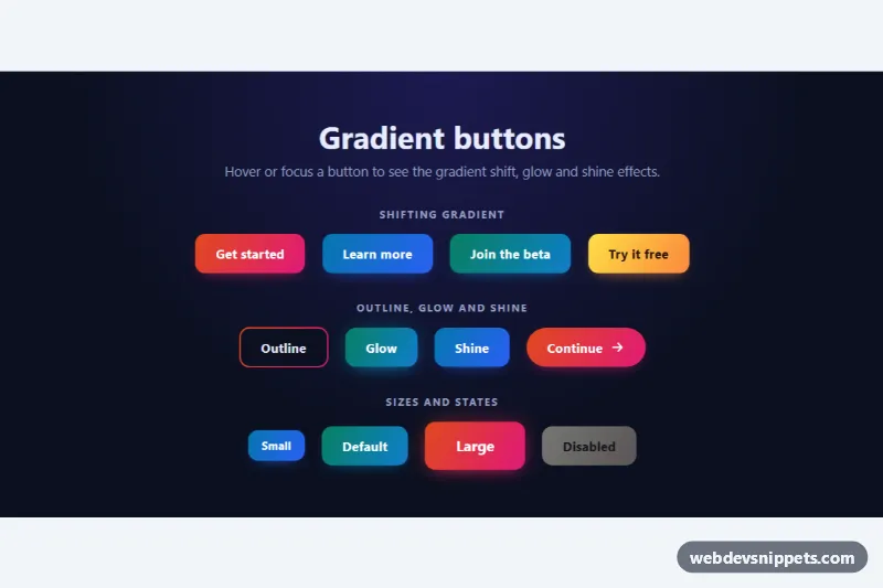
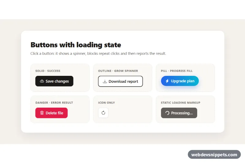
A complete set of Tailwind CSS button styles in one showcase: primary, secondary, outline, ghost, danger and link variants, five sizes plus a pill, buttons with leading and trailing icons, icon-only buttons, a loading state, disabled states and inverted buttons for dark sections. Copy the single button you need into forms, toolbars, cards, hero sections or settings pages.
How it works
The root is .tbv-showcase, a light page with four white panels and one dark bg-slate-900 panel. Each button is a plain <button type="button"> (or an <a> for the link variant) styled only with utilities. Every variant shares the same base: inline-flex items-center justify-center gap-2, rounded-lg, font-semibold, a transition, active:translate-y-px for a small press effect, and a focus-visible:outline-2 focus-visible:outline-offset-2 ring. Only the color utilities change between variants, so building a new one means swapping a few classes.
Sizes change padding, font size and radius together: px-2.5 py-1 text-xs rounded-md for extra small up to px-6 py-3 text-base rounded-xl for extra large. Icon-only buttons use a fixed square (h-10 w-10) with a centered SVG.
The States panel contains a button marked data-tbv-loading. On click, script.js sets aria-busy="true" and aria-disabled="true", changes the data-tbv-label text to "Saving..." and writes a message into the hidden data-tbv-status region. Tailwind's group-aria-busy:block variant reveals the .tbv-spinner SVG, which style.css rotates with the tbv-spin keyframes. After 1.5 seconds the button shows "Saved", then returns to its original label. Without JavaScript every button still renders and works as a normal button.
Customization
bg-blue-600 hover:bg-blue-700on the primary buttons: swapbluefor your brand color (for exampleemeraldorviolet) and update the matchingfocus-visible:outline-blue-600.rounded-lgin the base classes: userounded-fullfor a pill style system orrounded-nonefor sharp corners.px-4 py-2 text-smon the medium buttons: this is the default size; copy the extra small or extra large set for compact tables or hero sections.active:translate-y-px: remove it if you prefer buttons that do not move when pressed.BUSY_MSinscript.js: changes how long the loading and "Saved" states last; replace the timeout with your ownfetch()call..tbv-spinneranimation instyle.css: adjust0.8sto make the spinner faster or slower.from-blue-600 to-indigo-600on the full width button: change the gradient of the dark panel call to action.
Accessibility
All colors meet WCAG AA contrast for their text size. Icon-only buttons have an aria-label, and decorative SVGs carry aria-hidden="true". Every control shows a clearly visible focus outline, which turns white on the dark panel. The loading button keeps focus because it uses aria-disabled instead of disabled, exposes aria-busy while working and announces progress through a role="status" region. Disabled buttons use the native disabled attribute. The spinner slows down under prefers-reduced-motion.
Usage notes
Use the <a> link style only for navigation and real buttons for actions.