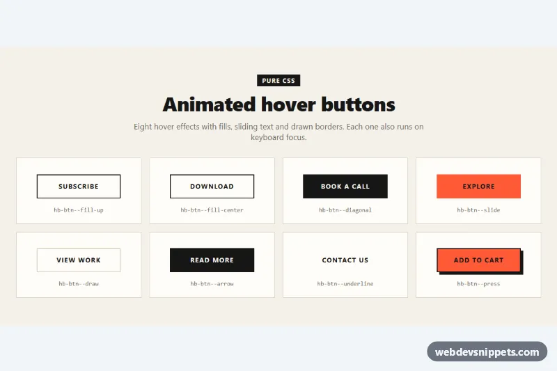
Animated Hover Buttons
Eight pure CSS hover buttons with fill, diagonal, sliding text, border drawing, arrow, underline and press effects that also run on focus.
Solid, outline, ghost and animated buttons.
4 component(s)
Eight pure CSS hover buttons with fill, diagonal, sliding text, border drawing, arrow, underline and press effects that also run on focus.
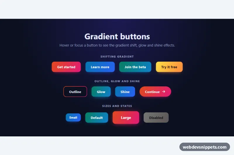
Pure CSS gradient buttons with shifting colors on hover, a gradient outline, glow and shine effects, sizes and a disabled state.
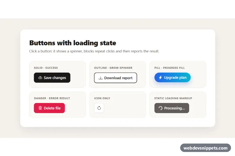
Bootstrap 5 buttons that show a spinner, block repeat clicks while working and then display a success or error state, in solid, outline, pill and icon styles.
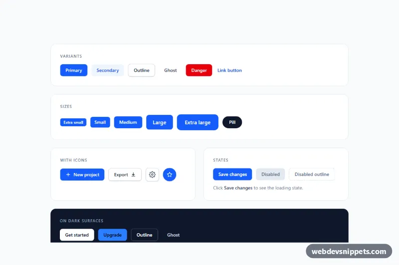
Tailwind CSS button set with primary, secondary, outline, ghost, danger and link variants, five sizes, icon buttons, loading and disabled states.
Button styles are the visual variants a button can take: solid fills for primary actions, outline buttons for secondary choices, ghost or text buttons for low-emphasis actions, and animated buttons that add a hover sweep, ripple or gradient shift. A consistent set of button styles tells users at a glance which action matters most on a screen, which is why every design system starts with them.
Use a real <button> element for actions and an <a> element for navigation, so keyboard and screen reader behaviour comes for free. Never remove the focus outline without replacing it with a visible :focus-visible style. Check the text-to-background contrast of every variant, including hover and disabled states; outline and ghost buttons often fail contrast on coloured backgrounds. Wrap motion in a prefers-reduced-motion media query so animated buttons calm down for users who ask for it. A disabled button should use the disabled attribute rather than only a grey colour.
These bootstrap button examples and CSS button styles come in Bootstrap 6, Bootstrap 5, Tailwind CSS and pure CSS flavours. Bootstrap 6 versions use the new theme-* colour roles, so a button adapts when you change the theme; Bootstrap 5 versions use the familiar btn-primary and btn-outline-* classes; Tailwind versions rely on utility classes; pure CSS versions use custom properties you can rename. Filter by framework, check the live preview, then copy the HTML and CSS from the code tabs with the copy button or download the snippet and adjust colours, radius and padding to match your brand.