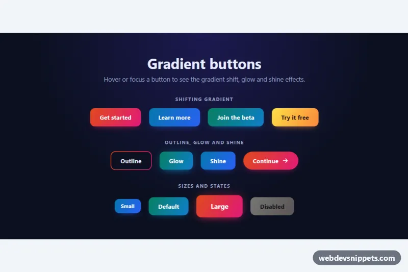
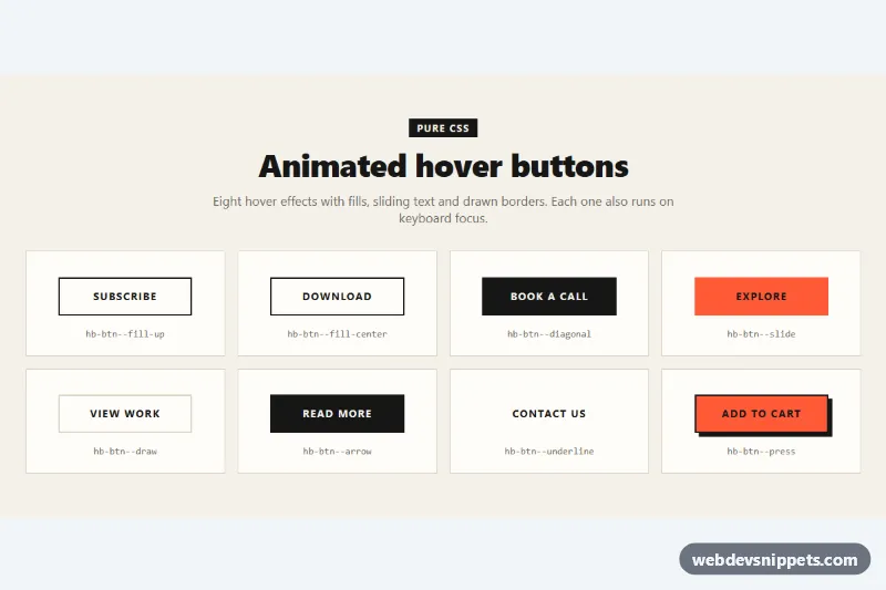
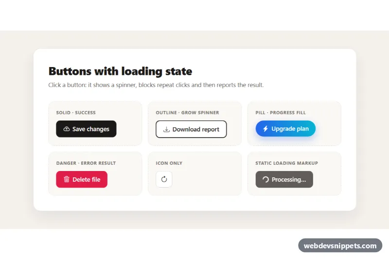
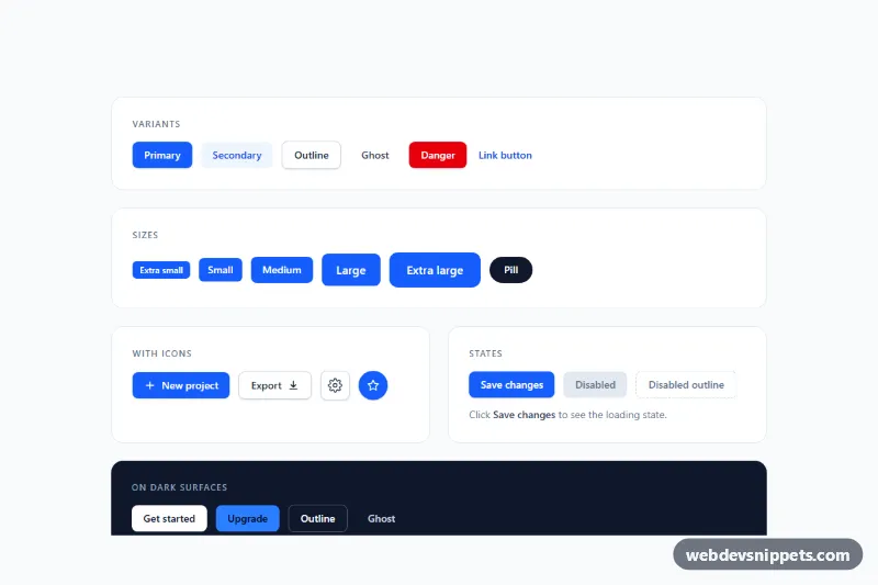
A collection of gradient buttons in pure CSS with animated hover effects: shifting gradients, a gradient outline that fills in, a soft glow and a light sweep. It works for hero calls to action, sign-up forms, pricing cards and landing pages on dark backgrounds. No JavaScript is used.
How it works
The demo wrapper section.gb-showcase holds three .gb-group blocks, each with a .gb-label and a flex .gb-row that wraps on small screens. Every button uses the base class .gb-btn, which works on both button and a elements. The base builds --gb-grad from three stops, --gb-from, --gb-via and --gb-to, and paints it at background-size: 300% 100%. On :hover and :focus-visible the background-position moves from 0% to 100%, so the colors slide across the button while it lifts by 2px and the shadow grows.
Palette modifiers (.gb-btn--sunset, .gb-btn--ocean, .gb-btn--aurora, .gb-btn--mango) only change the three color stops and --gb-ink. Effect modifiers stack on top of them:
.gb-btn--outlinedraws the gradient in the border box and a solid--gb-surfacein the padding box.--gb-surfaceis registered with@property, so the inner fill fades to a lighter shade on hover..gb-btn--glowadds a blurred copy of the gradient in::beforethat grows on hover..gb-btn--shinemoves a skewed white streak in::afteracross the button..gb-iconslides 4px to the right when its button is hovered.
Customization
--gb-from,--gb-viaand--gb-toon any.gb-btn(or a new palette class): the gradient colors.--gb-inkin a palette class: the label color;.gb-btn--mangouses a dark ink for contrast on yellow.--gb-radiuson.gb-showcase: corner radius of every button; add.gb-btn--pillfor fully rounded ends.--gb-angleon.gb-showcase: the gradient direction,120degby default..gb-btn--smand.gb-btn--lg: smaller or larger height, padding and font size.- Combine modifiers, such as
gb-btn gb-btn--lg gb-btn--glow gb-btn--sunset, to mix size, effect and palette. --gb-bgon.gb-showcase: the page background, which is also the inner fill of outline buttons.
Accessibility
Real button and a elements keep native keyboard behavior, and every hover effect also runs on :focus-visible together with a white --gb-focus outline. Label colors are chosen for readable contrast on their gradients. The decorative arrow is aria-hidden. Disabled buttons use the native disabled attribute (or aria-disabled="true" on links) and lose their hover motion. With prefers-reduced-motion: reduce all transitions, lifts and the shine sweep are switched off.
Usage notes
Copy the .gb-btn rules plus the modifiers you need; .gb-showcase, .gb-group and .gb-row are only demo layout. If you drop .gb-showcase, move its custom properties to :root.