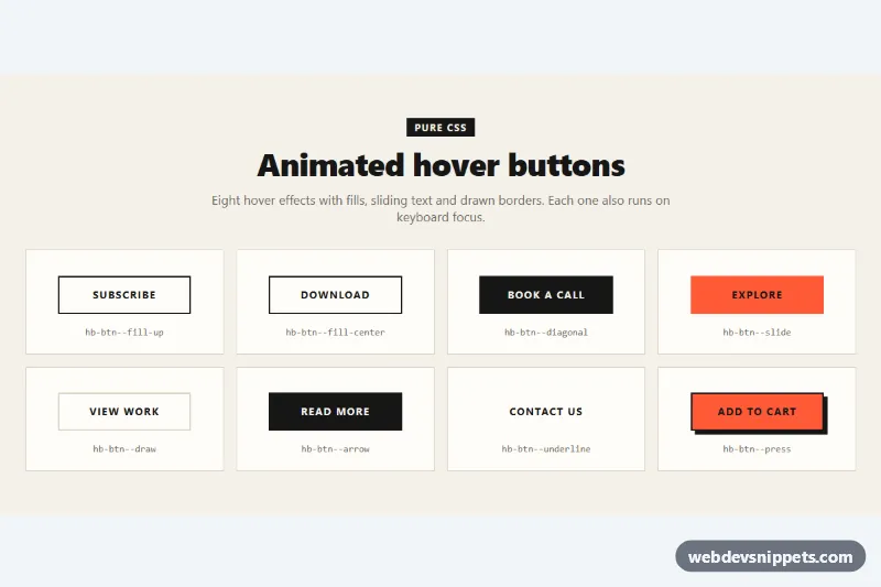
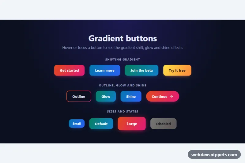
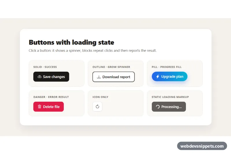
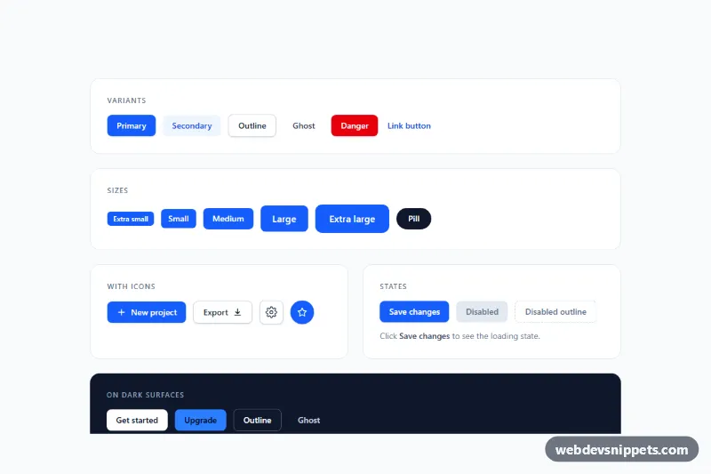
A set of eight animated hover buttons in pure CSS: fill, slide and border-drawing effects with square corners, bold uppercase labels and a warm paper-and-ink palette. Use them for calls to action on portfolios, agency sites, blogs and product pages. No JavaScript is needed.
How it works
The demo section.hb-board contains a ul.hb-grid of li.hb-cell cards, one button per card with a code.hb-caption that names its modifier. The grid shows one column on phones, two from 520px and four from 900px.
Every button shares the base class .hb-btn, which sets the 2px border, typography and isolation: isolate. That keeps each decorative ::before layer (with z-index: -1) above the button background but below the label. All effects are triggered with :is(:hover, :focus-visible), so keyboard users see them too.
.hb-btn--fill-up: an ink layer scales up from the bottom withscaleYwhile the text turns light..hb-btn--fill-center: an accent layer grows outward from the center withscaleX..hb-btn--diagonal: a skewed accent panel slides in from the left over a dark button..hb-btn--slide: inside.hb-window(a one-line mask),.hb-slidemoves up by 100%, so.hb-labelleaves and.hb-label--clonetakes its place while the background turns dark..hb-btn--draw:::beforedraws the top and right edges, then::afterdraws the bottom and left edges with staggeredtransition-delayvalues..hb-btn--arrow: the.hb-arrowSVG grows from zero width and fades in, pushing the label left..hb-btn--underline: a borderless button whosebackground-sizegrows a 3px accent underline..hb-btn--press: a hard offsetbox-shadowthat shrinks on hover and disappears on:active.
Customization
--hb-inkand--hb-accenton.hb-board: the dark color and the orange highlight used by all fills.--hb-speedand--hb-ease: duration and easing of every fill and slide animation.--hb-paperand--hb-card: the page background and card background;--hb-paperis also the light text color on dark fills.--hb-focus: color of the 3px keyboard focus outline.min-widthandpaddingin.hb-btn: make all buttons wider, narrower or taller.- Change
skewX(-24deg)in.hb-btn--diagonal::beforefor a steeper or flatter edge. - Change the label text in both
.hb-labelspans of the slide button so the copy matches.
Accessibility
Native button and a elements keep standard keyboard and screen reader behavior. The duplicate label in the slide button and the arrow icon are aria-hidden, so names are read once. Focus shows a blue outline offset from the button in addition to the hover effect. Text and fill colors keep strong contrast in both states. Under prefers-reduced-motion: reduce all transitions are removed and the end states appear instantly.
Usage notes
Copy .hb-btn plus the modifiers you need; .hb-board, .hb-grid and .hb-cell are only for the demo. Move the custom properties to :root if you drop .hb-board.