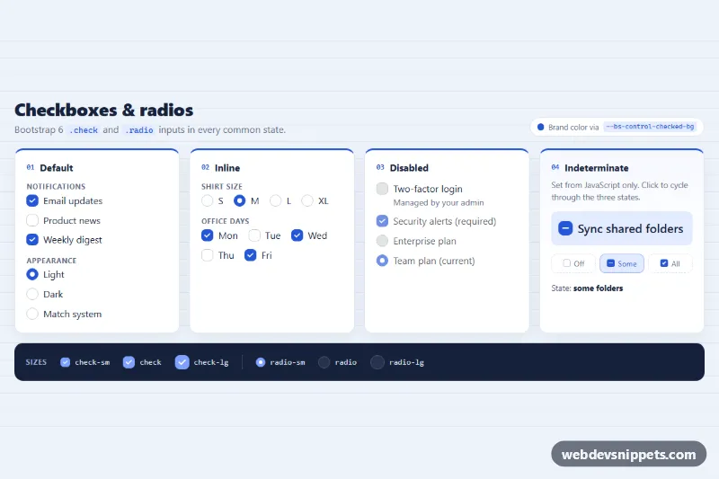
A reference sheet of Bootstrap 6 checkboxes and radios in a clean blue "spec sheet" layout. It shows the default, inline, disabled and indeterminate states, plus a strip with every size modifier. Use it to restyle settings pages, filters and sign-up forms, or as a quick look-up when moving from Bootstrap 5.
How it works
Each input is a plain <input class="check"> or <input class="radio"> next to a <label for>, inside a .form-field wrapper. Bootstrap 6 sees a .check, .radio or .switch child and turns the field into a two-column grid, so no form-check markup is needed.
- Default: two
<fieldset class="crs-set">groups with a<legend class="crs-legend-label">. - Inline: the fields sit in
.crs-inline, a wrapping flex row. Bootstrap 6 has noform-check-inline. - Disabled: uses the
disabledattribute. Bootstrap fades the label automatically. One item adds a.form-field-contentcolumn with a.form-texthint. - Indeterminate:
#crs-tricarriesdata-crs-tristate="mixed".script.jssets theindeterminateproperty, which has no HTML attribute. On everychangeit moves through off, mixed and on. It updates.crs-readoutand highlights the matching step in.crs-stateswith.crs-is-current. - Sizes:
.crs-sizesshowscheck-sm,check-lg,radio-smandradio-lgon a dark band.
The brand color is applied without per-input theme classes. .crs-root sets --bs-control-checked-bg, --bs-control-checked-border-color and --bs-focus-ring.
Customization
--crs-brandon.crs-root: one value recolors checked boxes, radios, card borders and code chips.--bs-control-checked-bginside.crs-sizes: gives the dark size strip its own lighter checked color (#7fa2ff).data-crs-tristateon a checkbox: setoff,mixedoronas the starting state. Any checkbox with the attribute gets the cycle.LABELSinscript.js: change the text shown in.crs-readoutfor each state.- The
@media (min-width: 1100px)rule on.crs-grid: changerepeat(4, …)to show fewer columns on wide screens. - Add
check-lgorradio-smto any input to resize it. Its label font size follows.
Use cases
- Settings pages: grouped checkboxes and radios in fieldsets with legends
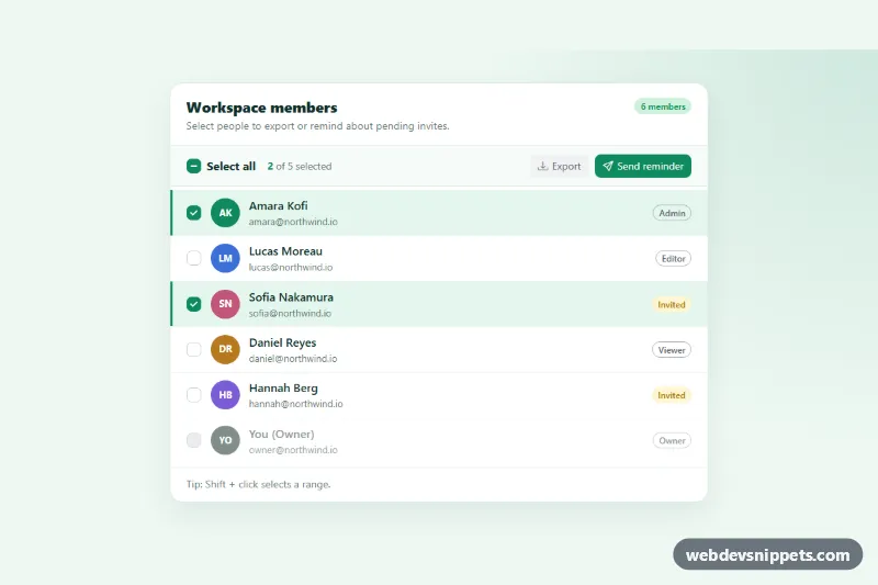
- Filter panels: inline options and an indeterminate parent checkbox show partial selections
- Sign-up forms: disabled options with hint text explain why a choice is unavailable
- Migration and style guides: a quick reference of default, small and large check and radio sizes
Accessibility
Related options are grouped in <fieldset> with a <legend>. Every input has its own label. The tri-state checkbox is a native input, so screen readers announce the mixed state. It is described by the live .crs-readout. Focus uses a 3 px ring in the brand color. The decorative step chips are aria-hidden. Bootstrap's check transitions are disabled under prefers-reduced-motion.
Bootstrap 6 notes
form-check, form-check-input and form-check-label are replaced by .check / .radio inside .form-field. A theme-* class on a check fills it even when unchecked in 6.0.0-alpha.1. That is why this snippet recolors through --bs-control-checked-bg. Built on Bootstrap 6.0.0-alpha.1. Alpha APIs can still change.