Skip to content

Radio Button Cards

Bootstrap 6 radio inputs styled as selectable plan and shipping cards with .form-field-card, a live price summary and a simulated submit.

Also known as: radio cards, selectable cards, pricing plan radio cards, radio button as cards, shipping method selector

Radio Button Cards live demo

Open in new tab

Bootstrap 6 code (HTML, CSS, JS)

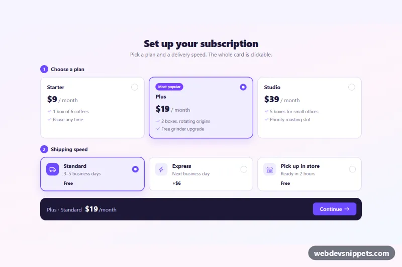
Selectable radio cards for a subscription checkout, built with Bootstrap 6's new .form-field-card. Plans are large price cards, shipping options are compact rows with icons, and a dark summary bar shows the total. The same pattern works for pricing plans, delivery methods, payment options or onboarding questions.

How it works

Every option is a .form-field.form-field-card that holds a native <input type="radio" class="radio"> and a .form-field-content column with the <label>. Bootstrap 6 places an absolutely positioned label::before over the card, so a click anywhere selects the radio. Radios with the same name (rbc-plan, rbc-ship) form two groups inside a <fieldset> with a numbered <legend class="rbc-legend">.

Selection styling is pure CSS. .form-field-card:has(:checked) gets the violet border, tint and shadow. .rbc-row:has(:checked) .rbc-icon fills the shipping icon. Plan cards (.rbc-card) move the radio to the top right with grid placement. Shipping rows (.rbc-row) lay out radio, icon, text and fee in one line on phones, and a stacked grid from 768 px.

Each radio has data-rbc-price and data-rbc-label. On any change, script.js adds both prices and writes the result into .rbc-summary and .rbc-sum. Submitting the form calls preventDefault(), disables .rbc-submit and shows a short "Saving" message. Then it confirms the choice in .rbc-status.

Customization

  • --rbc-brand and --rbc-brand-soft on .rbc-root: recolor checked cards, radios, icons, step badges and the button.
  • data-rbc-price on each radio: set the monthly price or shipping fee used for the total.
  • data-rbc-label on each radio: change the name shown in the summary bar.
  • Move checked to another radio to change the default plan, for example to highlight Starter.
  • Replace the setTimeout in the submit handler with fetch(). A comment shows a FormData example.
  • Change repeat(3, …) in the min-width: 768px rule of .rbc-plans to fit two or four plans.

Use cases

  • Subscription checkouts: large price cards let visitors choose a plan with one click
  • Delivery method selection: compact rows with icons and fees show shipping options
  • Onboarding questions: the whole card is clickable and highlights when selected
  • Order summaries: a dark summary bar adds the plan and shipping prices into a live total

Accessibility

Native radios keep the expected keyboard behavior. Tab enters each group, and the arrow keys move the selection. The whole card shows a focus ring through :has(:focus-visible). The "Most popular" badge is linked to the Plus radio with aria-describedby. The total is aria-live="polite", and .rbc-status uses role="status". Card transitions are turned off under prefers-reduced-motion.

Bootstrap 6 notes

Bootstrap 5 needed .btn-check tricks or custom CSS for card radios. Bootstrap 6 ships .form-field-card, .form-field-content and the .radio input. The button is btn-solid theme-primary, and the badge is badge theme-accent. Built on Bootstrap 6.0.0-alpha.1, which may still change. Icons come from Bootstrap Icons.
Radio Button Cards at a glance

Framework
Bootstrap 6
Code
HTML, CSS, JavaScript
JavaScript
Vanilla JavaScript, no jQuery
Dependencies
Bootstrap 6, Bootstrap Icons
Layout
Responsive, works on mobile
Category
Checkboxes & Radios
License
Free for personal and commercial use

Questions about this template

Can I use the Radio Button Cards code for free?

Yes. You can copy or download the code and use it in personal and commercial projects, including client work. No sign-up is needed. Reselling it as part of a component library or template collection is not allowed; see the license.

How do I add it to my website?

Load Bootstrap 6 and Bootstrap Icons from a CDN (the links are under Requirements). Paste the HTML where the component should appear, add the CSS to your stylesheet and load the JavaScript before the closing </body> tag. Download HTML gives you a complete page with everything already linked.

Does it need jQuery or a JavaScript framework?

No. The script is plain vanilla JavaScript, so it works without jQuery, React or Vue. You can still use the markup inside those frameworks.

Does it work on mobile?

Yes. The layout adapts to small screens. Use the Mobile and Tablet buttons above the live demo to check it at phone and tablet width.

Requirements

Add these to your page (already included in the download):

  • <link rel="stylesheet" href="https://cdn.jsdelivr.net/npm/bootstrap@6.0.0-alpha.1/dist/css/bootstrap.min.css">
  • <script type="module" src="https://cdn.jsdelivr.net/npm/bootstrap@6.0.0-alpha.1/dist/js/bootstrap.bundle.min.js"></script>
  • <link rel="stylesheet" href="https://cdn.jsdelivr.net/npm/bootstrap-icons@1.11.3/font/bootstrap-icons.min.css">

Built for Bootstrap 6.0.0-alpha.1. Bootstrap 6 ships as an ES module, so its script and this component's JavaScript load with type="module". Alpha releases can still change before the stable version.

Radio Button Cards – Bootstrap 6 checkboxes & radios component screenshot
Radio Button Cards · Bootstrap 6 Checkboxes & Radios

More Checkboxes & Radios

Checkbox List with Select All – Bootstrap 6 checkboxes & radios preview

Checkbox List with Select All

Bootstrap 6 member list with a select-all checkbox that turns indeterminate, a live counter, Shift+click ranges and bulk action buttons.

Checkbox and Radio Styles – Bootstrap 6 checkboxes & radios preview

Checkbox and Radio Styles

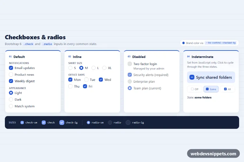
Bootstrap 6 .check and .radio inputs in default, inline, disabled and indeterminate states, with size modifiers and a brand color set by CSS variables.

Custom Checkboxes and Switches – Bootstrap 5 checkboxes & radios preview

Custom Checkboxes and Switches

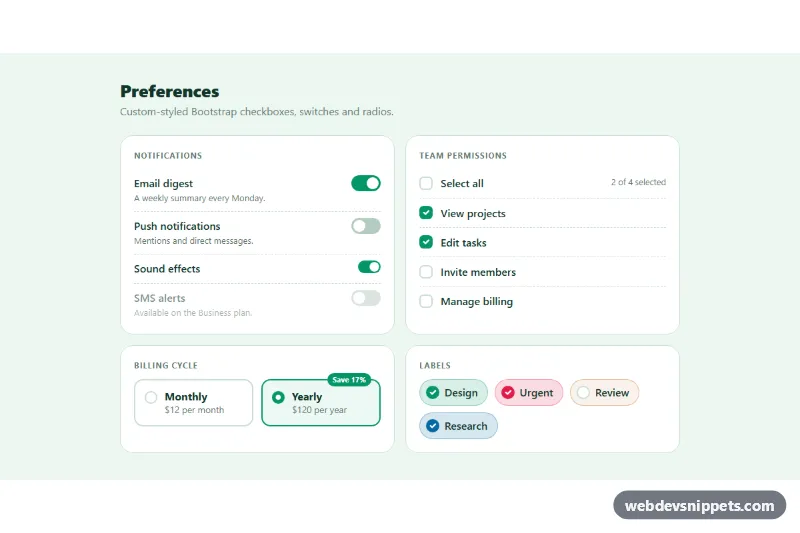
Restyled Bootstrap 5 checkboxes, large switches, select-all with indeterminate state, radio cards and colored checkbox chips.

Radio Card Selector – Tailwind CSS checkboxes & radios preview

Radio Card Selector

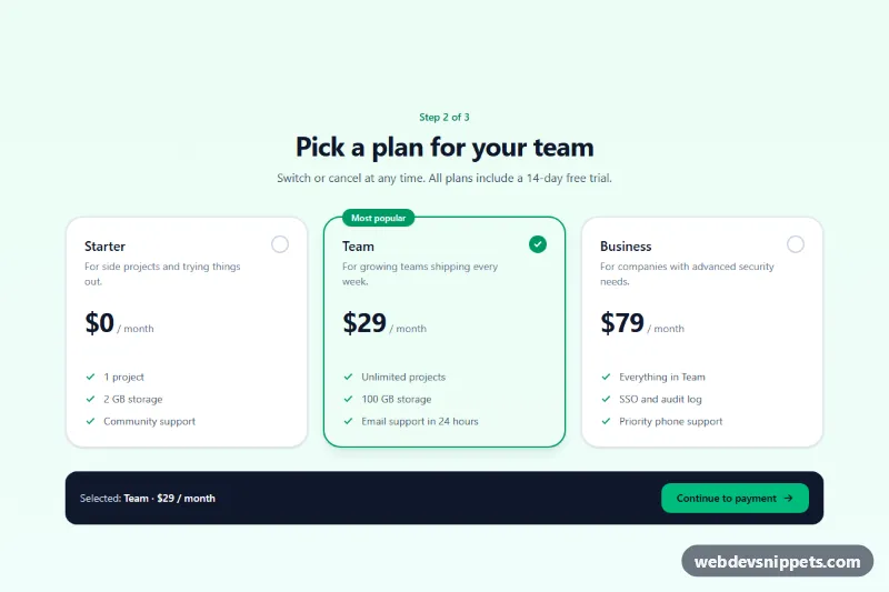
Tailwind CSS plan picker that turns native radio inputs into selectable pricing cards with a check indicator, focus ring and live summary.