Skip to content

Checkbox List with Select All

Bootstrap 6 member list with a select-all checkbox that turns indeterminate, a live counter, Shift+click ranges and bulk action buttons.

Also known as: select all checkbox, bulk select list, checkbox list select all, bulk actions list, shift click selection

Checkbox List with Select All live demo

Open in new tab

Bootstrap 6 code (HTML, CSS, JS)

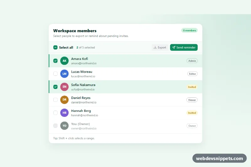
A Bootstrap 6 member list with a "Select all" checkbox that turns indeterminate when only some rows are checked. It has a live "2 of 5 selected" counter, Shift+click range selection and bulk action buttons that stay disabled until something is selected. It fits user tables, inbox lists, file managers and any admin screen with bulk actions.

How it works

The toolbar holds the master checkbox (.csa-all .check), the counter (.csa-count) and two buttons with data-csa-action. Each .csa-row in #csa-list contains an <input class="check csa-item">, a <label class="csa-person"> with an initials .avatar, and a role badge. The whole name area is clickable.

script.js collects every .csa-item that is not disabled. The owner row stays out of bulk selection. After any change, sync():

  • sets the master box to checked when all rows are selected;
  • sets it to indeterminate when only some are selected;
  • updates .csa-count-num and .csa-count-max;
  • disables the action buttons when nothing is selected.

Toggling the master box applies its state to every row. With Shift+click, all rows between the last clicked item and the current one get the same state. The action buttons collect the selected names and print a simulated result in .csa-status.

Selected rows get a green tint and a left accent bar from the CSS rule .csa-row:has(.csa-item:checked), with no extra JavaScript.

Customization

  • --csa-brand and --csa-brand-soft on .csa-root: recolor checked boxes, the selected-row tint, the counter and the primary button.
  • .csa-avatar--a to .csa-avatar--f: set the background of each initials avatar, or replace the letters with an <img class="avatar-img">.
  • Add disabled to any .csa-item to lock that row out of "Select all", as the owner row is.
  • data-csa-action on a button: add actions such as archive, and handle them in the action click listener.
  • Replace the status messages in that listener with a fetch() call that sends the selected IDs.
  • The max-width: 575.98px rule hides .csa-role badges and makes the action buttons full width on phones.

Use cases

  • User and member tables: a select-all box turns indeterminate when only some rows are checked
  • Inbox and message lists: Shift+click selects a range of rows at once
  • File managers: bulk action buttons stay disabled until at least one item is selected
  • Admin screens: a live counter shows how many items are selected, with the owner row excluded

Accessibility

Every checkbox has its own <label for>. The master box points to the list with aria-controls. Native checkboxes announce the mixed state on their own. The counter is aria-live="polite", and .csa-status has role="status", so selections and results are spoken. Avatars are aria-hidden because the name is already in the label. Row highlight transitions stop under prefers-reduced-motion.

Bootstrap 6 notes

Bootstrap 5's form-check-input becomes a plain .check. Its indeterminate dash is built in and uses the --bs-check-icon-indeterminate mask. Colors come from --bs-control-checked-bg, not theme-* on the input. Buttons use btn-subtle theme-secondary and btn-solid theme-success, and badges use badge-subtle / badge-outline. The initials circles use the new .avatar component. Built on Bootstrap 6.0.0-alpha.1. Alpha APIs can still change.
Checkbox List with Select All at a glance

Framework
Bootstrap 6
Code
HTML, CSS, JavaScript
JavaScript
Vanilla JavaScript, no jQuery
Dependencies
Bootstrap 6, Bootstrap Icons
Layout
Responsive, works on mobile
Category
Checkboxes & Radios
License
Free for personal and commercial use

Questions about this template

Can I use the Checkbox List with Select All code for free?

Yes. You can copy or download the code and use it in personal and commercial projects, including client work. No sign-up is needed. Reselling it as part of a component library or template collection is not allowed; see the license.

How do I add it to my website?

Load Bootstrap 6 and Bootstrap Icons from a CDN (the links are under Requirements). Paste the HTML where the component should appear, add the CSS to your stylesheet and load the JavaScript before the closing </body> tag. Download HTML gives you a complete page with everything already linked.

Does it need jQuery or a JavaScript framework?

No. The script is plain vanilla JavaScript, so it works without jQuery, React or Vue. You can still use the markup inside those frameworks.

Does it work on mobile?

Yes. The layout adapts to small screens. Use the Mobile and Tablet buttons above the live demo to check it at phone and tablet width.

Requirements

Add these to your page (already included in the download):

  • <link rel="stylesheet" href="https://cdn.jsdelivr.net/npm/bootstrap@6.0.0-alpha.1/dist/css/bootstrap.min.css">
  • <script type="module" src="https://cdn.jsdelivr.net/npm/bootstrap@6.0.0-alpha.1/dist/js/bootstrap.bundle.min.js"></script>
  • <link rel="stylesheet" href="https://cdn.jsdelivr.net/npm/bootstrap-icons@1.11.3/font/bootstrap-icons.min.css">

Built for Bootstrap 6.0.0-alpha.1. Bootstrap 6 ships as an ES module, so its script and this component's JavaScript load with type="module". Alpha releases can still change before the stable version.

Checkbox List with Select All – Bootstrap 6 checkboxes & radios component screenshot
Checkbox List with Select All · Bootstrap 6 Checkboxes & Radios

More Checkboxes & Radios

Radio Button Cards – Bootstrap 6 checkboxes & radios preview

Radio Button Cards

Bootstrap 6 radio inputs styled as selectable plan and shipping cards with .form-field-card, a live price summary and a simulated submit.

Checkbox and Radio Styles – Bootstrap 6 checkboxes & radios preview

Checkbox and Radio Styles

Bootstrap 6 .check and .radio inputs in default, inline, disabled and indeterminate states, with size modifiers and a brand color set by CSS variables.

Custom Checkboxes and Switches – Bootstrap 5 checkboxes & radios preview

Custom Checkboxes and Switches

Restyled Bootstrap 5 checkboxes, large switches, select-all with indeterminate state, radio cards and colored checkbox chips.

Radio Card Selector – Tailwind CSS checkboxes & radios preview

Radio Card Selector

Tailwind CSS plan picker that turns native radio inputs into selectable pricing cards with a check indicator, focus ring and live summary.