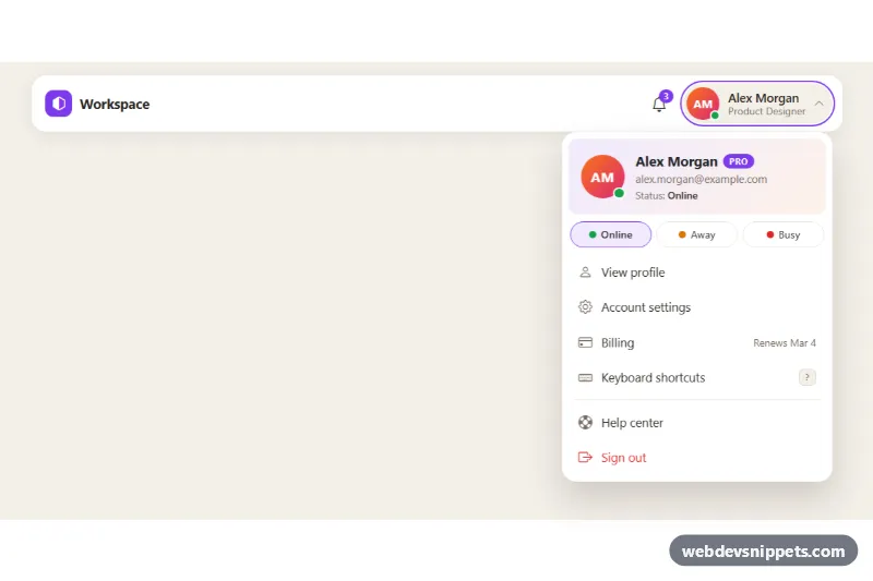
A Bootstrap 5 user account dropdown for app headers: an avatar button with name and role opens a menu with a profile header, a status picker (online, away, busy) and the usual account links ending in sign out. Use it in dashboards, admin panels and SaaS top bars.
How it works
The root is div.ud-stage, which holds a white .ud-bar header with the brand, a notification button and the .dropdown.ud-dropdown. The .ud-trigger button uses data-bs-toggle="dropdown", so Bootstrap's own Dropdown plugin (with Popper) opens and positions the .ud-menu, which is right-aligned with dropdown-menu-end. data-bs-offset="0,10" leaves a small gap below the bar, and data-bs-auto-close="outside" keeps the menu open while the user picks a status, but closes it on an outside click or Escape.
The .ud-avatar shows initials on a gradient instead of an image, plus a .ud-dot presence indicator. The menu starts with .ud-profile (large avatar, name, .ud-plan badge, email and status line), then the .ud-status group of three .ud-status__btn buttons. Clicking one runs setStatus(), which writes data-ud-status on the root, updates aria-pressed and the .ud-status-text. CSS maps the attribute to --ud-status-color, so both presence dots change color at once. The .ud-list contains .ud-item links with icons, a renewal note, a kbd shortcut hint and the red .ud-item--danger sign-out link.
Customization
--ud-accentand--ud-accent-softin.ud-stage: recolor the brand mark, plan badge, active status pill and focus rings.--ud-avatar-fromand--ud-avatar-toin.ud-stage: change the avatar gradient, or replace the initials with animginside.ud-avatar.--ud-online,--ud-awayand--ud-busyin.ud-stage: change the presence colors; add a key toSTATUS_LABELSinscript.jsand a matching button for a new status.data-ud-statuson.ud-stage: sets the initial status, for exampleaway.data-ud-openon.ud-stage: opens the menu on page load for the demo; remove it in production.data-bs-offseton.ud-trigger: move the menu closer to or farther from the button.widthin.ud-menu: make the menu wider or narrower.- Remove
d-none d-sm-flexfrom.ud-trigger__textto show the name on phones too.
Accessibility
The trigger is a real button with aria-expanded managed by Bootstrap and an aria-label that names the account, and the menu is linked with aria-labelledby. Bootstrap adds arrow key navigation across .dropdown-item elements and closes the menu with Escape. The status buttons sit in a labelled role="group", expose aria-pressed, and the status line is aria-live="polite" so the change is announced. Avatars and icons are aria-hidden. Every interactive element has a visible focus outline, and the menu animation is removed under prefers-reduced-motion: reduce.
Usage notes
Requires the Bootstrap 5 bundle (with Popper) and Bootstrap Icons. For several menus on one page, give each trigger its own id and update the matching aria-labelledby.