A navigation bar with dropdown menus that open on mouse hover and on keyboard focus, built with pure CSS and enhanced with a short vanilla JavaScript layer. It pairs a dark charcoal bar with white panels and amber accents, and includes a wide two-column panel with icons as well as compact link lists. Use it as the main menu of marketing sites, SaaS products and documentation portals.
How it works
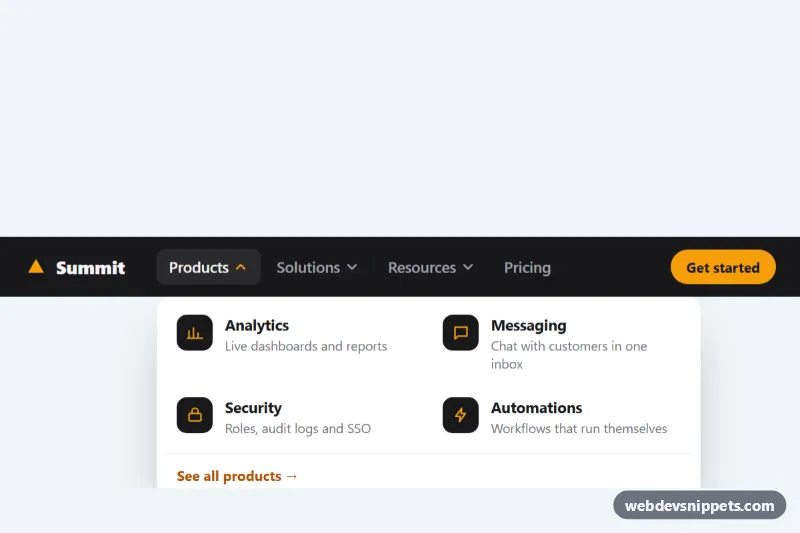
The root nav.hd-nav contains .hd-bar with the .hd-logo, the ul.hd-menubar and the .hd-cta button. Each li.hd-item holds a button.hd-trigger with a rotating .hd-caret and a .hd-menu panel. The Products panel uses .hd-menu--wide and a .hd-list--grid of .hd-link rows with an icon tile, a .hd-name and a .hd-desc; the other panels list .hd-link--plain links. Pricing is a plain link styled as a trigger.
The opening logic is CSS. Panels are hidden with opacity, visibility and a small translateY, and the selectors .hd-item:hover > .hd-menu and .hd-item:focus-within > .hd-menu reveal them, so tabbing to a trigger opens its panel and Tab continues through the links inside. Closing waits for --hd-hide-delay, and an invisible ::before bridge fills the gap above the panel, so the pointer can move from the trigger to the panel without the menu flickering shut.
The script keeps aria-expanded in sync, closes the open panel with Escape through the is-dismissed class and moves focus back to the trigger, toggles the is-open class on click and touch taps, and lets ArrowDown and ArrowUp move through the panel links. The item with data-hd-preview starts open until the first pointer or focus interaction. Without JavaScript, hover and keyboard focus still open every panel.
Customization
--hd-accenton.hd-nav: the logo, the icon strokes, the open caret, the focus outlines and the Get started button.--hd-barand--hd-panel: the background of the bar and of the dropdown panels.--hd-hide-delay: how long a panel stays visible after the pointer leaves, e.g.0.3sfor a more forgiving menu.--hd-speed: the fade, slide and caret rotation time.width: 34remin.hd-menu--wideandwidth: 13remin.hd-menu: the panel widths from 720px up.- Remove
data-hd-previewfrom the first.hd-itemif no panel should be open on page load. - Add
.hd-menu--wideand a.hd-list--gridlist to any item to turn it into a two-column panel.
Accessibility
The bar is a nav landmark labelled "Main", and every trigger is a real button with aria-expanded that reflects the panel state. Panels contain ordinary links, so screen readers and Tab work without special roles. Escape closes a panel and returns focus to its trigger, arrow keys move between links, and every control has a visible :focus-visible outline. Icons are aria-hidden. With prefers-reduced-motion: reduce the fade, slide and caret rotation are removed.
Usage notes
Below 720px the menu wraps onto its own row and panels span the full bar width. Several navbars can share a page because the script scopes everything to each .hd-nav.