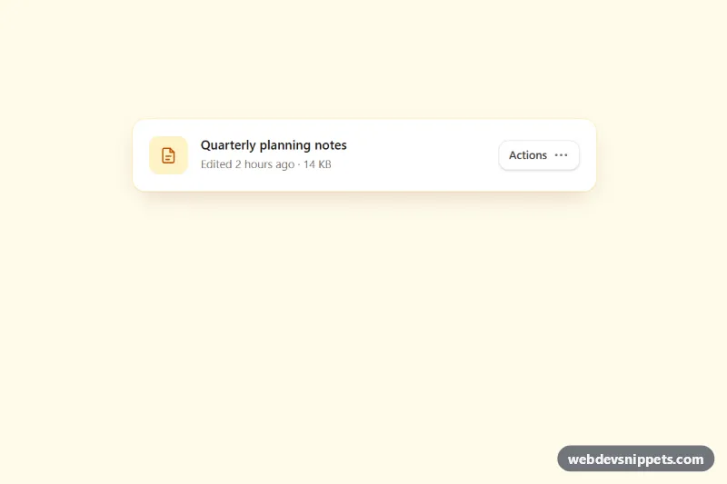
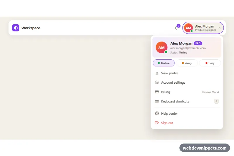
An accessible dropdown menu built with Tailwind CSS and vanilla JavaScript, attached to a document card as an "Actions" button. Each item has an icon, a keyboard shortcut hint, and the list is split into labelled groups with dividers, a disabled "Pro" item and a red destructive action. It fits file managers, dashboards, table rows and any place that needs a compact list of commands.
How it works
The root is .tdm-menu. Each menu lives in a relative wrapper marked data-tdm-dropdown, which holds the trigger (data-tdm-button, aria-haspopup="menu") and the panel #tdm-list (.tdm-list, role="menu", data-tdm-list), which starts with the hidden attribute. Items are button elements with role="menuitem" and tabindex="-1"; their text sits in .tdm-label and the shortcut in a kbd. Groups use role="group" with a small uppercase heading, and dividers use role="separator". The delete item carries data-tdm-danger.
On DOMContentLoaded the script initializes every data-tdm-dropdown inside each .tdm-menu. Clicking the trigger or pressing ArrowDown opens the panel and focuses the first item; ArrowUp opens it on the last item. Inside the menu a keydown listener handles ArrowDown, ArrowUp, Home, End, Escape and Tab, plus typeahead: typing letters moves focus to the next item whose label starts with them. Choosing an item closes the menu, returns focus to the trigger and writes the action into the data-tdm-status line. A mousedown listener on the document closes the menu when you click outside. style.css adds the short tdm-in scale-and-fade entrance.
Customization
right-0andorigin-top-righton#tdm-list: useleft-0andorigin-top-leftwhen the trigger sits on the left side of the page.w-64on#tdm-list: widen the panel for longer labels or wider shortcuts.amberutilities (hover:bg-amber-50,group-hover:text-amber-600,focus-visible:outline-amber-500): swap forskyorvioletto rebrand the highlight.- Add
aria-disabled="true"to anyrole="menuitem"to disable it; the script ignores clicks and Enter on it but keeps it reachable with the arrow keys. - Remove a
role="separator"element or a wholerole="group"block to flatten the list. - Replace the activation code in
activate()inscript.jsto run your own action (rename dialog, copy to clipboard, delete confirmation). animation: tdm-in 0.14sinstyle.css: lengthen or remove the entrance motion.
Accessibility
The trigger exposes aria-haspopup="menu", aria-controls and an aria-expanded state, and the menu is labelled by the trigger through aria-labelledby. Focus moves into the menu on open and returns to the trigger on Escape or selection, matching the WAI-ARIA menu button pattern. Groups are named with aria-labelledby, the disabled item uses aria-disabled, icons and shortcut hints are aria-hidden, and status changes are announced through role="status". Focus and hover share the same visible background, the trigger has a focus outline, and the animation is turned off under prefers-reduced-motion.
Usage notes
The shortcut hints are visual only; bind real shortcuts in your app if you show them. For several menus, repeat the data-tdm-dropdown wrapper with unique id values for the button and the menu.