
Hover and Focus Dropdown
Dark navbar with pure CSS dropdown menus that open on hover and keyboard focus, plus a small vanilla JS layer for Escape, arrow keys and touch taps.
Dropdown menus and action lists.
3 components
Dark navbar with pure CSS dropdown menus that open on hover and keyboard focus, plus a small vanilla JS layer for Escape, arrow keys and touch taps.
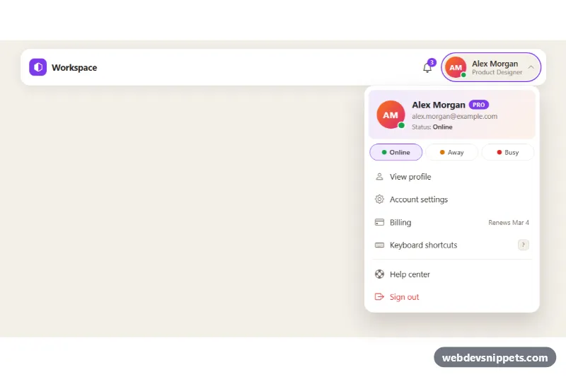
Bootstrap 5 avatar dropdown with profile header, plan badge, online/away/busy status picker and account menu links for app headers.
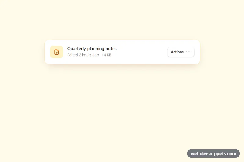
Accessible Tailwind CSS menu button with icons, grouped items, dividers, shortcut hints, typeahead and full arrow-key navigation.
A dropdown is a button that opens a small panel of actions or links. Common examples are account menus, "more actions" menus on table rows, sort and filter menus, and split buttons with a primary action and a menu of alternatives. Dropdown menus keep interfaces tidy by hiding secondary actions until the user needs them. They differ from selects: a dropdown triggers actions or navigation, while a select stores a form value.
<button> with aria-expanded and aria-controls that update when the menu opens.aria-label such as "More actions".The dropdown menu examples on this page include simple menus, menus with icons and headers, split buttons, user menus and action lists. Bootstrap 6 versions use the framework's ES module JavaScript and theme-* colour roles. Bootstrap 5 versions use the standard .dropdown component with data-bs-toggle="dropdown", Tailwind CSS versions pair utilities with a small script, and pure CSS versions use techniques such as <details> and <summary>. Preview each one live, copy the code and adapt the items to your app.