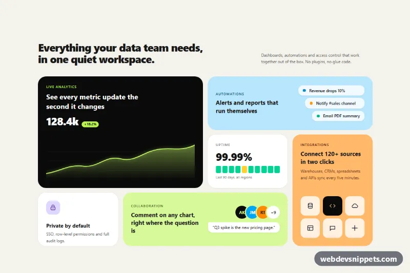
An asymmetric bento grid feature section built only with Tailwind CSS utilities and a few lines of CSS: six tiles of different sizes and colors present product features with mini illustrations instead of plain icon lists. It works well on SaaS homepages, product launch pages and "Why us" sections where a regular three-column feature grid looks too flat.
How it works
The root is section.bto-bento. A header row holds the heading and a short intro, and below it a single ul grid holds the tiles as li.bto-tile elements. The grid has one column on phones, two from sm and four from lg, where lg:auto-rows-[184px] gives every row the same height so the spans line up cleanly:
- The dark analytics tile uses
sm:col-span-2 lg:row-span-2and draws an area chart with inline SVG (.bto-chart, a gradient fill and the.bto-linestroke). - The sky automations tile spans two columns and shows a stepped list of rules.
- The uptime tile renders a status bar from ten small
spanblocks. - The orange integrations tile is tall (
lg:row-span-2) with a grid of source icons. - The security tile and the lime collaboration tile (
lg:col-span-2) fill the last row.
The grid relies on automatic placement, so the tile order in the markup decides the layout. style.css only adds the hover lift on .bto-tile and a soft glow on the chart line. There is no JavaScript.
Customization
lg:auto-rows-[184px]on theul: raise it to220pxfor more breathing room in every tile.lg:row-span-2andlg:col-span-2on the tiles: move them between tiles to reshuffle the bento layout; keep the spans adding up to full rows of four.bg-sky-200,bg-orange-300,bg-lime-200andbg-neutral-950: swap tile colors to match your brand.bg-[#f4f2ec]on.bto-bento: change the warm off-white page background.- The
dattribute of both chart paths in the analytics tile: edit the curve, keeping the fill path closed withV120 H0Z. rounded-[28px]on each tile: userounded-xlfor a sharper look.translateY(-4px)in.bto-tile:hover: increase, reduce or remove the lift.
Use cases
- SaaS homepages: six tiles of different sizes present features with mini illustrations
- Product launch pages: a dark analytics tile with an SVG chart leads the grid
- Why us sections: stats such as uptime and security sit in colored tiles
- Dashboard promos: a stepped automation list and integration icons show what the product does
- Modern landing pages: a livelier alternative to a flat three-column feature list
Accessibility
Tiles are list items with real h3 headings, so screen reader users can jump between features by heading. Charts, status bars, icons and avatar initials are decorative and marked aria-hidden="true"; the important numbers (128.4k, 99.99%) are real text. The automation steps are an ordered list with an aria-label. Colored tiles use dark text on light backgrounds and white or lime text on near-black, keeping contrast high. The hover lift is disabled under prefers-reduced-motion, and tiles are not focusable because they contain no actions.
Usage notes
To link a tile, wrap its content in an a element and add a focus-visible outline. Several grids can share a page if you rename the bto-fill gradient id.