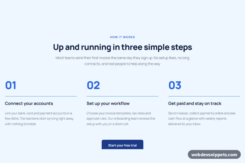
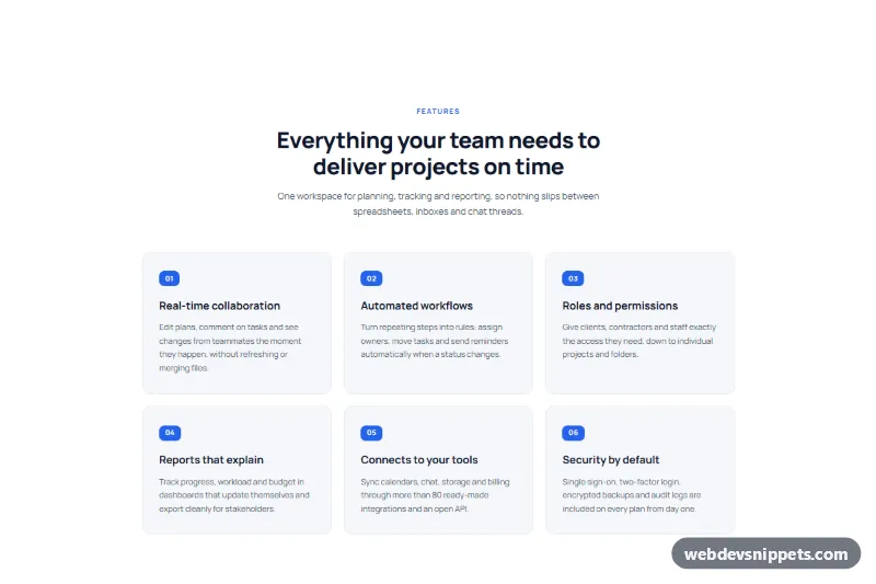
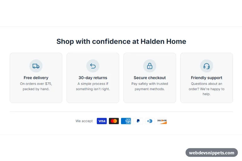
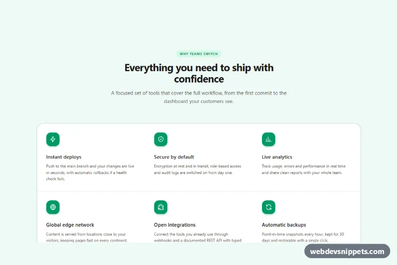
A how it works section as a Gutenberg pattern: a centered heading and intro, three numbered steps in columns with a blue connecting line under each number, and a call to action button with a short reassurance note. Use it as a three step process section, an onboarding steps block or a "getting started" overview on SaaS, service and booking sites.
How it works
The outer Group is full width with a pale blue #eff6ff background, navy text and a constrained 1120px layout. A nested Group (720px) holds the eyebrow, H2 and intro paragraph, all centered. A wide Columns block with three Columns follows; each Column contains a large step number paragraph ("01", "02", "03"), a thin Group used as a line (3px tall with a light blue background), an H3 and a paragraph. Because the lines sit at the same height in every column, they read as one connected track on desktop. On phones the columns stack and each step keeps its own line. A vertical flex Group at the bottom centers the button and the "Free for 14 days" note.
Use cases
SaaS and app sites: explain sign up, setup and first result in three steps
Agencies and consultants: show the discovery, delivery and support phases of a project
Booking and service businesses: describe how to choose, book and enjoy a service
Landing pages: reduce doubt right before the sign up button by showing how simple the process is
How to use it
Copy the block markup with the copy button.
Paste it into an empty paragraph in the block editor.
Replace the headings, step texts and button link with your own content.
Customization
Section background: outer Group, Color > Background #eff6ff; Color > Text #0f1e3d.
Step numbers: paragraph with Typography 56px, weight 800, Color > Text #2563eb.
Connecting line: the small Group under each number, Color > Background #93c5fd, Dimensions > Minimum height 3px, Border radius 3px; use a darker color for a stronger line.
Spacing between steps: Columns, Dimensions > Block spacing 48px.
Button: Color > Background #1e3a8a, Text #ffffff, Border radius 8px, padding 16px / 32px.
Fourth step: duplicate a Column; the Columns block spreads the steps evenly.
Accessibility
The section uses one H2 and an H3 per step, so screen reader users can jump from step to step. The step numbers are plain text read in order. Navy and slate text on pale blue and white text on the dark blue button keep contrast high, and the button is a real link with a clear label.
Can I use the How It Works Section with Three Steps code for free?
Yes. You can copy or download the block markup and use it in personal and commercial projects, including client work. No sign-up is needed. Reselling it as part of a component library or template collection is not allowed; see the license.
How do I add it to my WordPress site?
Copy the block markup, open a page in the block editor, click into an empty paragraph and paste. WordPress turns it into regular blocks that you can edit like any other content. You can also paste it in the Code editor view (Options menu > Code editor).
Does it need a page builder or plugin?
No. The pattern is built only from core blocks such as Group, Columns, Heading, Image and Buttons, so it works without Elementor, Spectra, Kadence or any other plugin. Colors and spacing are set on the blocks themselves; headings and text use your theme's fonts.
Will it look the same in my theme?
The layout, colors and spacing come with the blocks, so they carry over. Fonts, link styles and the content width follow your theme, so small differences are normal. The live demo shows the pattern in the default Twenty Twenty-Five theme. It works best with block themes; in classic themes the block editor still renders it, with your theme's styles.
Does it work on mobile?
Yes. The layout adapts to small screens. Use the Mobile and Tablet buttons above the live demo to check it at phone and tablet width.
How to install
Copy the block markup above.
Open a page or post in the WordPress block editor, click into an empty paragraph and paste. The editor turns the markup into blocks.
Replace the sample text and images. To reuse it, select the blocks and choose Create pattern from the block toolbar menu.
Uses only core WordPress blocks, so no plugin is needed. Tested with WordPress 6.8 and later. Fonts come from your theme; the live demo uses the default Twenty Twenty-Five theme. WebDevSnippets is not affiliated with or endorsed by the WordPress Foundation.
How It Works Section with Three Steps · WordPress Feature Sections