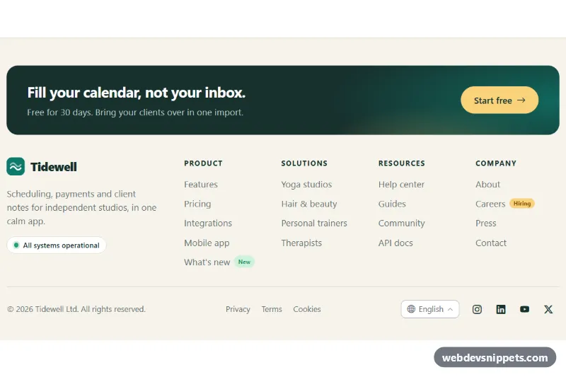
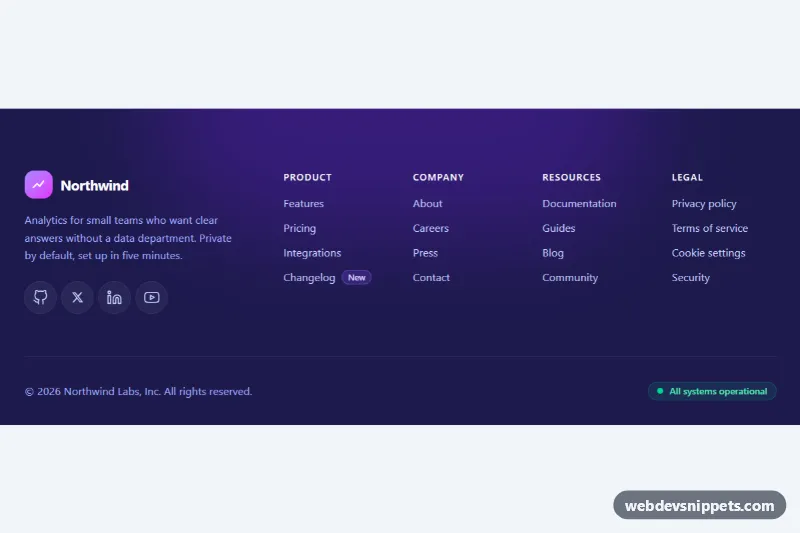
A light, warm website footer built with Bootstrap 6. A dark call-to-action band sits above a logo with a tagline and status pill, four link columns, and a bottom bar with copyright, legal links, a language picker and social icons. On phones the link columns fold into accordions.
How it works
The root .flc-footer is a <footer> with a visually hidden heading. .flc-cta is a flex band with a btn-solid theme-primary button recolored to sand yellow through its --bs-theme-bg token. .flc-top is a CSS grid. On screens from 768 px the brand block takes one column and .flc-cols shows four equal columns. Below that, everything stacks.
Each link column is a native <details class="flc-col"> with a summary.flc-col-title. The HTML ships with open on every column, so all links show even without JavaScript. script.js (an ES module) uses matchMedia('(min-width: 768px)') to keep the columns open on wide screens and closed on phones. On wide screens the summary is taken out of the tab order and its click is ignored, so it acts as a plain heading. The chevron is a CSS ::after that rotates when a column opens.
The language picker uses the Bootstrap 6 Menu: a button with data-bs-toggle="menu" and data-bs-placement="top-end" followed by a flat .menu with a menu-header and menu-item buttons. Clicking an item moves the active class and aria-current, updates .flc-lang-label and stores the code in data-flc-current-lang on the root. The year in .flc-year is filled from new Date(), so the copyright never goes out of date. Social links are btn-icon btn-text theme-secondary buttons with Bootstrap Icons.
Customization
--flc-bg,--flc-ink,--flc-mutedand--flc-lineon.flc-footer: change the background, text and divider colors.--flc-accent: recolors the logo, link hover, focus ring and the Bootstrap primary role used inside the footer.- Remove the whole
.flc-ctablock if your page already ends with a call to action. - Add a fifth
details.flc-coland changerepeat(4, …)in.flc-colstorepeat(5, …). - Edit the
data-flc-langvalues and redirect in the item click handler (location.href = '/' + code + '/') to switch locales. - Replace the
.flc-hiringpill or thebadge badge-subtle theme-success"New" badge with your own labels, or delete them.
Use cases
- Company websites: four link columns, a logo with tagline and a status pill organize the footer
- Marketing sites: a call-to-action band above the links encourages one last click
- Multilingual sites: a language menu sits in the bottom bar beside social icons
- Mobile visitors: the link columns fold into accordions on phones
Accessibility
The column links sit inside a nav labelled "Footer", and the social list has its own label. Every icon link has an aria-label that names the network. On phones the <details>/<summary> accordions are keyboard operable with Enter and Space. The Menu supports arrow keys and Escape, and Bootstrap keeps aria-expanded in sync on its toggle. All links have a visible teal focus outline, and the chevron rotation is turned off under prefers-reduced-motion.
Bootstrap 6 notes
Bootstrap 5's dropdown/dropup with dropdown-menu becomes a toggle plus a sibling .menu, positioned with data-bs-placement="top-end". Buttons use btn-solid, btn-outline and btn-icon btn-text with theme-* roles instead of btn-primary and btn-outline-secondary. Badges use badge-subtle theme-success instead of text-bg-success. Built on 6.0.0-alpha.1, so APIs can still change. Icons come from Bootstrap Icons.