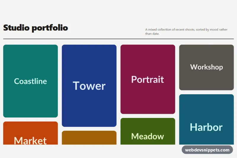
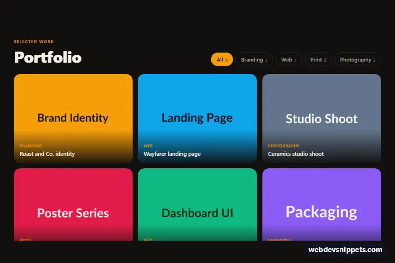
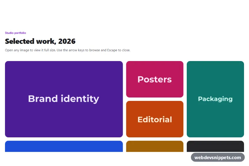
A responsive masonry image gallery made with pure CSS multi-column layout, no JavaScript and no grid library. Photos of different heights stack tightly in columns, and a caption slides up over each image on hover or keyboard focus. It works well for photography portfolios, mood boards, case study pages and product inspiration walls.
How it works
The root section.mg-gallery contains an .mg-header with the .mg-title and a short .mg-lead, followed by the ul.mg-grid. The list uses column-count and column-gap, which is what creates the masonry effect: the browser fills the first column top to bottom, then the next, and each li.mg-item keeps its natural height. break-inside: avoid stops an item from being split across two columns.
Every item wraps an a.mg-link around a figure.mg-figure that holds the img.mg-img and a figcaption.mg-caption with a .mg-cap-title and .mg-cap-meta. The caption is positioned at the bottom of the figure over a dark gradient and starts pushed down with translateY(100%) and opacity: 0. On :hover or :focus-visible of the link, the caption slides into view while the image scales up slightly and gains saturation. On touch devices, detected with (hover: none), captions are always visible because there is no hover state. The images carry width and height attributes so the browser reserves space before they load, and the lower ones use loading="lazy".
Customization
--mg-columnson.mg-gallery: number of columns. The media queries set 1, then 2 from 540px, 3 from 860px and 4 from 1140px.--mg-gap: space between columns and between stacked items.--mg-radius: corner radius of the figures and the focus outline.--mg-overlay: the dark color at the bottom of the caption gradient; lighten it for a softer look or use a brand color.--mg-zoomand--mg-speed: how far the image scales on hover and how long the caption and zoom transitions take.--mg-focus: color of the keyboard focus outline around each link.- Replace the
placehold.coURLs in each.mg-imgwith your own photos; any aspect ratio works.
Accessibility
Each image has a descriptive alt text and each tile is a real link, so it is reachable with Tab and opens with Enter. Caption text is part of the link, which gives screen readers a meaningful link name. A clear --mg-focus outline marks the focused tile, and the caption is revealed on keyboard focus as well as on hover. White caption text sits on a dark gradient for good contrast. With prefers-reduced-motion: reduce the zoom and slide are removed and the caption simply fades in.
Usage notes
CSS columns order items top to bottom, then left to right, so the visual order differs from the source order across columns. If strict left-to-right order matters, use CSS grid instead. Several galleries can share a page since all styles are scoped to .mg-gallery.