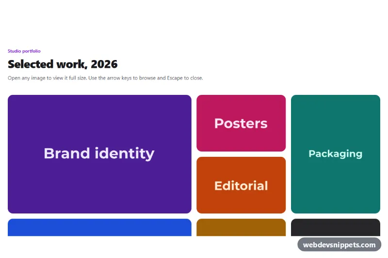
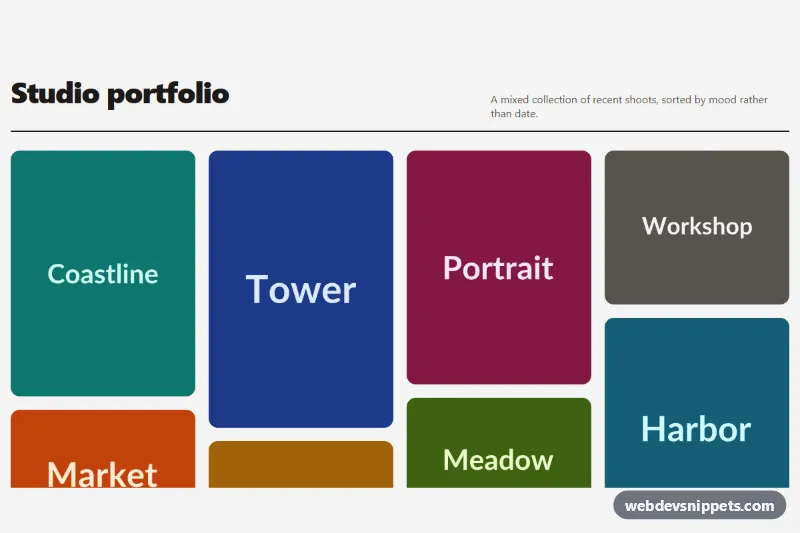
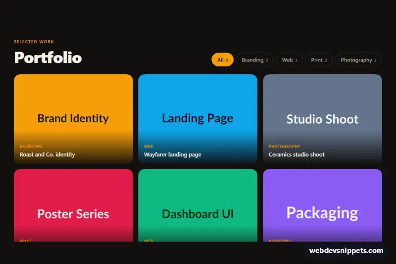
A responsive image gallery with a built-in lightbox, made with Tailwind CSS and plain JavaScript. Thumbnails sit in a mosaic grid with featured tiles, and clicking any of them opens a full-screen viewer with captions, a counter, previous and next buttons, keyboard shortcuts and swipe support. It works well for portfolios, case studies, event photos and product shots.
How it works
The root is section.tgl-gallery. The grid is a ul using grid-cols-2 md:grid-cols-4, fixed auto-rows-[9rem] and grid-flow-dense, so tiles with col-span-2 or row-span-2 pack without gaps. Each tile is a button.tgl-item holding a thumbnail img.tgl-img and a .tgl-hover caption bar. The large version and caption live in data-tgl-full and data-tgl-caption on the button.
The .tgl-lightbox dialog starts with the hidden attribute and contains a dark .tgl-backdrop, a counter (data-tgl-index / data-tgl-count), a close button, a figure with the data-tgl-image element and caption, and data-tgl-prev / data-tgl-next buttons.
On DOMContentLoaded the script initializes every .tgl-gallery. A click on a tile stores the focused element, calls show() to load the full image, removes hidden, locks page scrolling and focuses the close button. While a new file loads, data-tgl-loading fades the image out; the load event fades it back in. show() also preloads the neighbouring images. A keydown listener handles Escape, ArrowLeft, ArrowRight, Home and End and traps Tab inside the dialog. A horizontal touchend swipe of more than 50 pixels changes the image. Clicking the backdrop or anything marked data-tgl-close closes the viewer and returns focus to the tile that opened it.
Customization
data-tgl-fullanddata-tgl-captionon each.tgl-item: point to your high-resolution file and set the caption; withoutdata-tgl-fullthe thumbnail is reused.col-span-2androw-span-2on thelielements: choose which tiles are featured, or remove them for a uniform grid.md:grid-cols-4andauto-rows-[9rem] sm:auto-rows-[11rem]on theul: change the column count and tile height.bg-zinc-950/95on.tgl-backdrop: lower the opacity to let the page show through.from-violet-950/80on.tgl-hoverandhover:bg-violet-500on the arrows: swapvioletfor your brand color.transform: scale(1.06)instyle.css: increase or remove the hover zoom.
Accessibility
Every tile is a native button with aria-haspopup="dialog" and a descriptive alt text. The lightbox has role="dialog", aria-modal="true" and aria-labelledby pointing to the caption. Focus moves to the close button on open, stays trapped inside while open and returns to the tile on close. The counter is a polite live region, so each change is announced. Icon buttons have sr-only labels and decorative icons are aria-hidden. Focus outlines are clearly visible, hover captions are always shown on touch screens, and animations are disabled under prefers-reduced-motion: reduce.
Usage notes
Several galleries can share a page: each .tgl-gallery has its own lightbox, but give each copy a unique caption id.