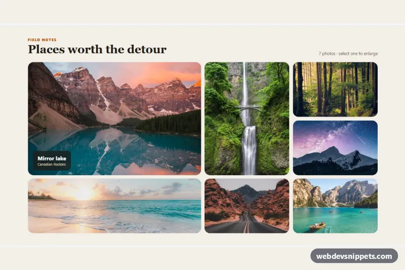
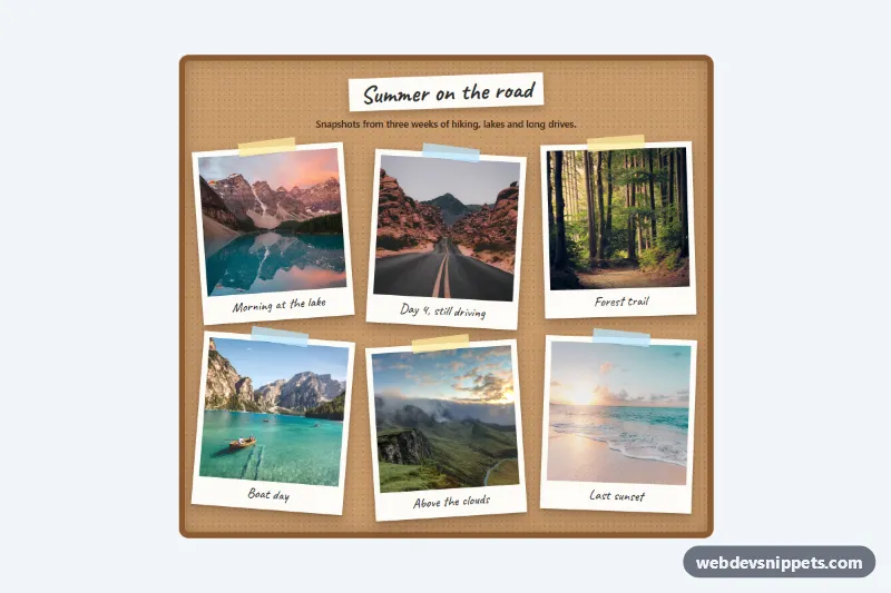
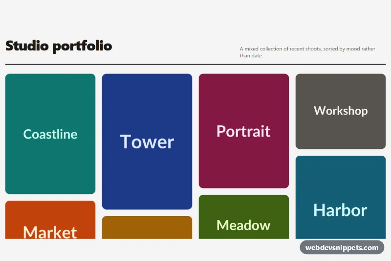
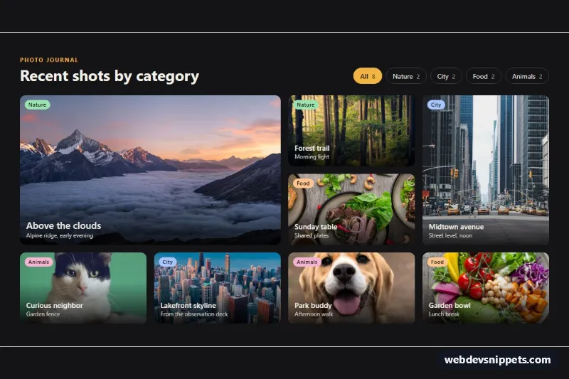
A bento-style photo gallery built with CSS Grid, where tiles of different sizes lock together into one tidy block, plus a small vanilla JavaScript lightbox. It works well for travel blogs, portfolio pages, hotel and venue sites or any "highlights" section that needs more character than a uniform grid.
How it works
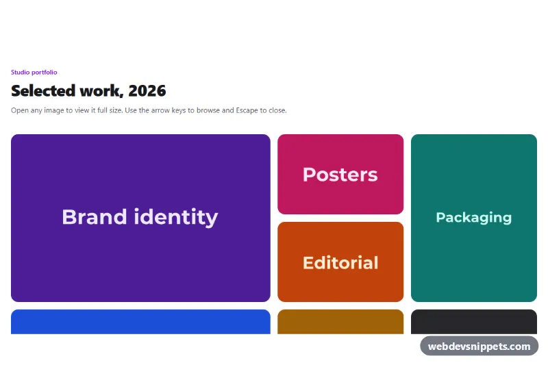
The root section.bpg-gallery contains a .bpg-head and the .bpg-grid. Each photo is a figure.bpg-tile with a link (a.bpg-link) that wraps the thumbnail img.bpg-img, and a figcaption.bpg-cap with a .bpg-title and .bpg-place. The grid uses fixed row heights from --bpg-row and grid-auto-flow: dense. Three modifiers decide the shape: .bpg-tile--big spans two columns and two rows, .bpg-tile--tall spans two rows and .bpg-tile--wide spans two columns. On phones the grid has two columns; from 720px it switches to four, and the dense packing fills every gap. Images use object-fit: cover, so any photo ratio fits its tile.
Captions slide up on hover or keyboard focus, are always visible on the featured tile, and are always shown on touch screens via (hover: none). Each link points to a large version of the photo, so without JavaScript a click simply opens the image. With JavaScript, the script listens for click on every .bpg-link, prevents navigation and opens the dialog.bpg-dialog with showModal(). It shows the large image in .bpg-full, the caption in .bpg-full-cap and a counter such as "3 / 7". .bpg-prev and .bpg-next loop through the photos.
The photos are from Unsplash and are meant as placeholders; replace them with your own images and update the alt text.
Customization
--bpg-rowon.bpg-gallery: row height (9rem on phones, 11.25rem from 720px); taller rows make every tile taller.--bpg-gapand--bpg-radius: spacing between tiles and their corner rounding.- Move
.bpg-tile--big,.bpg-tile--tallor.bpg-tile--wideto other figures to create a new mosaic; tiles without a modifier fill one cell. grid-template-columnsin.bpg-gridinside the 720px media query: userepeat(6, ...)for a wider, denser mosaic.--bpg-bg,--bpg-inkand--bpg-accent: section background, text color and the eyebrow / focus color.- The
hrefof each.bpg-linksets the image the lightbox loads; point it to a larger file than the thumbnail.
Use cases
- Travel blogs: mixed-size tiles show trip highlights and open full photos in a lightbox
- Portfolio pages: big, tall and wide tiles give work samples more character than a uniform grid
- Hotels and venues: photos of rooms and spaces lock into one block with captions on hover
- Highlights sections: a compact mosaic with a keyboard-friendly viewer and previous and next buttons
Accessibility
Every thumbnail has a descriptive alt, width, height, decoding="async", and every image after the first two uses loading="lazy". Links show a visible focus ring, and focusing a tile reveals its caption. The lightbox is a native modal dialog with an aria-label: focus moves to the close button, Escape closes it, the Left and Right arrow keys switch photos, a click on the backdrop closes it, and focus returns to the tile that opened it. The caption inside the viewer is an aria-live region, so screen readers announce the new photo. Zoom and caption transitions are turned off with prefers-reduced-motion.
Usage notes
Several galleries can share a page because the script scopes everything to each .bpg-gallery.