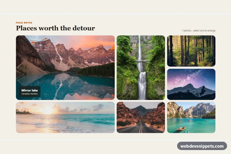
CSS Grid Bento Photo Gallery
Bento-style photo gallery with mixed tile sizes from CSS Grid spans, hover captions and a keyboard-friendly dialog lightbox.
Image grids, masonry layouts and lightboxes.
5 component(s)
Bento-style photo gallery with mixed tile sizes from CSS Grid spans, hover captions and a keyboard-friendly dialog lightbox.
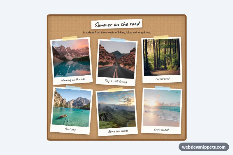
Pure CSS polaroid gallery on a cork board: tilted photo frames with tape and handwritten captions that straighten and lift on hover or focus.
Pure CSS masonry image gallery using multi-column layout, with hover and focus captions that slide up over each photo. No JavaScript needed.

Dark Bootstrap 5 portfolio gallery with pill filter buttons, automatic category counts, fade-in tiles and a screen reader status message.
Tailwind CSS mosaic image gallery that opens an accessible lightbox with captions, arrow-key and swipe navigation, focus trap and preloading.
An image gallery arranges a collection of photos or visuals so users can browse them and open larger versions. Common patterns include uniform grids, masonry layouts with mixed heights, justified rows, filterable galleries and thumbnail strips with a main image. Many galleries include a lightbox that shows the selected image full screen with next and previous navigation. Galleries are used on portfolios, photography sites, product pages, real estate listings and event pages.
Use a gallery when images are the content itself and users want to see many of them. For a few hero images, a carousel or single image may be enough.
alt text that explains what is shown, not just "image 1".<figure> and <figcaption> when images need captions.srcset, loading="lazy" and modern formats such as WebP or AVIF.aspect-ratio or width and height attributes to prevent layout shift.The gallery examples are available for Bootstrap 6, Bootstrap 5, Tailwind CSS and pure CSS. Bootstrap versions use the grid and image utilities, with lightboxes built on the modal component; in Bootstrap 6 the modal is based on the native <dialog> element and colours come from the theme-* roles. Tailwind CSS versions use utilities with a small script for lightboxes, and pure CSS versions use CSS Grid or multi-column layouts for masonry. Filter by framework, test the gallery in the live preview, then copy or download the code and swap in your own images.