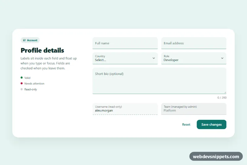
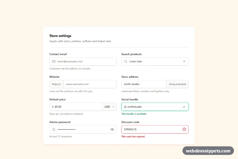
A set of Bootstrap 5 floating label inputs for text, email, select and textarea fields, restyled as soft "filled" fields with a strong bottom line, plus read-only and disabled examples. Use it for profile settings, account pages, checkout steps or any form where compact labels save space.
How it works
The root is section.fl-fields. A white .fl-panel splits into an intro column (col-lg-4) with a short legend and the .fl-form (col-lg-8). Every field uses Bootstrap's form-floating wrapper: the control comes first, then its label, and a placeholder is required so Bootstrap can detect an empty field with :placeholder-shown. The selects float their label permanently, and the .fl-bio textarea gets a fixed height so the floated label has room.
The CSS replaces the default box with a tinted background, a 2px bottom border and rounded top corners. On focus the line and label switch to the accent color, .is-valid and .is-invalid change the line to green or red, [readonly] uses a dashed line and :disabled turns gray. The textarea label's ::after mask is recolored so scrolled text never shows through.
The script validates only the [required] fields, and only after the user leaves one (blur) with a value; from then on it re-checks on input or change. Invalid fields get aria-invalid and their error text through aria-describedby. The textarea input event updates .fl-count, the reset event clears every state, and submit focuses the first invalid field or writes a confirmation into .fl-status.
Customization
--fl-accent,--fl-accent-hoverand--fl-accent-rgbin.fl-fields: change the teal focus line, focused label color, chip and buttons.--fl-field-bgand--fl-field-linein.fl-fields: set the fill color and the resting bottom line of every field.--fl-okand--fl-errin.fl-fields: recolor the valid and invalid states and the legend dots.--fl-field-radiusin.fl-fields: use0for square fields or a larger value for softer corners.--fl-bio-heightin.fl-fields: make the textarea taller or shorter.maxlength="200"on.fl-bio: change the bio limit; the counter reads it automatically.col-md-6on the field columns: switch tocol-12for a single-column form.- The
window.setTimeoutcall in the submit handler: replace it with afetch()to your API.
Accessibility
Every control has a real label linked with for, and the labels stay visible after they float, unlike plain placeholders. Error messages are connected through aria-describedby only while a field is invalid, the textarea is always described by its counter, and .fl-status is a role="status" region. Validation waits until a field is left, so users are not interrupted while typing. Focus shows both a colored line and a focus ring, and transitions are disabled with prefers-reduced-motion: reduce.
Usage notes
Requires Bootstrap 5.3 and Bootstrap Icons. Keep the placeholder attribute on inputs and textareas; without it the label overlaps the text.