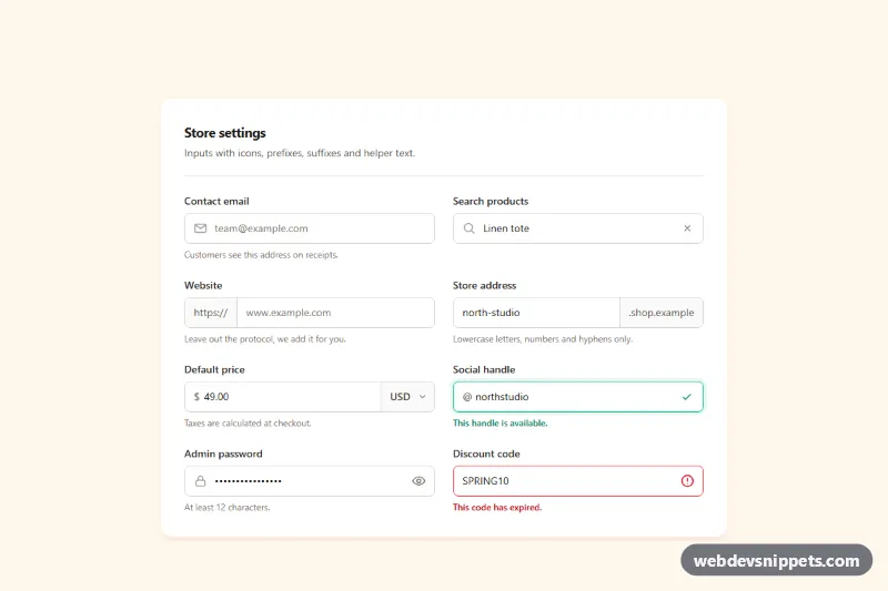
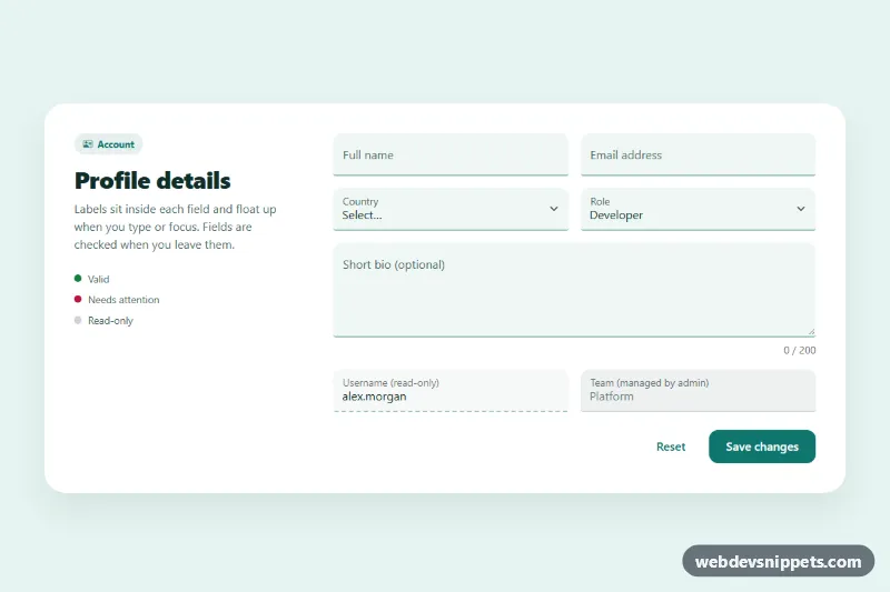
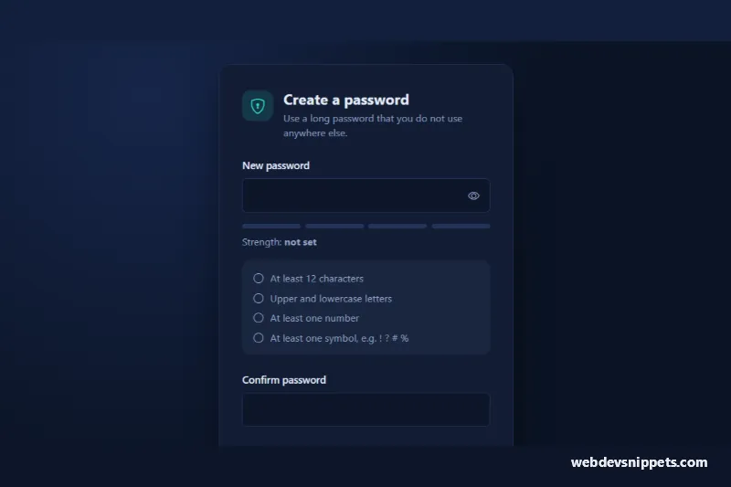
A set of form inputs with leading icons, text prefixes, suffix add-ons, an inline currency select and helper text, built with Tailwind CSS utilities and a few lines of vanilla JavaScript. Shown as a "Store settings" card, it covers the input patterns most admin panels, checkout forms and settings pages need, including success and error states.
How it works
The root is section.tig-inputs, which holds a white card with a two-column grid from the sm breakpoint. There are two input patterns:
- Icon inputs (email, search, password, discount code): a
relativewrapper with an absolutely positioned SVG and a full-width input that reserves room for it withpl-10(orpr-10for a trailing icon). - Add-on groups (website, store address, price, social handle): a
flexwrapper that draws the border and usesfocus-within:ring-4to show focus, with a borderless input in the middle andspanadd-ons such ashttps://,.shop.example,$and@on either side. The price field ends with a nativeselectfor the currency.
Each input is tied to its helper text with aria-describedby. The social handle shows a success state (border-emerald-500 and a check icon), and the discount code shows an error state with aria-invalid="true" and red helper text.
The script initializes every .tig-inputs on DOMContentLoaded. Inside each data-tig-clearable wrapper the clear button (data-tig-clear) is hidden while the field is empty; clicking it, or pressing Escape in the field, empties the input and returns focus to it. Inside each data-tig-password wrapper, the eye button (data-tig-toggle) switches the input between password and text, flips aria-pressed and swaps the data-tig-eye and data-tig-eye-off icons. style.css only hides the browser's built-in search clear icon and Edge's password reveal button so they do not double up.
Customization
focus:border-orange-500,focus:ring-orange-500/15andfocus-within:ring-orange-500/15: swaporangefor your brand color to change every focus state.https://,.shop.example,$and@in the add-onspanelements: replace with your own prefixes and suffixes such askg,%or+1.rounded-lgon inputs and groups: userounded-fullfor pill inputs (also round the add-ons withrounded-l-fullandrounded-r-full).- The
optionelements in#tig-currency: list the currencies you support. sm:grid-cols-2on the grid: usesm:grid-cols-1for a single column of full-width fields.- To show an error on any field, add
aria-invalid="true"andborder-red-500to the input and pointaria-describedbyat a red message, as#tig-codedoes.
Accessibility
Every input has a visible label; the currency select has a visually hidden one. Icons and text prefixes are aria-hidden, while the .shop.example suffix is part of the field description so screen readers announce the full address. The clear button has the hidden label "Clear search", and the password button is a toggle button with aria-pressed and aria-controls. Focus is always visible through rings on the inputs and outlines on the buttons, and helper, success and error texts keep strong contrast against white.