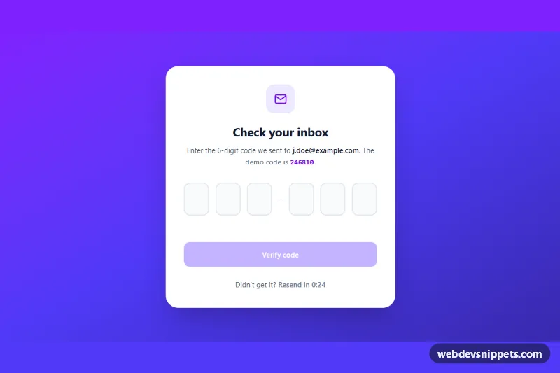
OTP Code Input Boxes
Six-digit Tailwind CSS OTP verification input with auto-advance, paste support, backspace navigation, resend timer and simulated check.
Text fields, floating labels and input groups.
4 component(s)
Six-digit Tailwind CSS OTP verification input with auto-advance, paste support, backspace navigation, resend timer and simulated check.
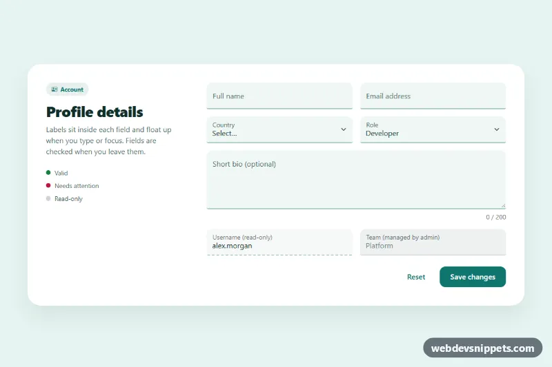
Bootstrap 5 floating label inputs for text, email, select and textarea, styled as filled fields with validation, read-only and disabled states.
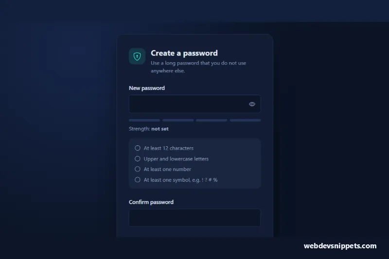
Bootstrap 5 password input with show/hide toggle, four-step strength meter, live requirements checklist and confirmation match check.
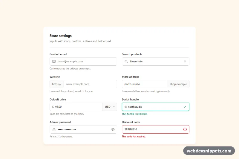
Tailwind CSS input group examples with leading icons, text prefixes and suffixes, a currency select, password toggle, clear button and helper text.
Inputs are the text fields users type into: single-line text, email, password, number, phone and multi-line textareas. This category covers styled inputs, floating labels, input groups with icons, prefixes and buttons, inputs with helper text and validation states, and character counters. Inputs are the building blocks of every form, so small improvements here pay off everywhere.
<label> using for and id.type and inputmode so mobile devices show the right keyboard, and set autocomplete values for personal data.aria-describedby; set aria-invalid="true" on invalid fields.aria-hidden="true".The input examples on this page include floating label inputs, input groups, icon inputs, validation states and textareas, each with a live preview and code tabs. Bootstrap 6 versions use theme-* colour roles for focus rings and validation feedback. Bootstrap 5 versions build on .form-control, .form-floating and .input-group, Tailwind CSS versions use border, ring and padding utilities, and pure CSS versions use plain selectors such as :focus-visible and :user-invalid. Filter by framework, copy the code and match it to your form design.