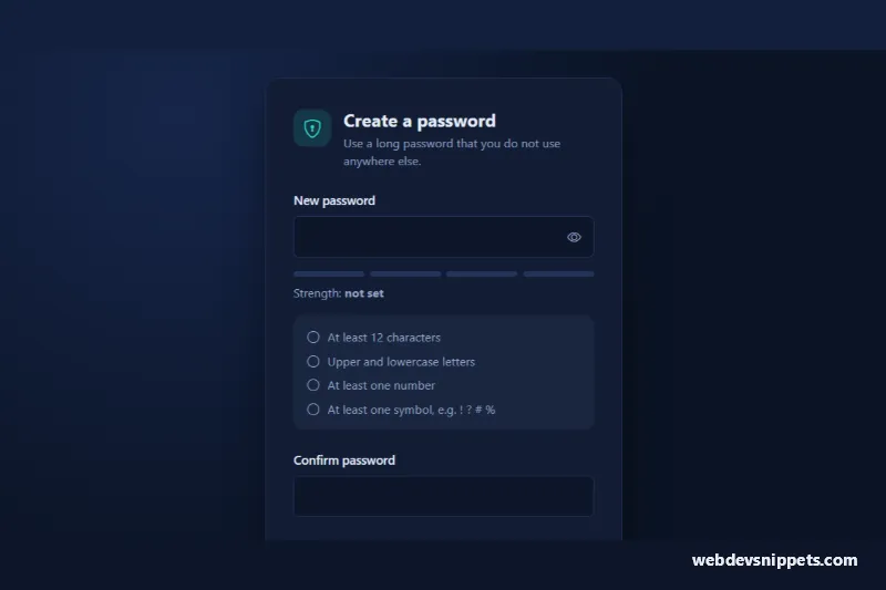
A Bootstrap 5 password field with a show/hide button, a four-segment strength meter, a live requirements checklist and a confirmation field. It suits sign-up forms, password reset pages and account security settings, and ships as a dark card that sits on its own gradient backdrop.
How it works
The root is section.ps-wrap, which centers the .ps-card. The password uses a Bootstrap input-group: the .ps-input field and the .ps-toggle button. Clicking the toggle switches both password fields between type="password" and type="text", swaps the eye icon and updates aria-pressed and aria-label.
On every input event the script runs scorePassword(). It awards one point for each rule in the RULES object (length, mixed case, number, symbol) and then caps the result: under 8 characters the score cannot pass 1, under MIN_LENGTH it cannot pass 2. The score (0 to 4) is written to data-strength on the root, and CSS colors the first N .ps-meter__bar elements with --ps-level-color. The word from the LABELS array goes into .ps-strength__value. Each li[data-ps-rule] gets is-met, a filled check icon and hidden "met" text when its rule passes.
The .ps-confirm field compares itself with the password and writes "Passwords match" or "Passwords do not match" into .ps-match. On submit the form requires a score of at least 3 and a matching confirmation, then simulates saving with a short timeout and shows the result in .ps-status.
Customization
MIN_LENGTHinscript.js: raise or lower the minimum length; also update the text of thelengthrule.- The
RULESobject inscript.js: add a rule (for example no spaces) and a matchingliwith the samedata-ps-rulekey. LABELSinscript.js: rename the five strength levels shown after "Strength:".--ps-weak,--ps-fair,--ps-goodand--ps-strongin.ps-wrap: recolor the meter for each level.--ps-accentin.ps-wrap: changes the submit button, the focus ring and the check icons.--ps-bg,--ps-cardand--ps-borderin.ps-wrap: turn the dark card into a light one.grid-template-columnsin.ps-meter: use more segments if you also add more.ps-meter__barspans and levels.- The
window.setTimeoutin the submit handler: replace it with afetch()call to your backend.
Accessibility
Each field has a visible label. The password input is described by the strength text and the rules list through aria-describedby, and the strength line is an aria-live="polite" region, so screen readers hear the level only when it changes. The colored bars are aria-hidden, because the level is also written as text. The toggle is a real button with aria-controls, aria-pressed and a changing label. The confirmation sets aria-invalid when it does not match, and the save result is announced through role="status". Transitions are disabled under prefers-reduced-motion: reduce.
Usage notes
Requires Bootstrap 5 and Bootstrap Icons. The meter is a guide for users, not a security check: enforce your password policy on the server and consider checking passwords against known breach lists. For several instances on one page, give each input and its described-by targets unique ids.