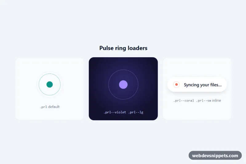
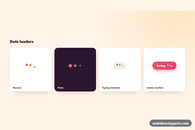
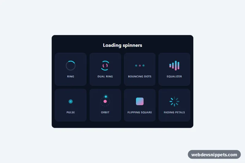
A pulse ring loader in pure CSS: concentric rings expand from a beating center dot and fade out, like a radar or sonar signal. The demo shows three uses: a default loader, a large violet one on a dark panel and a small coral one inside an inline "Syncing your files" status pill. It fits page loading screens, connection states, map markers and background sync indicators.
How it works
Each loader is a .prl element: a square grid that centers a .prl-core dot and stacks several .prl-ring spans on top of each other with position: absolute; inset: 0. Every ring is a circle drawn with a border. The prl-pulse keyframes scale a ring from 15% to full size while its opacity rises quickly and then fades to zero, so the rings seem to dissolve as they grow.
The rings start one after another because :nth-child gives the second, third and fourth ring negative animation-delay values calculated from --prl-duration. Negative delays mean the loader looks complete on the very first frame instead of starting with an empty circle. The core runs the prl-beat keyframes, a short heartbeat-like scale. Everything is driven by custom properties, so variants such as .prl--violet, .prl--coral, .prl--lg and .prl--sm only redefine a few variables. There is no JavaScript.
Customization
--prl-coloron.prl: color of the rings and the core; the.prl--violetand.prl--coralmodifiers show how to add new themes.--prl-size: outer diameter of the loader;.prl--lguses132pxand.prl--smuses28pxfor inline text.--prl-duration: length of one pulse cycle; shorter values feel more urgent, longer values calmer.--prl-ring-width: border thickness of each ring, e.g.4pxfor a bolder signal.--prl-core: size of the center dot as a percentage of the loader; set it to0%for rings only.- Add or remove
.prl-ringspans: two rings give a lighter effect, four rings (as in the large example) a denser one.
Accessibility
Each stand-alone loader has role="status" and a visually hidden .prl-sr text such as "Loading content", so screen readers announce what is happening while the rings themselves stay silent with aria-hidden="true". In the inline example the role="status" sits on .prl-inline and the visible text is announced instead. With prefers-reduced-motion: reduce the rings stop and show as static circles at fixed sizes, and only the core fades gently in and out, so the loader still signals activity without movement.
Usage notes
Remove the .prl-demo, .prl-grid and .prl-tile wrappers when you copy a loader into your project; only the .prl block and its rules are required. Remove the loader element, or update the status text, when loading finishes.