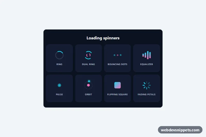
A collection of eight lightweight loading spinners written in pure CSS, with no JavaScript and no images. They are shown in a labelled dark grid so you can pick one and copy only the markup and rules you need for buttons, cards, page loaders or data tables.
How it works
The root section.sp-collection holds a heading and a ul.sp-grid of .sp-item tiles. Each tile contains one .sp-spinner element and a .sp-label caption. Every spinner is a square box sized by --sp-size, and a second class picks its style:
.sp-ring: a border circle with one colored segment that rotates..sp-dual: two arcs, the inner one drawn with::afterand turning in reverse..sp-dots: three.sp-dotelements bouncing one after another..sp-bars: four.sp-barelements stretching like an equalizer..sp-pulse: two expanding circles from::beforeand::after..sp-orbit: a.sp-planetdot circling a core on a dashed track..sp-square: a gradient tile flipping in 3D..sp-fade: eight.sp-petalbars arranged in a circle that fade in sequence.
All animation timings are multiples of --sp-speed, and staggered delays use calc() with the same variable, so one value speeds up or slows down the whole set while keeping each spinner's rhythm. Only transform and opacity are animated, which keeps them smooth on low-end devices.
Customization
--sp-coloron.sp-collection: the main spinner color, used by every style.--sp-color-2: the secondary color for the inner dual ring, the middle dot, the orbit core and the gradients.--sp-size: changes the size of all spinners, e.g.24pxfor a spinner inside a button.--sp-speed: base duration;0.6sfeels urgent,1.5sfeels calm.--sp-track: color of the faint track behind.sp-ringand the orbit path.--sp-bg,--sp-cardand--sp-text: the panel, tile and label colors, for example a light theme.- Change the text inside
.sp-srto describe what is loading, such as "Loading comments".
Accessibility
Every spinner has role="status", which is a polite live region, and contains a .sp-sr span with "Loading…". That text is hidden visually but read by screen readers, so the spinner is announced without extra ARIA. The visible .sp-label captions only name the style in this demo and can be removed. With prefers-reduced-motion: reduce the animations are not removed, because a frozen spinner looks like a broken page; instead --sp-speed becomes 3s, so the motion is three times slower and less distracting.
Usage notes
To use a single spinner elsewhere, copy the .sp-spinner element, the shared .sp-spinner and .sp-sr rules, its own rules and keyframes, and declare the custom properties on a parent or on the spinner itself. Remove the spinner or set hidden on it when loading finishes.