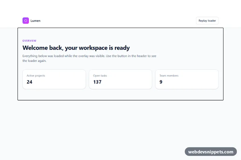
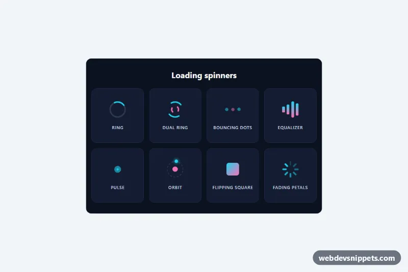
A full-page loader built with Tailwind CSS and a small vanilla JavaScript controller. A dark violet overlay with a spinning gradient ring, a progress bar and rotating status messages covers the page until it has finished loading, then fades away and hands focus to the main content. Use it for dashboards, single-page apps and any page that needs a moment before it is usable.
How it works
The root is .tpl-root. It holds the .tpl-overlay (marked data-tpl-overlay), a visually hidden live region marked data-tpl-status, and the page itself inside data-tpl-content. The overlay is fixed inset-0 z-50, so it sits above everything. Inside it are two .tpl-ring SVGs that rotate in opposite directions, the breathing .tpl-mark logo tile, a role="progressbar" track and the data-tpl-bar fill.
On DOMContentLoaded the script adds tpl-js to the root, marks the content aria-busy and inert, and starts a timer that eases the progress value toward 90% while cycling the texts in the MESSAGES array. When the page fires load and at least data-tpl-min-duration milliseconds have passed, the bar jumps to 100%, .tpl-overlay--done fades the overlay out, the content becomes interactive again and focus moves to the data-tpl-focus element. The Replay loader button (data-tpl-replay) runs the sequence again.
Without JavaScript the tpl-failsafe animation in style.css hides the overlay after 10 seconds, so the page is never locked behind it.
Customization
data-tpl-min-durationon.tpl-root: minimum time in milliseconds the loader stays visible; set0to hide it as soon as the page is ready.data-tpl-wait="event"on.tpl-root: keep the loader until you callroot.dispatchEvent(new CustomEvent('tpl:ready')), for example after yourfetch()resolves.--tpl-bgon.tpl-overlayinstyle.css: change the base color behind the two radial glows.--tpl-fadeon.tpl-overlay: make the fade-out faster or slower.MESSAGESat the top ofscript.js: replace or translate the rotating status texts.from-violet-400 to-fuchsia-400ondata-tpl-barand the stops in#tpl-ring-gradient: swap them for your brand colors.- Replace the hexagon SVG inside
.tpl-markwith your own logo.
Accessibility
The progress track uses role="progressbar" with aria-label, aria-valuemin, aria-valuemax and an aria-valuenow updated on every tick. The decorative rings and rotating text are aria-hidden; screen readers hear only "Loading page" and "Page loaded" from the polite role="status" region. While loading, the content is inert and aria-busy="true", so keyboard focus cannot reach hidden controls, and afterwards focus moves to the main element. Under prefers-reduced-motion: reduce the rings stop spinning and the transitions are removed.
Usage notes
Place the markup as the first element in body so the overlay is painted before the rest of the page. Use one loader per page; the gradient id inside the SVG must stay unique.