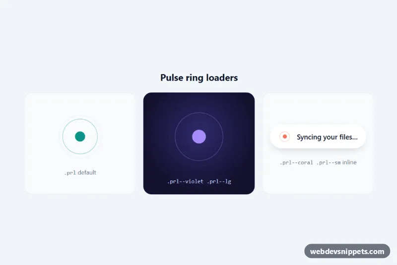
Pulse Ring Loader
Pure CSS loading animation with concentric rings expanding from a beating dot, in default, large and inline sizes with custom properties and reduced motion.
Loading animations.
4 component(s)
Pure CSS loading animation with concentric rings expanding from a beating dot, in default, large and inline sizes with custom properties and reduced motion.
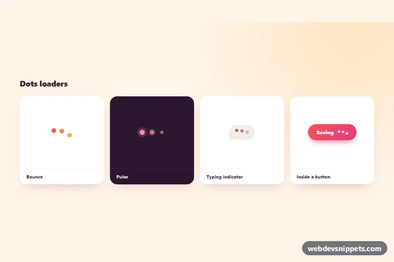
Pure CSS three-dot loaders: bounce, pulse with rings, chat typing indicator and a button loading state, all driven by custom properties.
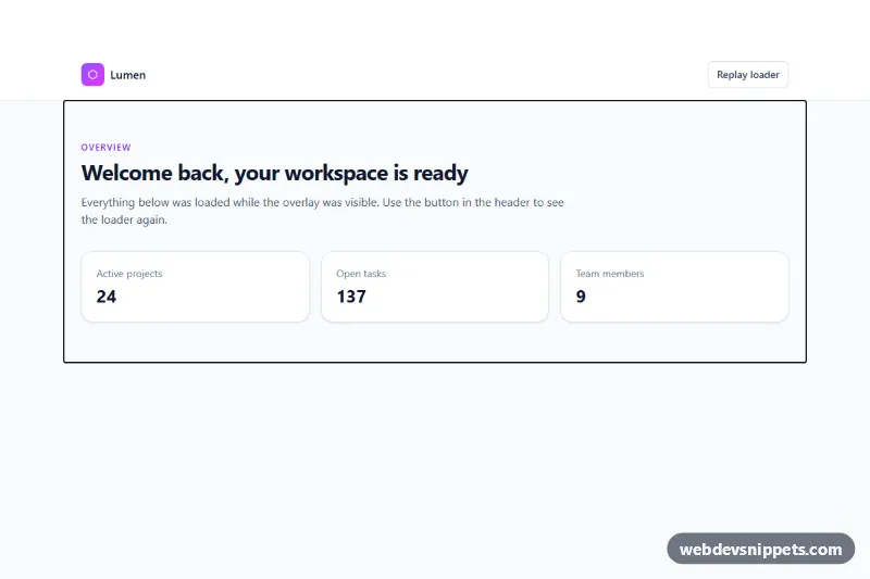
Tailwind CSS full-page loader overlay with a spinning gradient ring, progress bar and status messages that fades out once the page has loaded.
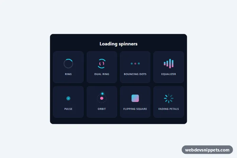
Eight lightweight pure CSS loading spinners in a labelled grid, each with role="status" and screen reader text, no JavaScript.
Loaders and spinners are small animations that tell the user something is happening and the interface has not frozen. Common types are rotating rings, bouncing dots, pulsing bars and branded logo animations. They appear on buttons while a form submits, in the centre of a panel while data loads, as full-page overlays during navigation and inside lazy-loaded sections.
A spinner is purely visual, so give screen reader users the same information: wrap it in an element with role="status" and include visually hidden text such as "Loading...". Mark the animated shapes as aria-hidden="true". When loading finishes, move focus or announce the result if the user needs to know. Animate only transform and opacity so the animation runs on the compositor and stays smooth even while the main thread is busy. Respect prefers-reduced-motion by slowing the animation or replacing it with a simple pulsing state.
These CSS loader animations and bootstrap spinner examples are available in Bootstrap 6, Bootstrap 5, Tailwind CSS and pure CSS. Most are pure HTML and CSS with no JavaScript, which keeps them light. Bootstrap 5 versions build on spinner-border and spinner-grow; Bootstrap 6 versions use the theme-* colour roles. Watch each animation in the live preview, then copy the code from the code tabs or download it and adjust size, speed and colour through the CSS variables.