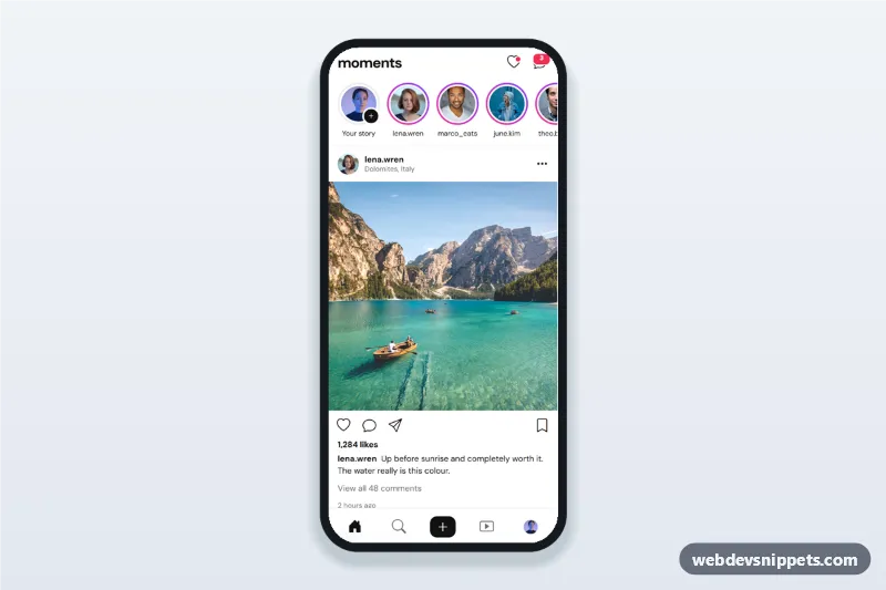
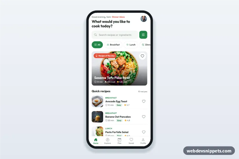
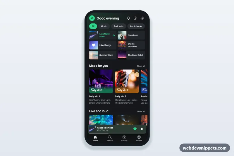
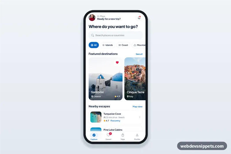
An HTML mobile template for a social media app feed: a stories row with gradient rings, photo posts with like, comment, share and save, a comments bottom sheet and a tab bar with a create button. Use this photo feed UI as the home screen of a photo sharing app, community PWA or mobile site, or package it with Capacitor. Built with Bootstrap 5, Bootstrap Icons and DM Sans. The photos come from Unsplash; replace them with your own images.
How it works
The root .sfd-app is a centred app column (max 430 px) with a sticky .sfd-top bar, the .sfd-stories row, the .sfd-feed and a sticky .sfd-tabs bar. The only colour accent is the pink to purple --sfd-ring gradient around unseen stories.
Each article.sfd-post stores its counts in data-likes and data-comments. The .sfd-like button toggles aria-pressed, swaps the heart icon and updates the like count. A double click on .sfd-post__media also likes the post and plays the .sfd-burst heart. .sfd-save toggles the bookmark.
The comment button and "View all comments" open the Bootstrap offcanvas #sfd-comments. It renders that post's comments from the COMMENTS object; Post stays disabled until the field has text, and a new comment raises the count. Tapping a story opens #sfd-viewer, a full-height sheet with progress bars, previous and next zones (or arrow keys) and a reply field, and marks the ring as seen with .is-seen. The create button in the tab bar and "Your story" open #sfd-create, and the three-dot button opens #sfd-options.
Customization
--sfd-ringon.sfd-app: the gradient of the story rings, the one accent colour of the screen.--sfd-likeon.sfd-app: the colour of the liked heart and the notification badges.aspect-ratio: 1 / 1on.sfd-post__media: use4 / 5for taller portrait posts.- The
COMMENTSobject inscript.js: replace it with comments loaded from your API, keyed by each post'sdata-post. data-photo,data-nameanddata-timeon each.sfd-story: the photo and header the story viewer shows.data-sfd-toaston the sheet options: the confirmation text; replace the handler with your real action.- Change
.sfd-logoto your own wordmark or an inline SVG logo.
Use cases
- Photo sharing and social networking apps: a familiar home feed with stories
- Community and club apps: members post updates, like and comment
- Creator and influencer platforms: a branded feed inside a PWA
Accessibility
Like and save buttons use aria-pressed and labels that change ("Like" / "Unlike"). Icon buttons have aria-label values and decorative icons are aria-hidden. The bottom nav marks the current tab with aria-current="page". Sheets are Bootstrap offcanvas dialogs: they trap focus, close with Escape or the backdrop, and focus returns to the button that opened them. The comments list is a live region and toasts use role="status". Animations are switched off with prefers-reduced-motion.
Usage notes
Requires Bootstrap 5 (offcanvas) and Bootstrap Icons; DM Sans comes from Google Fonts. Share only shows a toast; call navigator.share() there.