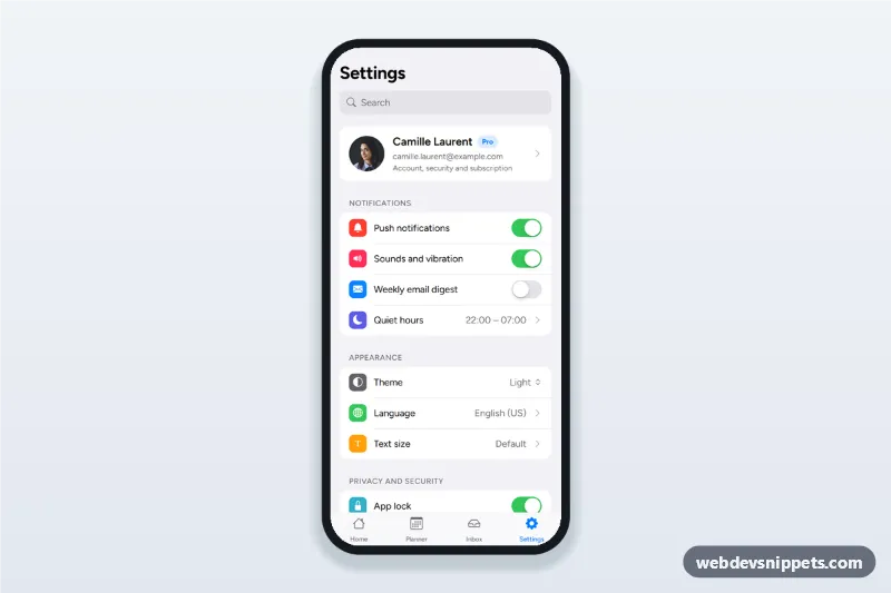
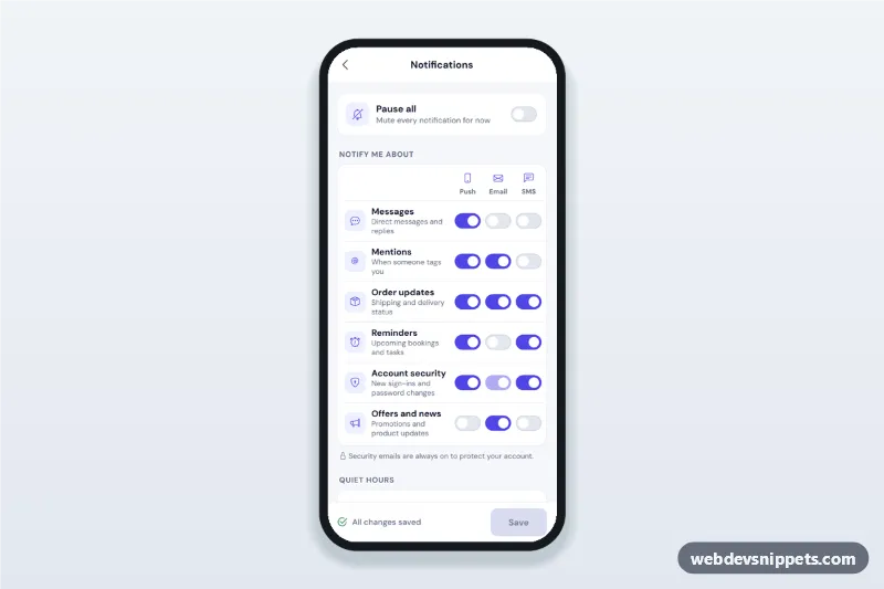
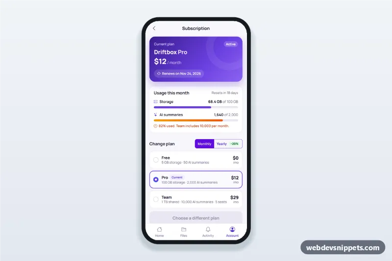
An app settings screen built with Tailwind CSS in the familiar iOS style: a large title with search, an account card, grouped lists with coloured icons, notification switches, a theme select with a working dark mode, a language bottom sheet, privacy options, help links and a sign out action sheet. It is an HTML mobile template for mobile websites and PWAs and can be packaged as a native app with Capacitor.
How it works
The root .asg-app is a phone-width column on a light grey background. Each ul.asg-group is a white rounded group of .asg-row items with inset separators drawn by .asg-row + .asg-row::before. Rows hold a checkbox with role="switch" (.asg-switch), a native <select> or a .asg-row-link.
script.js adds the behaviour. Every switch shows a short toast when it changes, and turning off Push notifications disables the switches marked data-asg-needs-push. The Theme select sets data-theme on .asg-app to light or dark (or follows prefers-color-scheme for System), and all colours switch through custom properties. The Language row opens #asg-lang, a <dialog> bottom sheet with Cancel and Done: Done writes the choice into [data-asg-lang-value], Cancel restores the saved one. Sign out opens #asg-signout-sheet, an action sheet that asks for confirmation. Sheets close with Escape or a backdrop tap. Typing in the search field filters rows by their text and data-asg-label keywords and hides empty groups.
Customization
--asg-accentand--asg-dangeron.asg-appinstyle.css: the blue for links, values and the active tab, and the red for Sign out.- The
.asg-app[data-theme="dark"]block holds the dark palette (--asg-bg,--asg-card,--asg-sepand more); adjust it, or mark the Dark option of[data-asg-theme]asselectedto start in dark mode. - Add a setting by copying an
.asg-row; give it adata-asg-labelwith extra search keywords. - Change the colour of a row icon with the background utility on its
.asg-icospan. - Add
data-asg-needs-pushto any switch that should depend on Push notifications. - Replace the toast in the switch change handler and the sign out handler with
fetch()calls to your settings and auth API.
Use cases
- Productivity and planner apps: notification, theme and language preferences.
- Social and messaging apps: privacy, blocked accounts and app lock.
- Subscription apps and SaaS PWAs: account card with plan badge and help links.
- Any Capacitor app: a ready settings tab in a native look.
Accessibility
Switches are real checkboxes with role="switch" and visible labels, the theme picker is a native labelled <select>, and the language list is a fieldset of radio buttons. Sheets are labelled modal <dialog> elements, the sign out sheet has a description, toasts use role="status", and the active tab has aria-current="page". Animations respect prefers-reduced-motion.
Usage notes
The portrait comes from Unsplash; replace it with your own image. The name and email are sample data. Bootstrap Icons and Figtree load from CDNs.