Skip to content

Fashion Store Product Detail Screen

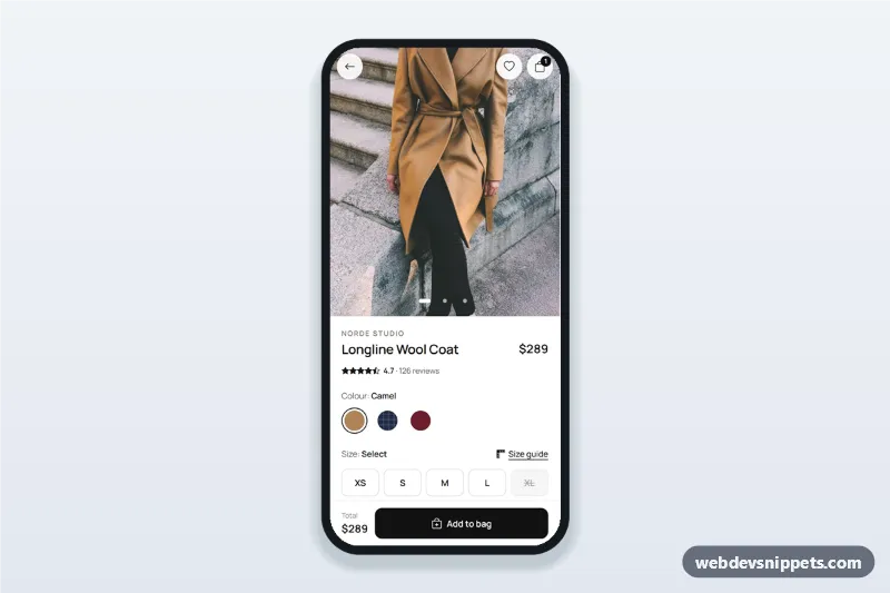
Fashion store product detail screen with swipeable photos, colour swatches, size chips with a size guide bottom sheet, details accordion and a sticky Add to bag bar.

Also known as: clothing app product page, mobile product detail ui, fashion ecommerce app template, product page with size selector

Fashion Store Product Detail Screen live demo

Open in new tab

Tailwind CSS code (HTML, CSS, JS)

A fashion store product detail screen built with Tailwind CSS: swipeable product photos with dots, price and rating, colour swatches, size chips with a size guide bottom sheet, a details accordion and a sticky Add to bag bar. It is an HTML mobile template for mobile websites and PWAs and can be packaged as a native app with Capacitor. Use it as the product page of a clothing app or boutique shop.

How it works

The root .fpd-app is a phone-width column. The gallery [data-fpd-gallery] is a horizontal scroll-snap row of .fpd-slide figures; a debounced scroll listener in script.js moves aria-current between the .fpd-dot buttons, the dots scroll to their photo, and the arrow keys move between photos when the gallery has focus.

Colour and size are native radio groups inside fieldsets. Choosing a swatch updates [data-fpd-color-label] and scrolls the gallery to the slide whose data-fpd-slide matches the radio value.

Add to bag ([data-fpd-add]) checks for a size first. Without one it shows "Please select a size." in [data-fpd-size-error], outlines the chips and moves focus to the size group. With a size it raises the bag badge and shows a toast. The Size guide button opens #fpd-guide, a native <dialog> bottom sheet with a measurement table that highlights the chosen size and switches between cm and inches from the data-cm values. The sheet closes with Escape or a backdrop tap. The accordion uses <details class="fpd-acc">.

Customization

  • --fpd-ink and --fpd-ink-press on .fpd-app in style.css: colour of the Add to bag button, selected size chip and focus rings.
  • aspect-ratio on .fpd-slide: change 6 / 7 to 3 / 4 for taller photos.
  • Add a colour by copying a .fpd-swatch label with a new value and data-fpd-name, plus a .fpd-slide with the same data-fpd-slide.
  • Add or remove the disabled attribute on a size radio to mark sizes as sold out.
  • Edit the data-cm values in .fpd-table to match your own size chart; inches are calculated.
  • font-family on .fpd-app: replace Manrope and update the Google Fonts URL.
  • Replace the bag counter update in the Add to bag click handler with fetch() to your cart API.

Use cases

  • Clothing and fashion apps: a product page with sizes, colours and a size chart.
  • Boutique and brand stores: an editorial mobile product page for coats, dresses or knitwear.
  • Shoe and accessory shops: reuse the size chips for EU or US shoe sizes.
  • Marketplace PWAs: a mobile-first product detail screen before checkout.

Accessibility

The gallery uses aria-roledescription="carousel" and labelled slides, the dots are buttons with labels, and the radio groups have legends. The size error is linked with aria-describedby and announced through aria-live. The wishlist and unit buttons use aria-pressed, the size guide is a labelled modal <dialog> and focus returns to its trigger. Animations respect prefers-reduced-motion.

Usage notes

The photos come from Unsplash; replace them with your own product images. Bootstrap Icons and Manrope load from CDNs.
Fashion Store Product Detail Screen at a glance

Framework
Tailwind CSS
Code
HTML, CSS, JavaScript
JavaScript
Vanilla JavaScript, no jQuery
Dependencies
Tailwind CSS, fonts.googleapis.com, Bootstrap Icons
Layout
Mobile-first app screen, centred on wider screens
Category
Mobile Shop & Checkout
License
Free for personal and commercial use

Questions about this template

Can I use the Fashion Store Product Detail Screen code for free?

Yes. You can copy or download the code and use it in personal and commercial projects, including client work. No sign-up is needed. Reselling it as part of a component library or template collection is not allowed; see the license.

How do I add it to my website?

Load Tailwind CSS and fonts.googleapis.com and Bootstrap Icons from a CDN (the links are under Requirements). Paste the HTML where the component should appear, add the CSS to your stylesheet and load the JavaScript before the closing </body> tag. Download HTML gives you a complete page with everything already linked.

Does it need jQuery or a JavaScript framework?

No. The script is plain vanilla JavaScript, so it works without jQuery, React or Vue. You can still use the markup inside those frameworks.

Can I turn this screen into an iOS or Android app?

Yes. It is plain HTML, CSS and JavaScript, so it works in a mobile website or progressive web app as it is. To ship it as a store app, put it in the web folder of a Capacitor or Cordova project and build it for iOS and Android; replace the sample data with calls to your own API.

How does it look on a desktop screen?

The screen is designed for phones. On wider screens it stays at phone width in the middle of the page, so it still looks like an app. The live demo opens at mobile width; use the Tablet and Desktop buttons to check other sizes.

Requirements

Add these to your page (already included in the download):

  • <script src="https://cdn.jsdelivr.net/npm/@tailwindcss/browser@4"></script>
  • <link rel="stylesheet" href="https://fonts.googleapis.com/css2?family=Manrope:wght@400;500;600;700&display=swap">
  • <link rel="stylesheet" href="https://cdn.jsdelivr.net/npm/bootstrap-icons@1.11.3/font/bootstrap-icons.min.css">

The Tailwind browser build is for prototyping. In production, compile Tailwind with its CLI or your bundler.

Fashion Store Product Detail Screen – Tailwind CSS mobile shop & checkout component screenshot
Fashion Store Product Detail Screen · Tailwind CSS Mobile Shop & Checkout

More Mobile Shop & Checkout

Sneaker Store Home with Filters Sheet – Tailwind CSS mobile shop & checkout preview

Sneaker Store Home with Filters Sheet

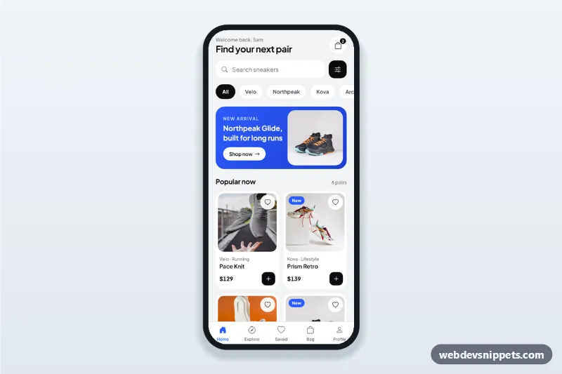
Sneaker store app home screen with brand chips, search, product cards and a filter bottom sheet with price range, sizes and sort that applies to the product grid.

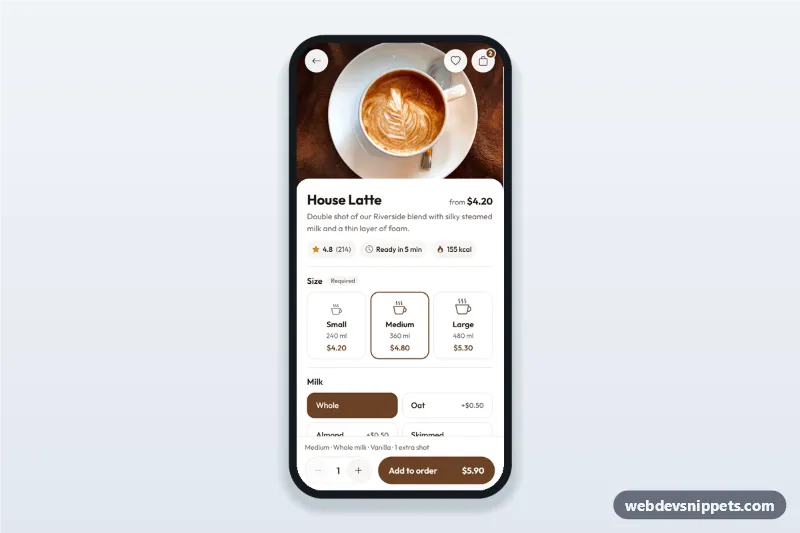
Coffee Shop Order Customization Screen – Bootstrap 5 mobile shop & checkout preview

Coffee Shop Order Customization Screen

Coffee shop app order screen where customers customize a drink: size cards, milk and syrup options, an extra shot stepper and a live price on the add to order button.

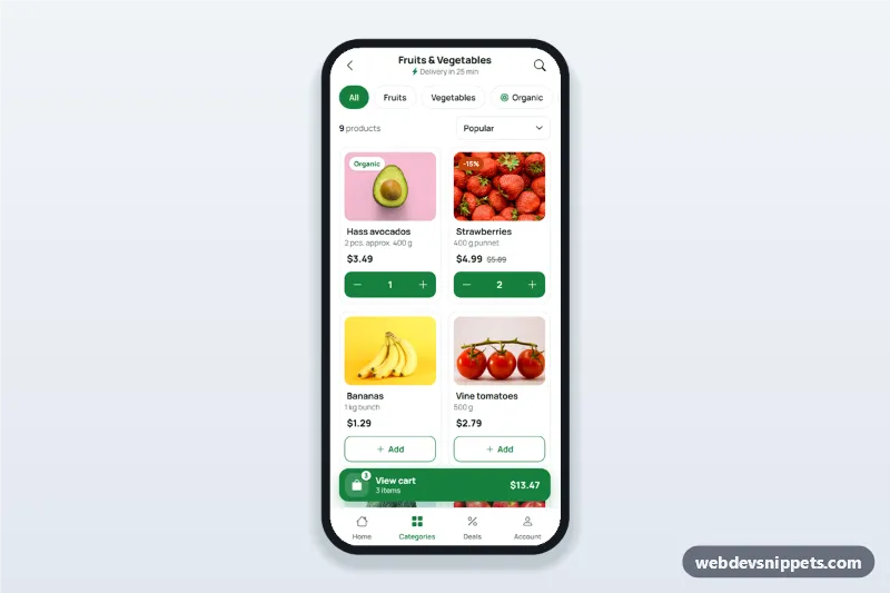
Grocery App Product List with Cart Badge – Bootstrap 5 mobile shop & checkout preview

Grocery App Product List with Cart Badge

Grocery app product list screen with filter chips, a two-column product grid with add-to-cart steppers and a floating cart button showing the item count and total.

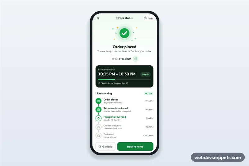
Order Confirmation and Tracking Screen – Bootstrap 6 mobile shop & checkout preview

Order Confirmation and Tracking Screen

Order confirmation screen for delivery apps with a success illustration, order number, ETA computed from now, live order tracking steps and a help sheet.

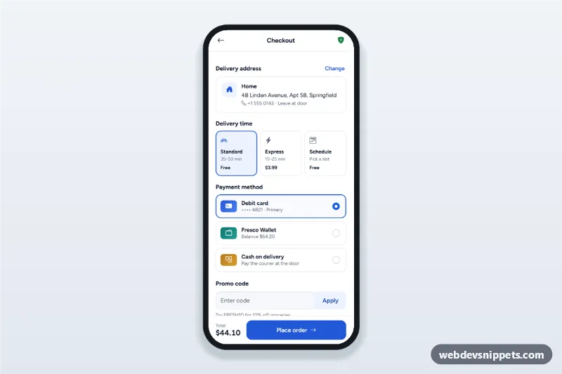
Mobile Checkout with Payment Methods – Bootstrap 6 mobile shop & checkout preview

Mobile Checkout with Payment Methods

Mobile checkout screen with a delivery address sheet, delivery time options, payment method radio cards, promo code and a live order summary with place order.