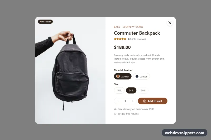
A Bootstrap 5 product quick view modal with a large product photo, rating, live price, material and size options, a quantity stepper and an add-to-cart button. Use it on category pages and product grids so shoppers can check details and add an item without leaving the list.
How it works
The root section.qv-root holds a product tile (.qv-tile) and the modal (.modal.qv-modal). The tile's .qv-tile__btn opens the modal through Bootstrap's data-bs-toggle="modal". Inside, a row g-0 splits the dialog into the photo column (.qv-media with .qv-photo and a .qv-badge) and the form.qv-form with the details. The dialog uses modal-lg modal-dialog-centered on desktop and modal-fullscreen-sm-down on phones, where the photo stacks above the form.
Material and size choices are radio inputs with Bootstrap's btn-check pattern, styled as pills by .qv-swatch and .qv-size. Each material radio carries data-qv-price, data-qv-img and data-qv-alt. On change the script formats the price with Intl.NumberFormat, writes it to .qv-price__value, updates .qv-material-name and swaps the photo, fading it with the is-loading class until the new image loads. Buttons with data-qv-step change the quantity, and a clamp() helper keeps it inside the input's min and max.
Submitting the form calls preventDefault(), shows "Adding..." for 600 ms, then turns .qv-add green with is-added and writes a summary into .qv-status. The hidden.bs.modal event clears the message. The data-qv-open="true" flag opens the modal on page load for the demo.
Customization
--qv-accentand--qv-inkon.qv-rootinstyle.css: change the add-to-cart color, eyebrow text and the selected pill color.data-qv-priceanddata-qv-imgon each material radio: set the price and photo shown for that option; add more radios for more variants.disabledon a size radio: marks the size as sold out with a strike-through pill, as on the 30 L option.min="1" max="5"on the quantity input: change the allowed quantity range.- The
setTimeoutblock in thesubmithandler ofscript.js: replace it with afetch()call to your cart API. - Remove
data-qv-open="true"from.qv-rootso the modal only opens from the Quick view button. max-width: 280pxin.qv-tile: resize the product tile to fit your grid.
Use cases
- Category pages: shoppers check details of an item without leaving the product list
- Product grids: open a modal with photo, rating, material and size options from a Quick view button
- Online stores: the price and photo update when a material is chosen
- Mobile shops: the dialog goes fullscreen on phones with the photo stacked above the form
- Conversion-focused shops: a quantity stepper and add-to-cart button let customers buy right away
Accessibility
The modal uses Bootstrap's focus trap, Escape to close and aria-labelledby pointing at the product title. The close button has an aria-label. Options are real radio groups inside fieldset elements with a legend, so arrow keys work and screen readers announce the group. The sold-out size includes visually hidden "(sold out)" text. The star row is one role="img" element with a rating label. Price changes and the cart message are announced through aria-live regions. Every control has a visible :focus-visible outline, and the photo fade is disabled under prefers-reduced-motion.
Usage notes
Requires Bootstrap 5 (loaded automatically) and Bootstrap Icons. The photos come from Unsplash; replace them with your own product images. For several products on one page, give each modal, title and radio group unique id and name values.