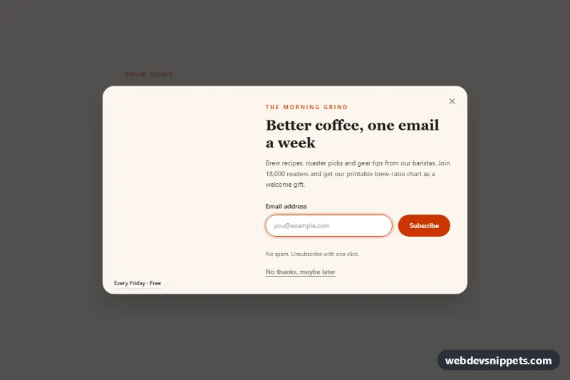
Newsletter Popup Modal with Side Image
Tailwind CSS newsletter popup with a side photo, email validation, focus trap, dismiss memory and a thank-you state.
Dialog windows and lightboxes.
5 component(s)
Tailwind CSS newsletter popup with a side photo, email validation, focus trap, dismiss memory and a thank-you state.
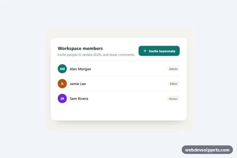
Accessible modal built on the native HTML dialog element with @starting-style enter and exit animation, blurred backdrop, mobile bottom sheet and an invite form.
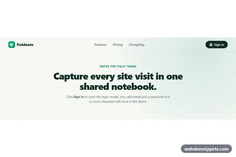
Bootstrap 5 login modal with social sign-in buttons, floating labels, a show/hide password toggle, client-side validation and a signed-in success view.
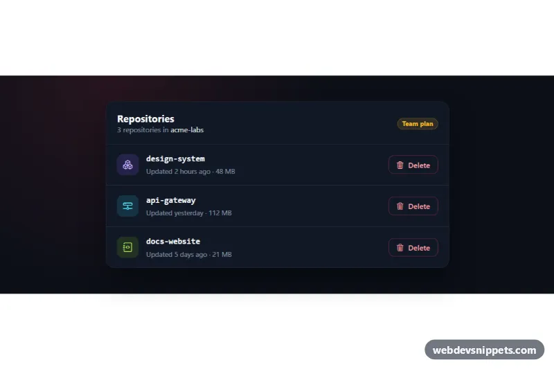
Dark Bootstrap 5 modal that confirms deleting an item by typing its exact name, with per-row triggers, a loading state and removal of the deleted row.
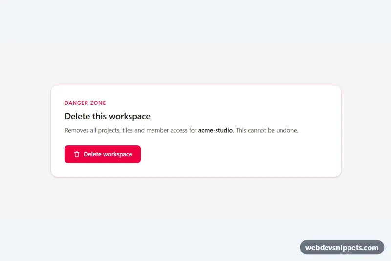
Accessible Tailwind CSS modal dialog with focus trap, Escape and backdrop close, scroll lock and a type-to-confirm delete action.
A modal is a dialog window that appears on top of the page and blocks interaction with the content behind it until the user responds or closes it. Modals are used for confirmations ("Delete this file?"), short forms such as sign-in or newsletter signup, image lightboxes, terms and detailed previews. Because they interrupt the user, they work best for focused, short tasks.
The native <dialog> element opened with showModal() handles much of the hard work: it traps focus, makes the background inert and closes on Escape. If you build a custom modal, add role="dialog", aria-modal="true" and aria-labelledby pointing to the title, move focus into the dialog on open, keep focus inside while it is open, and return focus to the trigger on close. Always provide a visible close button with an accessible label, and make sure the backdrop does not hide a scrollable page that still scrolls underneath.
These bootstrap modal examples and modal popup HTML CSS snippets cover Bootstrap 6, Bootstrap 5, Tailwind CSS and pure CSS. Bootstrap 6 modals are built on the native <dialog> element and loaded as an ES module, while Bootstrap 5 modals use the modal component with data-bs-toggle. Tailwind and pure CSS versions use <dialog> with a small script or none at all. Open each example in the live preview, then copy the HTML, CSS and JS from the code tabs or download it and replace the content with your own.