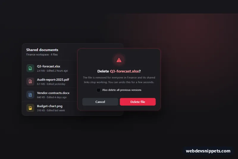
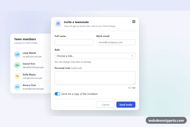
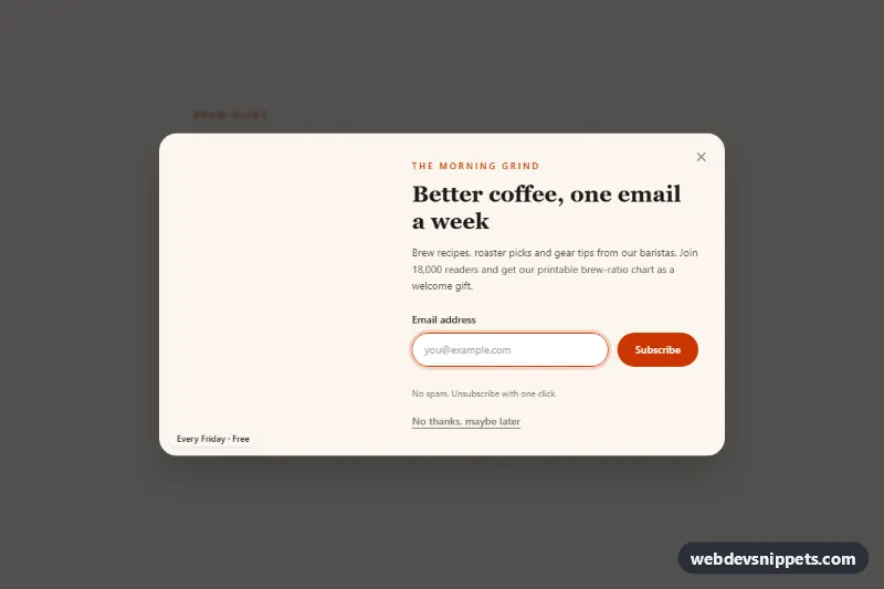
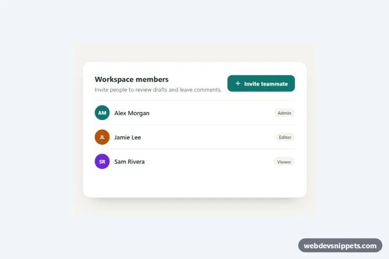
A dark Bootstrap 6 confirmation dialog for destructive actions, shown here deleting files from a shared documents list. The dialog uses the danger theme. It names the exact file, offers a "delete previous versions" option and moves focus to Cancel, so a stray Enter never deletes anything. After a confirmed delete the row fades out and a Bootstrap 6 Toast offers Undo.
How it works
Each .cdd-row has an icon-only .cdd-trigger button with data-bs-toggle="dialog", data-bs-target="#cdd-dialog" and a data-cdd-name attribute. One <dialog class="dialog theme-danger cdd-dialog" role="alertdialog"> serves every row. In show.bs.dialog, event.relatedTarget is the clicked button. The script reads its data-cdd-name into .cdd-target and remembers the row. The same event schedules cancel.focus() right after the native showModal() call, so the safe action is focused first.
theme-danger on the dialog colors the solid Delete button through inherited --bs-theme-* variables. The checkbox wrapper uses .theme-reset, because in alpha.1 a themed .check fills its unchecked box with the theme color.
Clicking .cdd-confirm disables both buttons and shows a .spinner-border.spinner-sm. A hide.bs.dialog listener keeps the dialog open while busy. When the simulated request finishes, the dialog closes. After hidden.bs.dialog, the row gets .cdd-row--leaving, is removed, .cdd-count updates, and focus moves to the next row's delete button or the list heading. Toast.getOrCreateInstance(...).show() then shows the message. .cdd-undo puts the row back in its old position.
For the demo, the closed dialog is also shown inline with .cdd-preview. Opening it from a row or pressing Cancel ends the preview.
Customization
- Remove
cdd-previewfrom the<dialog>for production, so it only appears when a delete button is pressed. --cdd-dangeron.cdd-root: changes the alert icon, the dialog glow and the checked checkbox.--cdd-surface,--cdd-bgand--cdd-lineon.cdd-root: adjust the panel, page and divider colors.--bs-dialog-widthon.cdd-dialog: makes the confirmation wider or narrower (420px by default).data-cdd-nameon each.cdd-trigger: sets the name shown in the dialog title and toast.- Replace the
setTimeoutin the.cdd-confirmclick handler with afetch()DELETE request. KeepremoveRow()for the success path. - Add
data-bs-backdrop="static"to the triggers so clicks outside do not dismiss the dialog.
Use cases
- File managers: one dialog serves every row and names the exact file being deleted
- Document lists: after deleting, an Undo toast puts the row back in its old position
- Admin tools: focus starts on Cancel so a stray Enter never deletes anything
- Cloud storage apps: a checkbox offers to delete previous versions as well
Accessibility
The dialog uses role="alertdialog" and is labelled by #cdd-title and described by #cdd-desc. Focus starts on Cancel, Escape and the backdrop close it, and focus returns to the trigger, or to the next row after a delete. Each icon button's aria-label includes the file name. The toast is a polite status message, and the row fade is disabled under prefers-reduced-motion.
Bootstrap 6 notes
Bootstrap 5's .modal with data-bs-dismiss="modal" becomes a native <dialog class="dialog"> with data-bs-dismiss="dialog". btn-danger is now btn-solid theme-danger, and icon buttons use btn-icon btn-text. Checkboxes are a plain .check inside .form-field. Built on Bootstrap 6.0.0-alpha.1, so APIs may still change. Icons come from Bootstrap Icons.