Skip to content

Fullscreen Dialog on Mobile

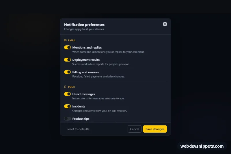
Dark Bootstrap 6 Dialog for notification settings that is centered on desktop, fullscreen on phones, with a scrollable body of switches and a sticky footer.

Also known as: fullscreen modal on mobile, responsive full screen popup, mobile settings modal, scrollable modal with sticky footer

Fullscreen Dialog on Mobile live demo

Open in new tab

Bootstrap 6 code (HTML, CSS, JS)

A dark notification-settings editor built on the Bootstrap 6 Dialog component. On desktop it is a centered card. Below 768px it fills the whole screen, while the header and footer stay fixed and only the list of switches scrolls. It works well for long forms, settings panels and terms that would be cramped in a small popup on phones.

How it works

The root .fdm-root is pinned to data-bs-theme="dark". It shows a summary card (.fdm-card) with an "Edit preferences" button that opens the dialog through data-bs-toggle="dialog".

The dialog element is <dialog class="dialog dialog-scrollable md-down:dialog-fullscreen fdm-dialog">. dialog-scrollable gives .dialog-body its own scroll area, and md-down:dialog-fullscreen removes the margins, radius and max-width on viewports narrower than 768px. The body holds a <form id="fdm-form"> with four fieldset.fdm-group sections. These contain Bootstrap 6 .switch toggles with form-field-content labels and a digest <select class="form-control">. The Save button sits in .dialog-footer and submits the form through form="fdm-form".

script.js keeps two states: the defaults (the checked/selected attributes in the markup) and the last saved values. Each time show.bs.dialog fires, the form is restored to the saved values, so Cancel discards edits. Save shows a spinner, updates .fdm-count and .fdm-digest-label on the card, announces "Preferences saved." and closes the dialog. .fdm-reset loads the defaults.

Customization

  • --fdm-accent on .fdm-root: the amber used for section labels and the card icon. The switches and Save button use theme-warning; swap it for another theme-* role.
  • Change md-down:dialog-fullscreen to sm-down:dialog-fullscreen or lg-down:dialog-fullscreen to move the fullscreen breakpoint.
  • --bs-dialog-width inside the min-width: 768px media query on .fdm-dialog: the desktop width (36rem).
  • Add more .fdm-row switches or .fdm-group fieldsets; the count updates automatically.
  • Replace the setTimeout in the submit handler with a fetch() that sends the form values to your API.
  • Remove data-fdm-autoopen so the dialog no longer opens on load (the attribute is there for the preview).

Use cases

  • Settings panels: notification switches scroll in the body while header and footer stay fixed
  • Long forms: the dialog is a centered card on desktop and fills the screen on phones
  • Terms and policies: lengthy content is easier to read than in a cramped small popup
  • Mobile apps on the web: the Save button respects the safe area at the bottom of the screen

Accessibility

Every switch is an input type="checkbox" role="switch" with a <label for> and a description. Groups use fieldset and legend. The dialog is labelled by its title, traps focus, closes with Escape and returns focus to the trigger. The saved message uses role="status". On phones the footer respects env(safe-area-inset-bottom).

Bootstrap 6 notes

This is built on Bootstrap 6.0.0-alpha.1, and alpha APIs can still change. BS5's modal-fullscreen-md-down is now the prefix class md-down:dialog-fullscreen, and modal-dialog-scrollable is dialog-scrollable. form-switch becomes <div class="switch"><input role="switch" switch></div>, and form-select is gone in favour of form-control on the <select>. Buttons use btn-solid, btn-outline and btn-text with theme-* roles.
Fullscreen Dialog on Mobile at a glance

Framework
Bootstrap 6
Code
HTML, CSS, JavaScript
JavaScript
Vanilla JavaScript, no jQuery
Dependencies
Bootstrap 6, Bootstrap Icons
Layout
Responsive, works on mobile, dark design
Category
Modals
License
Free for personal and commercial use

Questions about this template

Can I use the Fullscreen Dialog on Mobile code for free?

Yes. You can copy or download the code and use it in personal and commercial projects, including client work. No sign-up is needed. Reselling it as part of a component library or template collection is not allowed; see the license.

How do I add it to my website?

Load Bootstrap 6 and Bootstrap Icons from a CDN (the links are under Requirements). Paste the HTML where the component should appear, add the CSS to your stylesheet and load the JavaScript before the closing </body> tag. Download HTML gives you a complete page with everything already linked.

Does it need jQuery or a JavaScript framework?

No. The script is plain vanilla JavaScript, so it works without jQuery, React or Vue. You can still use the markup inside those frameworks.

Does it work on mobile?

Yes. The layout adapts to small screens. Use the Mobile and Tablet buttons above the live demo to check it at phone and tablet width.

Requirements

Add these to your page (already included in the download):

  • <link rel="stylesheet" href="https://cdn.jsdelivr.net/npm/bootstrap@6.0.0-alpha.1/dist/css/bootstrap.min.css">
  • <script type="module" src="https://cdn.jsdelivr.net/npm/bootstrap@6.0.0-alpha.1/dist/js/bootstrap.bundle.min.js"></script>
  • <link rel="stylesheet" href="https://cdn.jsdelivr.net/npm/bootstrap-icons@1.11.3/font/bootstrap-icons.min.css">

Built for Bootstrap 6.0.0-alpha.1. Bootstrap 6 ships as an ES module, so its script and this component's JavaScript load with type="module". Alpha releases can still change before the stable version.

Fullscreen Dialog on Mobile – Bootstrap 6 modals component screenshot
Fullscreen Dialog on Mobile · Bootstrap 6 Modals

More Modals

Multi-Step Wizard Dialog – Bootstrap 6 modals preview

Multi-Step Wizard Dialog

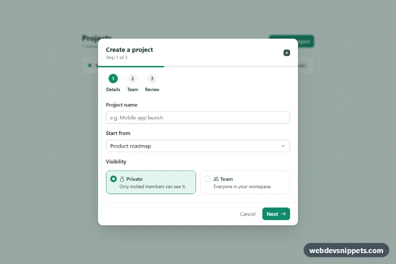
Bootstrap 6 Dialog wizard with three steps, a Stepper and progress bar, back/next buttons, per-step validation, Chips email invites and a review screen.

Image Lightbox Dialog – Bootstrap 6 modals preview

Image Lightbox Dialog

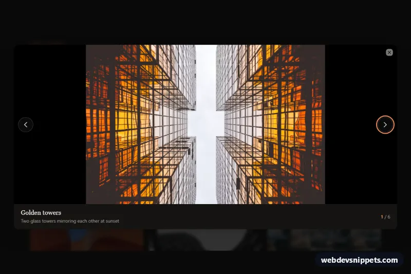
Dark Bootstrap 6 Dialog lightbox that opens gallery thumbnails large, with previous/next buttons, arrow-key and swipe navigation, captions and a photo counter.

Newsletter Popup Dialog – Bootstrap 6 modals preview

Newsletter Popup Dialog

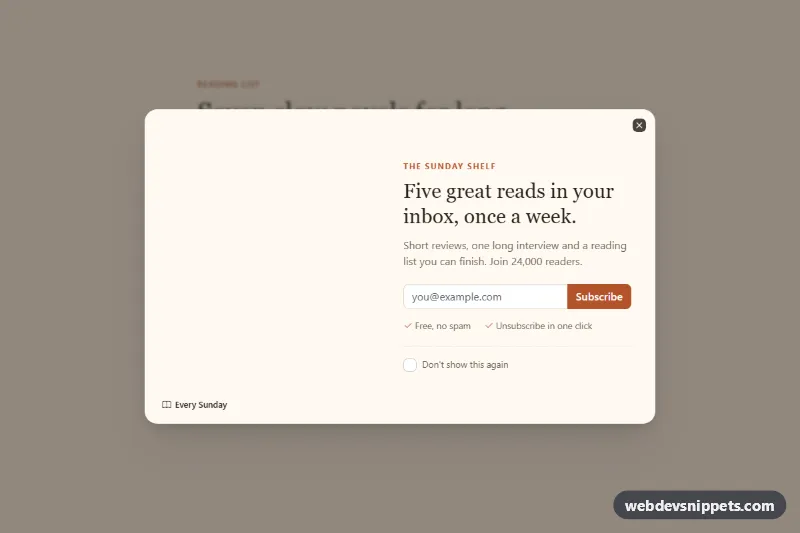
Bootstrap 6 Dialog newsletter popup with a photo side, email signup with validation, a don't-show-again option, delayed auto-open and a confirmation state.

Login Dialog with Social Buttons – Bootstrap 6 modals preview

Login Dialog with Social Buttons

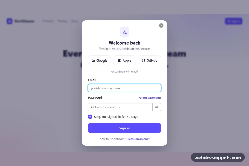
Bootstrap 6 Dialog login form with Google, Apple and GitHub sign-in buttons, email and password fields, show-password toggle, validation and a success state.

Confirm Delete Dialog – Bootstrap 6 modals preview

Confirm Delete Dialog

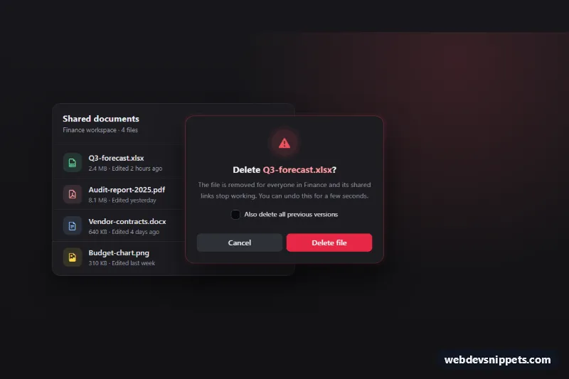
Dark Bootstrap 6 Dialog that confirms deleting a file, with danger theme, focus on Cancel, per-row triggers, a loading state, row removal and an Undo toast.

Dialog Modal with Form – Bootstrap 6 modals preview

Dialog Modal with Form

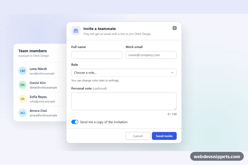
Bootstrap 6 Dialog with a validated invite form: name, email, role select, note counter and switch, with cancel and save actions, loading state and success toast.