Skip to content

Login Dialog with Social Buttons

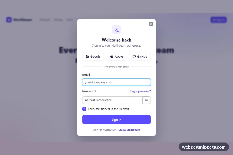
Bootstrap 6 Dialog login form with Google, Apple and GitHub sign-in buttons, email and password fields, show-password toggle, validation and a success state.

Also known as: login modal, sign in popup, social login modal, login popup with google

Bootstrap 6 Modals Responsive #dialog #form #login #modal #social

Login Dialog with Social Buttons live demo

Open in new tab

Bootstrap 6 code (HTML, CSS, JS)

A light, indigo-accented sign-in popup built on the Bootstrap 6 Dialog component: three social sign-in buttons, an email and password form with a show-password toggle, a "keep me signed in" checkbox and a success screen. Use it on SaaS landing pages, dashboards or any site that signs users in without leaving the current page.

How it works

The root .lgd-root holds a small demo page (brand, links and a "Sign in" button) and a native <dialog class="dialog dialog-slide-up lgd-dialog">. The button opens it through the Bootstrap 6 data API with data-bs-toggle="dialog", and the close button uses data-bs-dismiss="dialog". Bootstrap handles the backdrop, the Escape key, focus trapping and returning focus to the trigger. Native autofocus puts the cursor in the email field.

Inside .lgd-body there are two panes. .lgd-pane--form holds the .lgd-social button group (data-lgd-provider names the provider), a text divider and .lgd-form. .lgd-pane--done is the hidden success state.

script.js validates on submit: invalid fields get .is-invalid and aria-invalid, and Bootstrap shows the sibling .invalid-feedback. The password feedback works inside .input-group because it sits in the same .form-field. .lgd-reveal switches the password field between password and text and updates aria-pressed. A valid submit shows the spinner and then the success pane. Provider buttons write "Redirecting to …" into the .lgd-status live region. When hidden.bs.dialog fires, the form resets.

Customization

  • --lgd-accent on .lgd-root in style.css: the brand color. It also feeds --bs-primary-bg and --bs-control-checked-bg, so the Sign in button and the checkbox follow it.
  • --bs-dialog-width on .lgd-dialog: change 25.5rem for a wider or narrower popup.
  • --bs-dialog-backdrop-bg and --bs-dialog-backdrop-blur on .lgd-dialog: the tint and blur behind the dialog.
  • Add or remove .lgd-provider buttons and set grid-template-columns on .lgd-social to match the number of providers.
  • Replace the setTimeout in the submit handler with fetch('/api/login', …), and start your OAuth redirect in the provider click handler.
  • Remove data-lgd-autoopen from .lgd-root so the dialog only opens from the button (the attribute opens it on load for the preview).

Use cases

  • SaaS landing pages: visitors sign in from a popup without leaving the current page
  • Dashboards: Google, Apple and GitHub buttons sit above an email and password form
  • Membership sites: a show-password toggle and a keep me signed in checkbox reduce login friction
  • Web apps: a success screen confirms the sign-in inside the same dialog

Accessibility

The dialog has aria-labelledby and aria-describedby. Icon buttons have aria-labels ("Continue with Google", "Show password"), and their icons are aria-hidden. Errors use aria-invalid and visible messages, and focus moves to the first invalid field. Status text is announced through role="status". The success heading receives focus so screen readers announce it. Bootstrap's dialog transition is turned off when the user prefers reduced motion.

Bootstrap 6 notes

This is built on Bootstrap 6.0.0-alpha.1, and alpha APIs can still change. The BS5 .modal markup becomes <dialog class="dialog"> with dialog-body and data-bs-dismiss="dialog". btn btn-primary becomes btn-solid theme-primary, and outline buttons use btn-outline theme-secondary. form-check becomes a bare .check inside .form-field, and buttons inside an input group get input-group-btn. The script imports Dialog from the bundle URL; there is no window.bootstrap.
Login Dialog with Social Buttons at a glance

Framework
Bootstrap 6
Code
HTML, CSS, JavaScript
JavaScript
Vanilla JavaScript, no jQuery
Dependencies
Bootstrap 6, Bootstrap Icons
Layout
Responsive, works on mobile
Category
Modals
License
Free for personal and commercial use

Questions about this template

Can I use the Login Dialog with Social Buttons code for free?

Yes. You can copy or download the code and use it in personal and commercial projects, including client work. No sign-up is needed. Reselling it as part of a component library or template collection is not allowed; see the license.

How do I add it to my website?

Load Bootstrap 6 and Bootstrap Icons from a CDN (the links are under Requirements). Paste the HTML where the component should appear, add the CSS to your stylesheet and load the JavaScript before the closing </body> tag. Download HTML gives you a complete page with everything already linked.

Does it need jQuery or a JavaScript framework?

No. The script is plain vanilla JavaScript, so it works without jQuery, React or Vue. You can still use the markup inside those frameworks.

Does it work on mobile?

Yes. The layout adapts to small screens. Use the Mobile and Tablet buttons above the live demo to check it at phone and tablet width.

Requirements

Add these to your page (already included in the download):

  • <link rel="stylesheet" href="https://cdn.jsdelivr.net/npm/bootstrap@6.0.0-alpha.1/dist/css/bootstrap.min.css">
  • <script type="module" src="https://cdn.jsdelivr.net/npm/bootstrap@6.0.0-alpha.1/dist/js/bootstrap.bundle.min.js"></script>
  • <link rel="stylesheet" href="https://cdn.jsdelivr.net/npm/bootstrap-icons@1.11.3/font/bootstrap-icons.min.css">

Built for Bootstrap 6.0.0-alpha.1. Bootstrap 6 ships as an ES module, so its script and this component's JavaScript load with type="module". Alpha releases can still change before the stable version.

Login Dialog with Social Buttons – Bootstrap 6 modals component screenshot
Login Dialog with Social Buttons · Bootstrap 6 Modals

More Modals

Multi-Step Wizard Dialog – Bootstrap 6 modals preview

Multi-Step Wizard Dialog

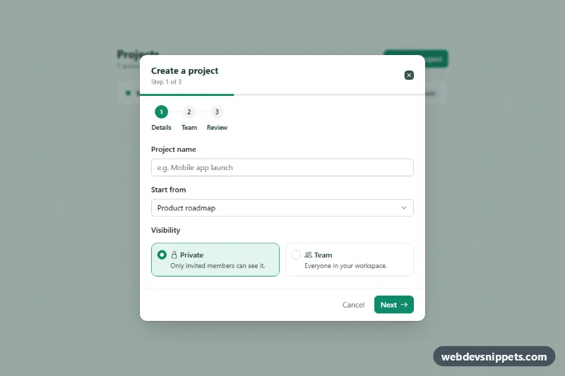
Bootstrap 6 Dialog wizard with three steps, a Stepper and progress bar, back/next buttons, per-step validation, Chips email invites and a review screen.

Image Lightbox Dialog – Bootstrap 6 modals preview

Image Lightbox Dialog

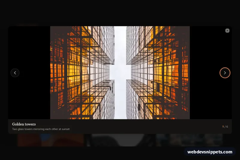
Dark Bootstrap 6 Dialog lightbox that opens gallery thumbnails large, with previous/next buttons, arrow-key and swipe navigation, captions and a photo counter.

Newsletter Popup Dialog – Bootstrap 6 modals preview

Newsletter Popup Dialog

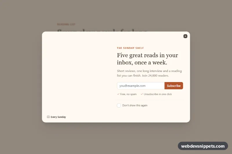
Bootstrap 6 Dialog newsletter popup with a photo side, email signup with validation, a don't-show-again option, delayed auto-open and a confirmation state.

Fullscreen Dialog on Mobile – Bootstrap 6 modals preview

Fullscreen Dialog on Mobile

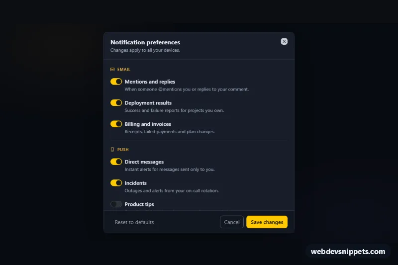
Dark Bootstrap 6 Dialog for notification settings that is centered on desktop, fullscreen on phones, with a scrollable body of switches and a sticky footer.

Confirm Delete Dialog – Bootstrap 6 modals preview

Confirm Delete Dialog

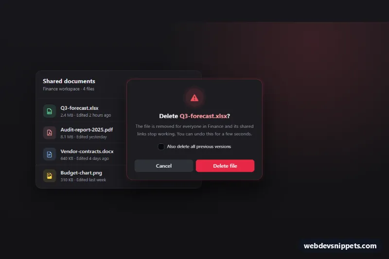
Dark Bootstrap 6 Dialog that confirms deleting a file, with danger theme, focus on Cancel, per-row triggers, a loading state, row removal and an Undo toast.

Dialog Modal with Form – Bootstrap 6 modals preview

Dialog Modal with Form

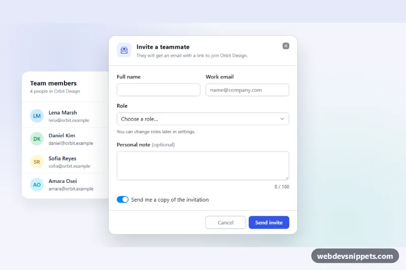
Bootstrap 6 Dialog with a validated invite form: name, email, role select, note counter and switch, with cancel and save actions, loading state and success toast.