A multi-step modal dialog built with Tailwind CSS and vanilla JavaScript that walks users through a short "Create a project" wizard: pick a template, enter validated details, then review and confirm. Use it for onboarding, checkout steps, setup flows or any task that is too long for one screen but too short for its own page.
How it works
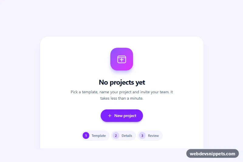
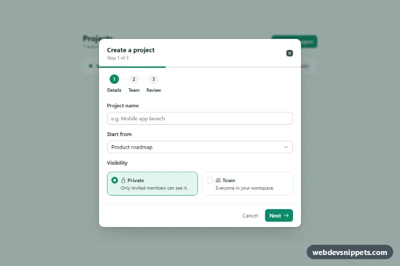
The root is .msm-wizard. It holds an empty-state card with the trigger button (data-msm-open), a role="status" message (data-msm-result) and the .msm-overlay, which starts hidden. Inside the overlay is the #msm-dialog panel with a header, a progress stepper (ol with three data-msm-indicator items), a scrollable form with three fieldset elements marked data-msm-step, and a footer with Back (data-msm-back) and the primary button (data-msm-next).
On DOMContentLoaded the script initializes every .msm-wizard. Opening the dialog resets the form, shows step one, locks page scrolling and moves focus into the step. The primary button is a submit button, so both a click and Enter in a field fire the form's submit event; the handler calls preventDefault(), validates the current step and either moves forward or finishes. showStep() toggles hidden on the fieldsets, writes data-state="done|current|todo" and aria-current="step" on the stepper, updates the "Step 2 of 3" text and changes the button label to "Create project" on the last step, where fillReview() copies the answers into the data-msm-review cells. Finishing shows "Creating…" for 900 ms, closes the dialog and announces the result; replace that setTimeout with fetch() to save the project.
style.css colors the stepper bars, styles the selected template card with :has(input:checked) and adds the msm-rise and msm-slide animations.
Customization
- Add a step by inserting another
fieldset data-msm-stepand a matchingli data-msm-indicator, then changegrid-cols-3on the stepperol. validate()inscript.js: add rules for new required fields; it currently checksdata-msm-name.data-msm-reviewcells: add one per field you want on the review step and a matching key in themapobject infillReview().#7c3aedinstyle.csstogether with theviolet-600utilities: change the accent color.max-w-lgon#msm-dialog: usemax-w-2xlfor wider forms.items-endandsm:items-centeron.msm-overlay: useitems-centerto center the panel on phones as well.- Delete the
.msm-enterand.msm-enter-backrules instyle.cssto switch steps without sliding.
Use cases
- Onboarding: guide new users through picking a template, entering details and confirming
- Setup flows: a three-step dialog for tasks too long for one screen but too short for a page
- Checkout steps: validation on each step before continuing, with a review before submit
- Project tools: a Create project wizard with a stepper and Back and Next buttons
- Accessible apps: the dialog traps focus, closes on Escape and returns focus to the trigger
Accessibility
The panel has role="dialog", aria-modal="true", aria-labelledby="msm-title" and is described by the live "Step x of 3" text, so each step change is announced. The trigger exposes aria-haspopup, aria-controls and aria-expanded. Focus is trapped inside the dialog, Escape closes it and focus returns to the trigger. Every step is a fieldset with a legend; the template cards are real radio buttons, and the name field uses aria-invalid plus aria-describedby for its error. All controls show a visible focus outline, and animations are switched off under prefers-reduced-motion.
Usage notes
The dialog stays below the viewport height and scrolls internally on small screens. For several wizards on one page, give each copy unique id values.