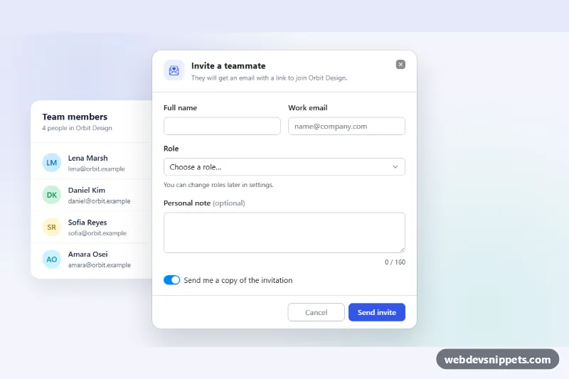
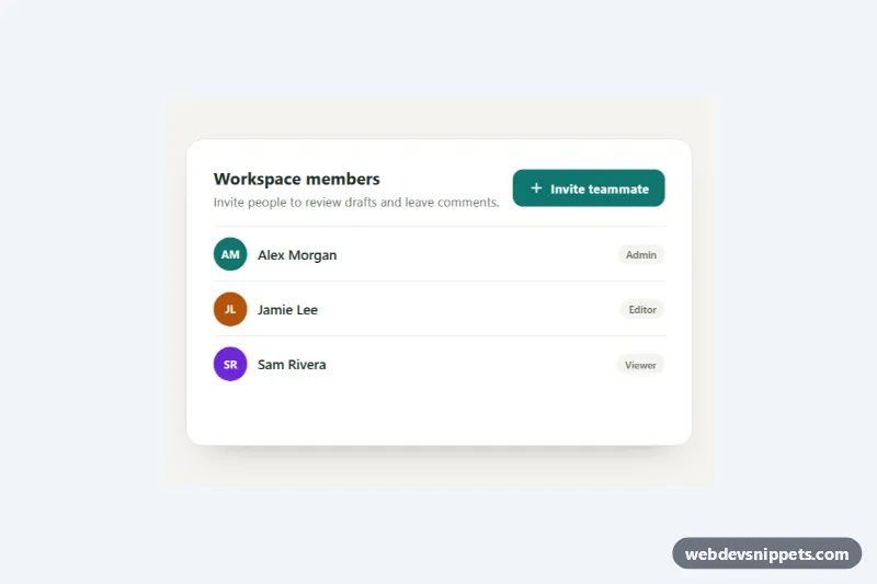
A Bootstrap 6 Dialog that holds a complete, validated form, here used to invite a teammate from a "Team members" card. The form has name and email fields, a role select, an optional note with a character counter, and a switch. Cancel and Send buttons sit in the footer. On success the dialog closes, the new person joins the list and a Bootstrap 6 Toast confirms it.
How it works
The "Invite member" button opens <dialog class="dialog dmf-dialog"> through the data API (data-bs-toggle="dialog" and data-bs-target="#dmf-dialog"). Bootstrap calls the native showModal(), so the browser handles the backdrop, focus trapping and Escape. A <form class="dmf-form" data-bs-validate novalidate> wraps .dialog-header, .dialog-body and .dialog-footer, so the footer's submit button belongs to the form.
Each control sits in a .form-field with a .form-label and an .invalid-feedback message. data-bs-validate gives CSS-only :user-invalid styling after the user edits a field. On submit, script.js also checks every required control with checkValidity(), adds .is-invalid and aria-invalid, and focuses the first invalid field. A flagged field clears as soon as it becomes valid.
A valid submit disables the button and shows a .spinner-border.spinner-sm. A hide.bs.dialog listener blocks closing while sending. After the simulated request, the script appends a new .dmf-member row, updates .dmf-count, closes the dialog and calls Toast.getOrCreateInstance(...).show(). hidden.bs.dialog resets the form.
For the demo, the <dialog> also has .dmf-preview, which shows the closed dialog inline next to the card. Opening it with the button, or pressing Cancel, ends the preview.
Customization
- Remove
dmf-previewfrom the<dialog>for production, so the dialog stays hidden until the button is pressed. --dmf-accenton.dmf-root: changes the trigger and submit buttons, the title icon and the input focus border.--bs-dialog-widthon.dmf-dialog: sets the dialog width (560px). Alternatively, adddialog-lgormd-down:dialog-fullscreen.- Replace the
setTimeoutin thesubmithandler withfetch('/api/invites', { method: 'POST', body: data })and keep the success branch. maxlength="160"on#dmf-note: change the note limit. The.dmf-countertext follows automatically.- Add
requiredand an.invalid-feedbackto any new field. The script picks up every input and select inside the form. - Add
data-bs-backdrop="static"to.dmf-openso clicks outside do not close the form.
Use cases
- Team management pages: invite a teammate with name, email, role and an optional note
- SaaS apps: the Send button shows a loading state and a toast confirms success
- Admin panels: required fields show inline error messages and focus the first invalid field
- Settings screens: a character counter on the note field keeps messages short
Accessibility
The dialog is labelled by #dmf-title and described by #dmf-desc. When the modal opens, focus moves to the name field, and when it closes, focus returns to the trigger. Every feedback message is linked with aria-describedby, and invalid fields get aria-invalid="true". The note counter is a polite live region, and the toast uses role="status". The switch is a native checkbox with role="switch".
Bootstrap 6 notes
Bootstrap 5's .modal, .modal-dialog and .modal-content become a single native <dialog class="dialog"> with dialog-header, dialog-body and dialog-footer, closed with data-bs-dismiss="dialog". form-select is gone, so the select uses form-control. .form-field, .switch, data-bs-validate and spinner-sm are new. Built on Bootstrap 6.0.0-alpha.1, so APIs may still change.