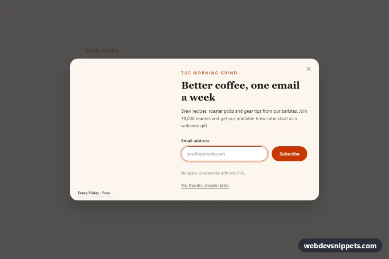
A newsletter signup popup built with Tailwind CSS and vanilla JavaScript, with a photo on one side and an email form on the other. It opens automatically over a blog post, can be dismissed in several ways, remembers the dismissal, and switches to a thank-you view after a simulated subscription. Use it on blogs, recipe sites and online shops to grow an email list.
How it works
The root is .tnp-newsletter. It holds sample article content, a "Get the newsletter" trigger marked data-tnp-open, a role="status" message (data-tnp-status) and the .tnp-overlay, which starts hidden. The overlay contains the dimmed .tnp-backdrop and the #tnp-dialog panel (.tnp-panel), a grid with md:grid-cols-5: the photo takes md:col-span-2 and the form md:col-span-3. On phones the photo becomes an h-40 banner above the form.
The script initializes every .tnp-newsletter on DOMContentLoaded. If the root has data-tnp-auto-open, the popup opens after data-tnp-delay milliseconds unless it was dismissed within the last data-tnp-remember-days days; the dismissal time is stored in localStorage under tnp-dismissed-at, wrapped in try/catch so the popup still works where storage is blocked. Opening locks page scroll, focuses the email field (data-tnp-autofocus) and traps Tab inside the dialog. Escape, the backdrop and every element with data-tnp-close close it and return focus. On submit the email is checked against a simple pattern; after an 800 ms simulated request the data-tnp-form-view is hidden and data-tnp-success-view is shown. style.css adds the tnp-fade and tnp-rise entrance animations.
Customization
data-tnp-delayon.tnp-newsletter: set e.g.5000to open the popup five seconds after page load;0opens it at once.data-tnp-remember-days: how long a dismissal is respected, e.g.30; set0to show it on every visit.- Remove
data-tnp-auto-opento open the popup only from thedata-tnp-openbutton. - The
imginside#tnp-dialog: swap the photo;md:col-span-2andmd:col-span-3control the image-to-form ratio. bg-orange-700,text-orange-700andbg-[#fbf6ef]: change the accent and the cream panel color to match your brand.max-w-3xlon.tnp-panel: usemax-w-2xlfor a more compact popup.- The
setTimeoutin the submit handler ofscript.js: replace it with afetch()call to your email provider or API.
Accessibility
The panel uses role="dialog", aria-modal="true", aria-labelledby="tnp-title" and aria-describedby="tnp-desc". Focus moves into the dialog on open, is trapped while it is open and returns to the trigger on close; Escape always closes. The trigger exposes aria-haspopup="dialog", aria-controls and an aria-expanded state. The email field has a visible label, autocomplete="email", and on invalid input gets aria-invalid="true" plus an error read from a polite live region. After subscribing, focus moves to the success heading. The close icon has a hidden text label, decorative icons are aria-hidden, and the entrance animations stop under prefers-reduced-motion: reduce.
Usage notes
The photo comes from Unsplash; replace it with your own image. Use one popup per page and keep the id values unique.