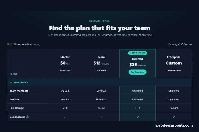
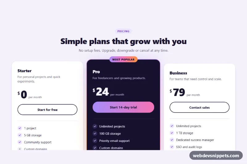
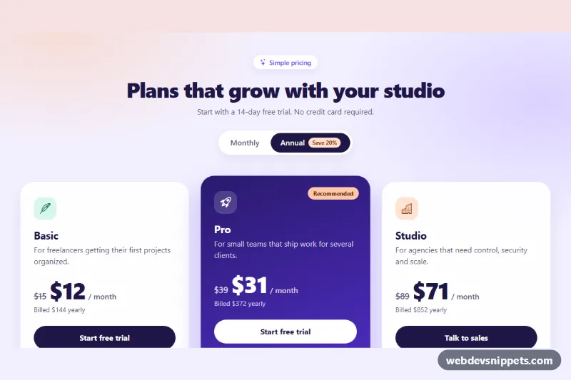
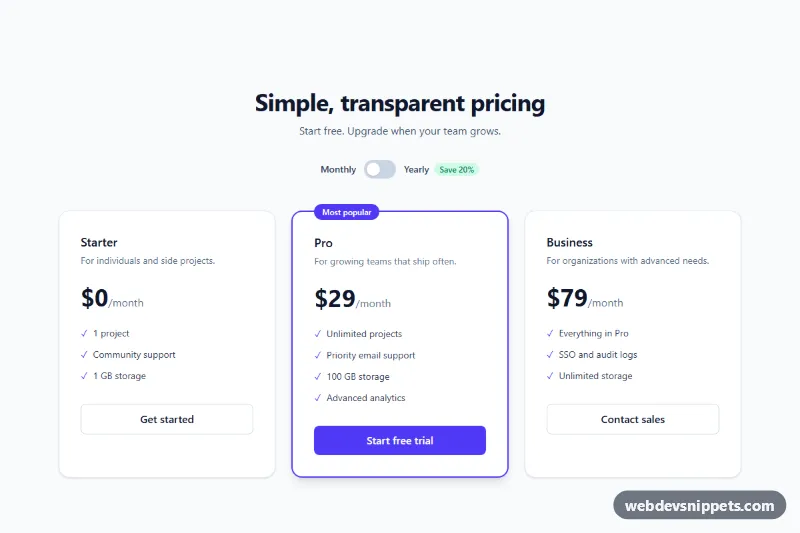
A dark Bootstrap 5 pricing comparison table that lines up four plans against grouped feature rows, highlights the most popular plan and can hide every feature that is the same in all plans. Use it under your pricing cards or on a dedicated "Compare plans" page for SaaS products.
How it works
The root is section.pq-compare with data-bs-theme="dark", so Bootstrap's own components (the switch and tooltips) render in dark mode. The table sits in a .table-responsive.pq-scroll wrapper: on narrow screens it scrolls sideways while the feature column (th[scope="row"] and .pq-corner) stays pinned with position: sticky. The thead holds one th.pq-plan per plan with name, price and a button. Each tbody.pq-group starts with a .pq-group__head row (scope="colgroup") followed by feature rows. Included features show a .pq-yes check icon, missing ones a .pq-no dash, and both carry visually hidden "Included" / "Not included" text.
On DOMContentLoaded the script reads data-pq-highlight on .pq-table and adds .pq-col--pop to every cell in that column, which draws the tinted, outlined popular column. It then compares the text of all td cells in each row and marks identical rows with .pq-row--same (and whole groups with .pq-group--same). When the .pq-diff switch fires change, the root gets .pq-compare--diff, the CSS hides those rows, and .pq-count reports how many features are visible. Buttons with data-bs-toggle="tooltip" are initialized as Bootstrap tooltips.
Customization
--pq-accent,--pq-accent-inkand--pq-accent-rgbin.pq-compare: change the check icons, group headings, badge, primary button and popular column tint.--pq-bgand--pq-surfacein.pq-compare: set the page background and the table card color.data-pq-highlight="3"on.pq-table: highlight another plan column (1 is the first plan), or remove the attribute for no highlight.--pq-feature-widthin.pq-compare: widen the sticky feature column for longer feature names.min-width: 48remin.pq-table: the width at which the table starts to scroll horizontally.- Add a column: append a
col, ath.pq-planand onetdper row, then updatecolspan="5"on the group heads. - Move
.pq-plan__badgeinto anotherth.pq-planto promote a different plan.
Accessibility
The table has a visually hidden caption, column headers use scope="col", feature names scope="row" and group titles scope="colgroup", so screen readers announce each cell with its plan and feature. Icons are aria-hidden and replaced by hidden text. The scroll wrapper is a focusable role="region" labelled by the caption, so keyboard users can scroll it with arrow keys. The switch uses role="switch", and .pq-count is a polite live region. Info buttons are real button elements with an aria-label, so tooltips open on focus as well as hover. Focus rings use the accent color.
Usage notes
Requires Bootstrap 5.3 (for data-bs-theme) with its JS bundle, and Bootstrap Icons. Several tables can share a page; each .pq-compare is handled on its own, but give each a unique switch id.