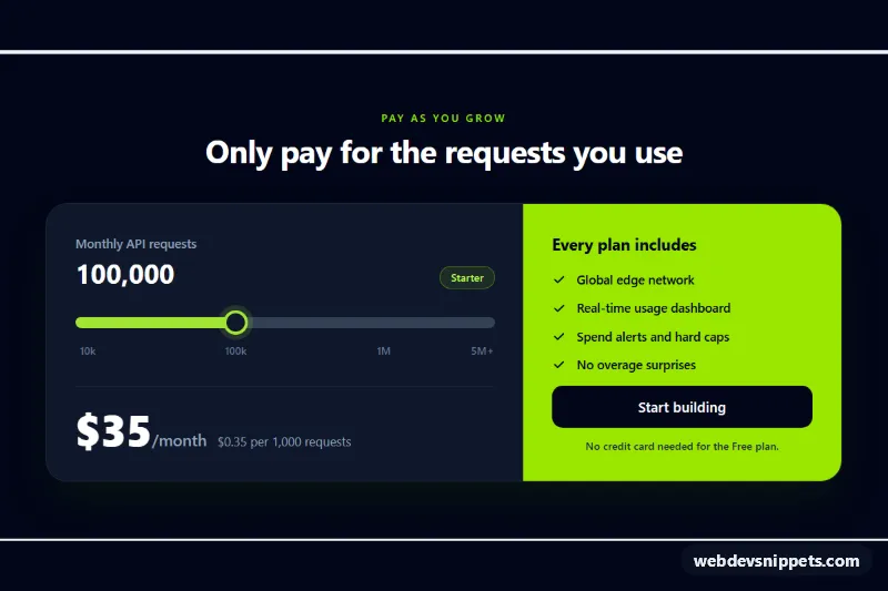
A usage-based pricing card built with Tailwind CSS and a few lines of vanilla JavaScript: visitors drag a slider to pick their monthly API request volume and immediately see the plan name, the monthly price and the cost per 1,000 requests. It suits APIs, email services, hosting and other SaaS products billed by consumption.
How it works
The root is section.ups-pricing. All pricing data lives in data attributes on that element: data-ups-volumes lists the volume steps, data-ups-prices the matching monthly prices and data-ups-plans the plan name for each step. The card is a grid that splits into a dark slider panel and a lime feature panel from the md breakpoint; on phones the panels stack.
The slider is a native input type="range" with the class .ups-range. Its value is an index into the lists, so the steps can be unevenly spaced while the thumb moves in equal steps. On every input event the script reads the index, updates the output element marked data-ups-volume, the data-ups-plan badge, the data-ups-price amount and the data-ups-rate line, and changes the data-ups-cta button text. A price that is not a number, such as custom on the last step, switches the card to a "Custom / Talk to sales" state.
style.css styles the range track with a gradient whose stop is the --ups-fill custom property; the script sets it to the slider position so the filled part follows the thumb. Without JavaScript the markup still shows a correct 100,000 request price.
Customization
data-ups-volumesanddata-ups-priceson.ups-pricing: replace with your own tiers; keep both lists the same length. The script sets the slidermaxautomatically.data-ups-plans: rename the tiers shown in the badge, e.g.Free,Pro,Team.data-ups-unit: change "requests" to "emails", "GB" or "seats" in the rate line and screen reader text.value="3"on#ups-range: choose the step that is selected on page load (also update the static text and the--ups-filldefault instyle.css).--ups-accentand--ups-trackin.ups-range: recolor the filled and empty parts of the track and the thumb ring.bg-lime-400on the feature panel: swap for another Tailwind color to change the brand accent.- The tick labels use
left-[37.5%]andleft-[75%]; move them to match the index positions of your own steps.
Accessibility
The slider is a real range input with a visible label, so arrow keys, Page Up/Down, Home and End all work. The script keeps aria-valuetext in sync, so screen readers hear "250,000 requests per month, $79 per month" instead of a bare index. A sr-only region with aria-live="polite" announces the selected plan after a short debounce. The thumb gets a stronger glow on :focus-visible, the CTA has a focus ring, decorative check icons are aria-hidden and thumb transitions are disabled under prefers-reduced-motion.
Usage notes
Requires the Tailwind browser build (added automatically). Several cards can share a page because each .ups-pricing is initialized separately; give every copy a unique id for the range and its label.