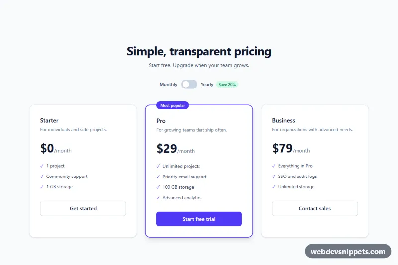
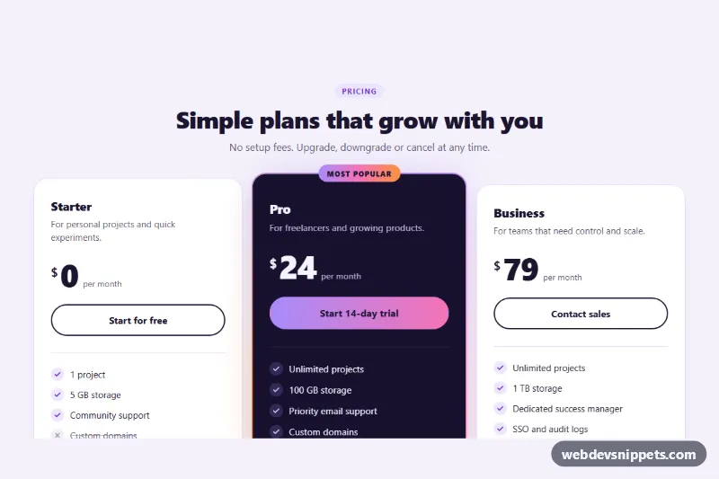
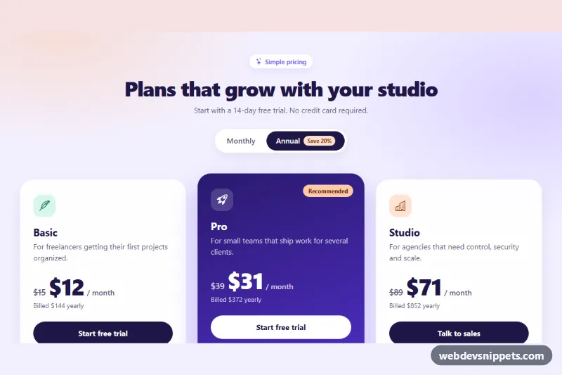
A three-tier pricing section built with Tailwind CSS utilities, featuring a monthly/yearly billing switch, a highlighted "Most popular" plan and feature checklists. It is a ready-made pricing page block for SaaS products, apps and subscription services.
How it works
The root is section.tp-pricing. The header area contains the heading, a subtitle and the billing switch: a button.tp-switch with role="switch" and a sliding .tp-knob, flanked by "Monthly" and "Yearly" labels and a "Save 20%" pill. Below, a grid that becomes three columns at the md breakpoint holds three article cards: Starter, Pro and Business. The Pro card stands out with border-2 border-indigo-600, shadow-lg and an absolutely positioned badge. Each price is a span with data-monthly and data-yearly values, followed by a data-period span.
The script initializes every .tp-pricing on DOMContentLoaded. A click on .tp-switch flips aria-checked, swaps the track color between bg-slate-300 and bg-indigo-600, and moves the knob by swapping translate-x-1 and translate-x-6. It then rewrites every element with data-monthly using the matching attribute value, changes each data-period text to "/month, billed yearly" or "/month", and updates a status message. Without JavaScript the monthly prices remain visible and correct.
Customization
data-monthlyanddata-yearlyon each pricespan: set your real prices; the script prefixes them with$.- The "Save 20%" pill next to
#tp-yearly-label: update the percentage to match the difference between your prices. bg-indigo-600in the.tp-switchclick handler inscript.jsand on the Pro card: replace with another Tailwind color such asbg-emerald-600for a new accent.md:grid-cols-3on the cards grid: uselg:grid-cols-3to keep cards stacked longer, ormd:grid-cols-2for two plans.- Move
border-2 border-indigo-600,shadow-lgand the "Most popular" badge to anotherarticleto feature a different plan. /month, billed yearlyinscript.js: change the period text, e.g. to show a yearly total.max-w-5xlon the header and grid wrappers: widen or narrow the whole section.
Accessibility
The toggle is a real button with role="switch", aria-checked and aria-labelledby="tp-yearly-label", so screen readers announce "Yearly, switch, on/off". A sr-only paragraph with data-tp-status and aria-live="polite" announces "Showing yearly prices." or "Showing monthly prices." after each change. Checkmarks are aria-hidden, leaving clean feature text. The switch and every plan button use a visible focus-visible:ring-4 ring, and slate text on white keeps contrast high. The section is labelled by #tp-title.
Usage notes
Needs the Tailwind browser build (added automatically); there is no style.css. Several pricing sections can share a page because the script scopes all queries to each .tp-pricing, but give each copy unique label id values.