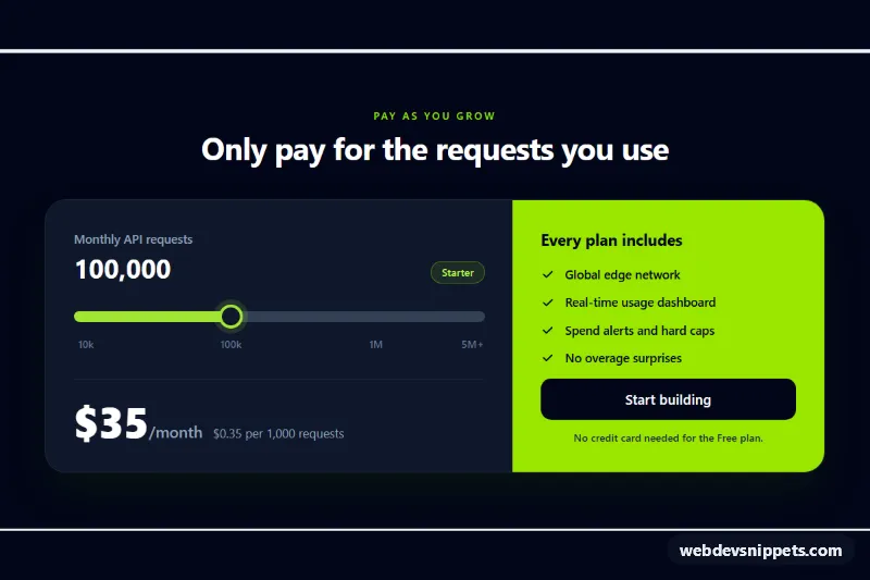
Usage-Based Pricing Slider
Tailwind CSS pricing card with a range slider that updates the plan, monthly price and cost per 1,000 requests as usage changes.
Plan comparison and pricing cards.
5 component(s)
Tailwind CSS pricing card with a range slider that updates the plan, monthly price and cost per 1,000 requests as usage changes.
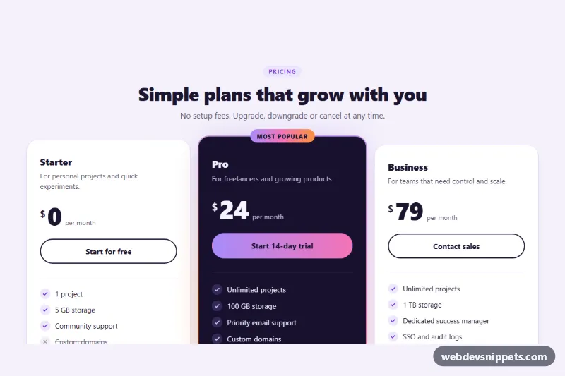
Three pure CSS pricing cards with hover lift and a featured plan that has a spinning conic-gradient border, glow and Most popular badge.
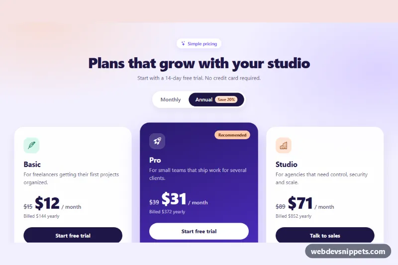
Bootstrap 5 pricing cards with a Monthly / Annual segmented switch that updates prices, savings and yearly totals, plus a highlighted featured plan.
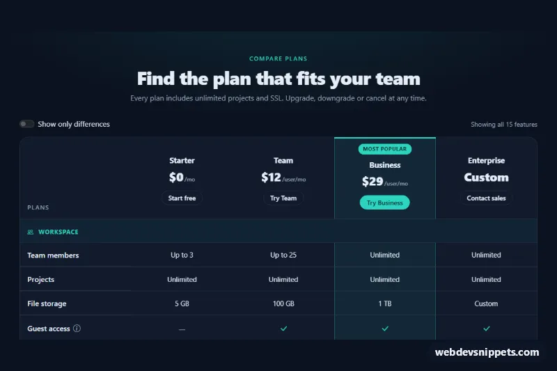
Dark Bootstrap 5 plan comparison table with grouped features, highlighted popular plan, sticky feature column, tooltips and a show-only-differences switch.
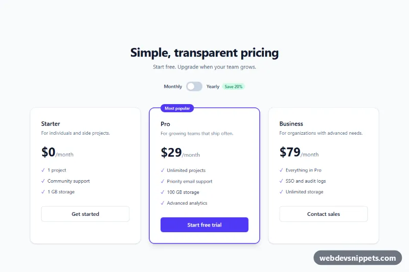
Three-tier Tailwind CSS pricing section with an accessible billing switch and a highlighted plan.
A pricing table compares two or more plans side by side so visitors can see what each tier costs and what it includes. You find them on SaaS sites, hosting providers, membership sites and agencies, usually as a row of pricing cards or as a full feature comparison grid. A good responsive pricing table in HTML and CSS answers three questions quickly: how much, what do I get, and which plan fits me.
Use real headings for plan names and a list for features, so screen readers can navigate them. Checkmarks and crosses need text alternatives such as "Included" or "Not included". If the billing switch is a toggle, give it a label and make it keyboard operable. Keep contrast high on the highlighted plan, where white text on brand colours often fails. Avoid hiding fees in tooltips; important conditions belong in visible text.
Each pricing table example comes with a live preview and code tabs. Bootstrap 6 versions use the new alpha with its ES module build and theme-* colour roles, Bootstrap 5 versions use the familiar card and grid utilities, and Tailwind CSS and pure CSS versions need no component JavaScript beyond an optional billing toggle. Use the framework filter to find bootstrap pricing table examples or a Tailwind variant, press the copy button or download the files, then replace plan names, prices and features with your own.