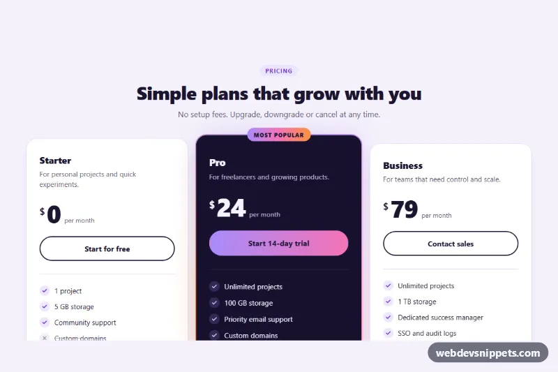
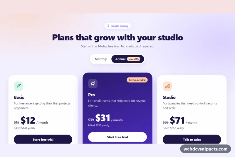
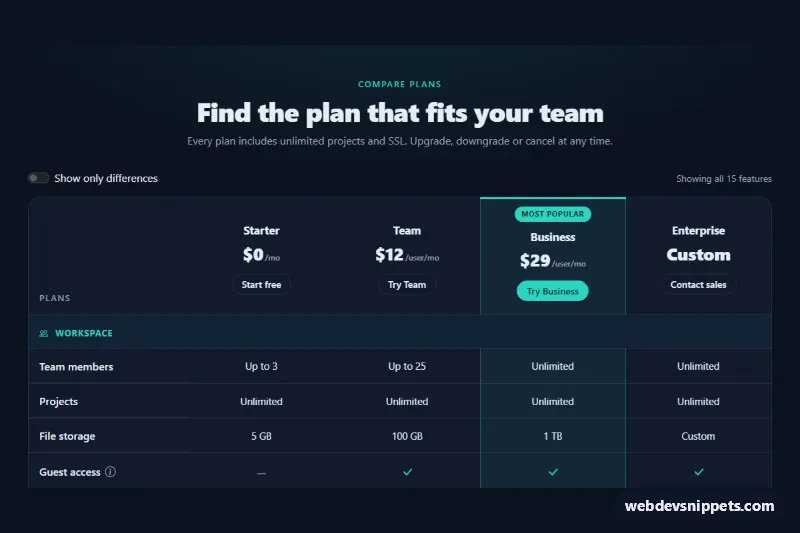
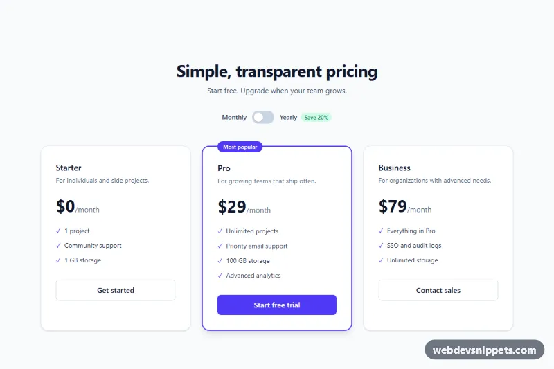
Three pricing cards built with pure CSS and no JavaScript. The middle plan is a dark featured card with a spinning gradient border, a soft colored glow and a "Most popular" badge, while every card lifts on hover. Use it on SaaS landing pages, membership sites and product upgrade screens.
How it works
The root section.prc-root holds a centered header and a .prc-grid of three article.prc-card elements. Each card contains the plan name .prc-name, a short .prc-desc, the price block .prc-price (.prc-currency, .prc-amount and .prc-period), a call-to-action link .prc-cta and a .prc-features list. Included features show a check icon; items with .is-off show a cross, are struck through and contain hidden "Not included" text.
The featured plan uses .prc-card--featured. Its own background is transparent: the ::before pseudo-element paints the dark fill on the padding box and a conic-gradient on the border box, which produces a 2px gradient ring. The ::after pseudo-element repeats the gradient behind the card with a large blur to create the glow. The gradient angle is the custom property --prc-angle, registered with @property so the prc-spin keyframes can animate it from 0 to 360 degrees. .prc-grid uses isolation: isolate so the glow stays behind the card but above the section background.
Hover and keyboard focus inside a card (:focus-within) move it up with the translate property, deepen the shadow and tint the border. From 900px the grid switches to three columns and the featured card is slightly enlarged with scale.
Customization
--prc-glow-1,--prc-glow-2and--prc-glow-3on.prc-root: the three colors of the spinning border, the glow, the badge and the featured button.--prc-spin: duration of one full border rotation, e.g.3sfor a faster spin.--prc-lift: how far a card moves up on hover, e.g.-4pxfor a subtler effect.--prc-featured-bgand--prc-featured-text: background and text color of the featured plan.--prc-accent: color of the check icons and focus outlines on the light cards.- Move the
prc-card--featuredclass and the.prc-badgeparagraph to another card to highlight a different plan. - Add
class="is-off"to a.prc-featuresitem to mark a feature as not included.
Accessibility
The plans are article elements with real h3 headings, and each feature list has an aria-label with the plan name. Icons are aria-hidden, and excluded features are announced with a visually hidden .prc-sr prefix, so the meaning does not rely on the strike-through alone. The call-to-action links show a clear :focus-visible outline, and keyboard focus lifts the card just like hover. With prefers-reduced-motion: reduce the border stops spinning and cards no longer move.
Usage notes
The animated border needs @property support (all current browsers). Where it is missing, the gradient ring still shows but does not rotate. Change the prc-heading id if you place two pricing sections on one page.