Skip to content

Dark Pricing Section

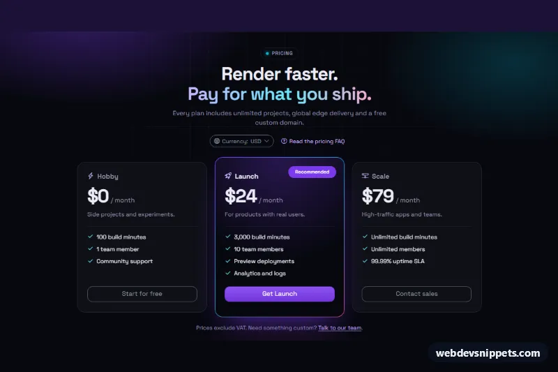
Dark Bootstrap 6 pricing section with three glass cards, a gradient-bordered recommended plan, a currency Menu and an FAQ link that opens a Drawer with an accordion.

Also known as: dark mode pricing cards, pricing with currency switcher, gradient border pricing card

Bootstrap 6 Pricing Tables Responsive Dark #card #dark #faq #pricing #responsive

Dark Pricing Section live demo

Open in new tab

Bootstrap 6 code (HTML, CSS, JS)

A dark pricing section built with Bootstrap 6 for developer tools, hosting platforms and SaaS landing pages. It shows three glassy plan cards on a near-black background with soft violet, cyan and pink glows. The recommended plan gets a gradient border. A Bootstrap 6 Menu switches the currency, and the "Read the pricing FAQ" link opens a Drawer with an exclusive accordion.

How it works

The root .dkp-root sets data-bs-theme="dark", so every Bootstrap component inside it, including the Menu, buttons and close button, renders in dark mode no matter what the visitor's OS prefers.

The header holds the currency toggle: a button with data-bs-toggle="menu", directly followed by div.menu.dkp-menu with a menu-header and three button.menu-item elements carrying data-dkp-currency. Each .dkp-amount stores its price per currency in data-usd, data-eur and data-gbp. In script.js, a click on a menu item formats those values with Intl.NumberFormat (rules in the CURRENCIES map). It then marks the chosen item .active with aria-current, updates .dkp-currency-label, announces the change in .dkp-live, closes the menu through Menu.getOrCreateInstance(...).hide() and returns focus to the toggle.

The cards sit in .dkp-grid, which has one column on phones and three from 768px. .dkp-card--hot draws its gradient border with a padding-box / border-box background pair and extends past its neighbours. The FAQ trigger uses data-bs-toggle="drawer" to open dialog.drawer.drawer-end.dkp-drawer. Inside, native <details> elements share name="dkp-faq", so only one answer is open at a time. The script syncs the trigger's aria-expanded on shown.bs.drawer and hidden.bs.drawer.

Customization

  • data-usd, data-eur and data-gbp on each .dkp-amount: set your real prices per currency. Add a key to CURRENCIES plus a matching menu item and data attribute for more currencies.
  • --dkp-glow-1, --dkp-glow-2 and --dkp-glow-3 on .dkp-root: recolor the background glows and the gradient border of the recommended card.
  • --bs-accent-bg, --bs-accent-fg and --bs-accent-border on .dkp-root: re-map the accent role used by the "Get Launch" button, the badge and the drawer button.
  • --dkp-bg and --dkp-card on .dkp-root: change the page black and the translucent card fill.
  • Move dkp-card--hot and the .dkp-hot badge to another article to recommend a different plan.

Use cases

  • Developer tools: three glass plan cards sit on a near-black background with soft glows
  • Hosting platforms: the recommended plan has a gradient border to stand out
  • SaaS landing pages: a currency menu changes the prices shown
  • Pricing support: a Read the pricing FAQ link opens a drawer with an accordion

Accessibility

Each plan is an article labelled by its heading, and all icons are aria-hidden. The Menu supports arrow keys and Escape, and focus returns to its toggle after a choice. The Drawer is a native modal <dialog> labelled by its title, so it traps focus and closes with Escape. The accordion uses real <summary> elements. Text colors keep strong contrast on the dark surfaces, and the price blur-in animation is disabled under prefers-reduced-motion.

Bootstrap 6 notes

The Bootstrap 5 dropdown with dropdown-menu and dropdown-item becomes a flat .menu with .menu-item, opened by data-bs-toggle="menu". Offcanvas is now a <dialog class="drawer">. The accordion is built on <details>, and a shared name replaces data-bs-parent. Buttons use btn-solid btn-styled theme-accent, btn-outline theme-secondary and btn-text. Built on Bootstrap 6.0.0-alpha.1, so APIs may still change. Icons come from Bootstrap Icons.
Dark Pricing Section at a glance

Framework
Bootstrap 6
Code
HTML, CSS, JavaScript
JavaScript
Vanilla JavaScript, no jQuery
Dependencies
Bootstrap 6, Bootstrap Icons, fonts.googleapis.com
Layout
Responsive, works on mobile, dark design
Category
Pricing Tables
License
Free for personal and commercial use

Questions about this template

Can I use the Dark Pricing Section code for free?

Yes. You can copy or download the code and use it in personal and commercial projects, including client work. No sign-up is needed. Reselling it as part of a component library or template collection is not allowed; see the license.

How do I add it to my website?

Load Bootstrap 6 and Bootstrap Icons and fonts.googleapis.com from a CDN (the links are under Requirements). Paste the HTML where the component should appear, add the CSS to your stylesheet and load the JavaScript before the closing </body> tag. Download HTML gives you a complete page with everything already linked.

Does it need jQuery or a JavaScript framework?

No. The script is plain vanilla JavaScript, so it works without jQuery, React or Vue. You can still use the markup inside those frameworks.

Does it work on mobile?

Yes. The layout adapts to small screens. Use the Mobile and Tablet buttons above the live demo to check it at phone and tablet width.

Requirements

Add these to your page (already included in the download):

  • <link rel="stylesheet" href="https://cdn.jsdelivr.net/npm/bootstrap@6.0.0-alpha.1/dist/css/bootstrap.min.css">
  • <script type="module" src="https://cdn.jsdelivr.net/npm/bootstrap@6.0.0-alpha.1/dist/js/bootstrap.bundle.min.js"></script>
  • <link rel="stylesheet" href="https://cdn.jsdelivr.net/npm/bootstrap-icons@1.11.3/font/bootstrap-icons.min.css">
  • <link rel="stylesheet" href="https://fonts.googleapis.com/css2?family=Space+Grotesk:wght@400;500;600;700&display=swap">

Built for Bootstrap 6.0.0-alpha.1. Bootstrap 6 ships as an ES module, so its script and this component's JavaScript load with type="module". Alpha releases can still change before the stable version.

Dark Pricing Section – Bootstrap 6 pricing tables component screenshot
Dark Pricing Section · Bootstrap 6 Pricing Tables

More Pricing Tables

Pricing Cards with Billing Toggle – Bootstrap 5 pricing tables preview

Pricing Cards with Billing Toggle

Bootstrap 5 pricing cards with a Monthly / Annual segmented switch that updates prices, savings and yearly totals, plus a highlighted featured plan.

Pricing Comparison Table – Bootstrap 6 pricing tables preview

Pricing Comparison Table

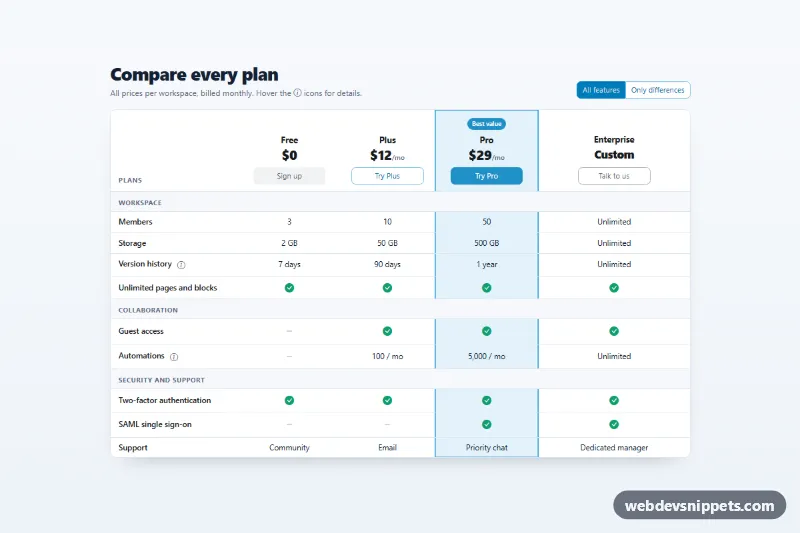
Bootstrap 6 feature comparison table across four plans with check icons, a highlighted Pro column, tooltips, a sticky feature column and an Only differences filter.

Pricing Table with Highlighted Plan – Bootstrap 6 pricing tables preview

Pricing Table with Highlighted Plan

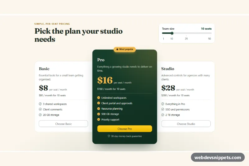
Bootstrap 6 pricing cards with a raised dark green Most popular plan, gold accents and a team-size Range slider that recalculates every plan's monthly total.

Pricing Table with Monthly Yearly Toggle – Bootstrap 6 pricing tables preview

Pricing Table with Monthly Yearly Toggle

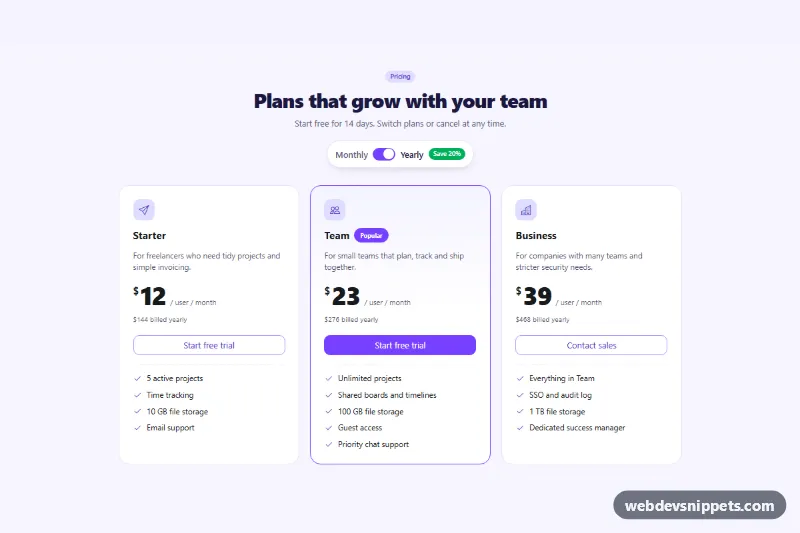
Bootstrap 6 three-tier pricing table with a monthly/yearly billing switch that updates every price and billing note, plus a save badge and a popular plan.

Pricing Plan Comparison Table – WordPress pricing tables preview

Pricing Plan Comparison Table

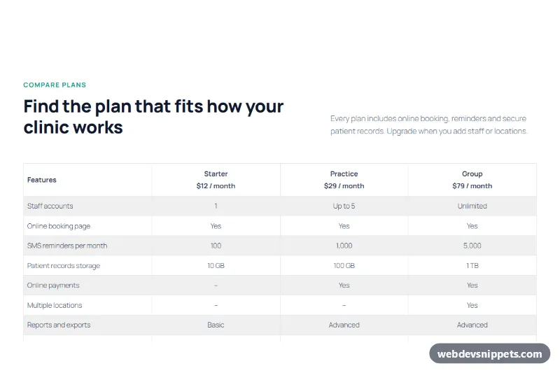
A pricing plan comparison table for the block editor that compares three plans across eight features in a striped table, with prices in the header and plan buttons below.

Three-Tier Pricing Table with Highlighted Plan – WordPress pricing tables preview

Three-Tier Pricing Table with Highlighted Plan

A three-tier pricing table for the block editor with Starter, Pro and Business plans, a highlighted dark Pro plan card, feature lists and full-width buttons.