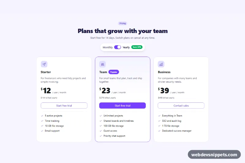
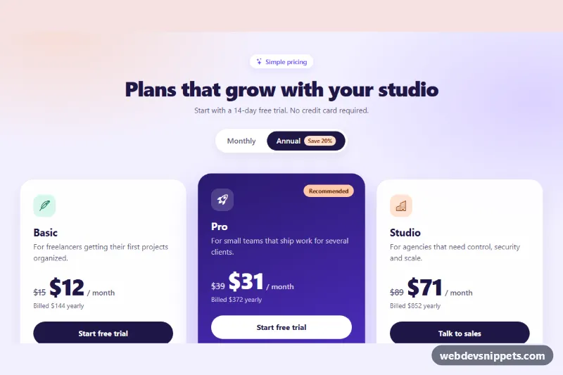
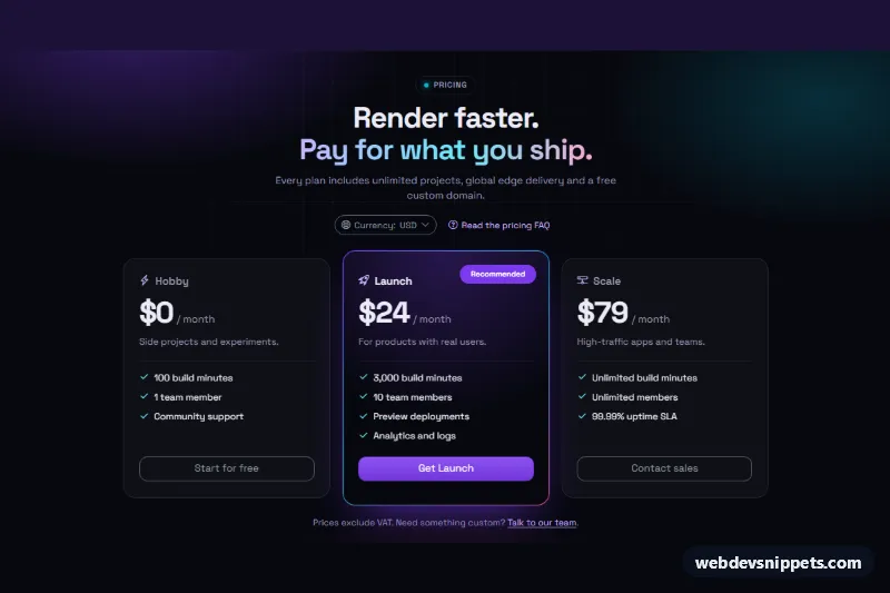
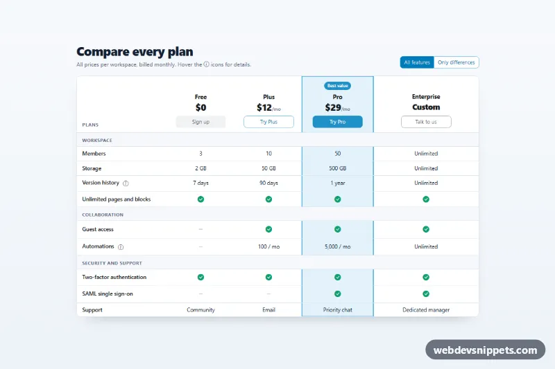
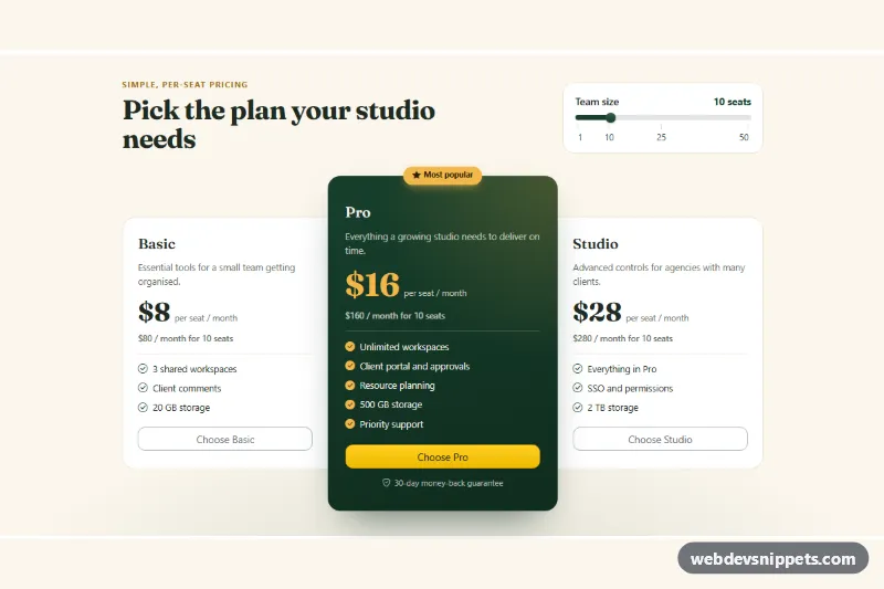
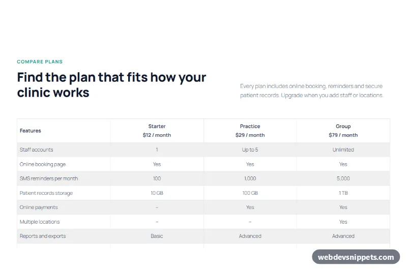
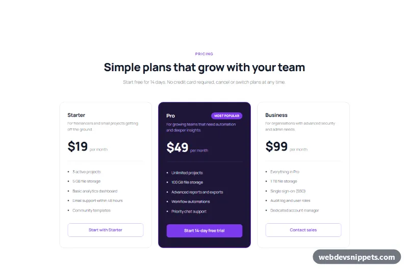
A three-tier SaaS pricing table built with Bootstrap 6, with a billing switch that flips every plan between monthly and yearly prices. It uses the native Bootstrap 6 Switch, theme-based buttons and badges, and the new Chip for the "Popular" label. It fits pricing pages, landing pages and upgrade screens.
How it works
The root .pmy-root contains a centered header and a .grid.grid-cols-1.md:grid-cols-3 of three .card.pmy-card articles. The billing control is a Bootstrap 6 .switch.switch-lg.theme-accent wrapper around input.pmy-toggle with role="switch". The visible "Monthly" and "Yearly" words sit on each side, and a badge theme-success shows the yearly saving.
Each price is a .pmy-amount span with data-monthly and data-yearly values. Each billing line is a .pmy-note with the same two attributes. script.js listens to the switch's change event and also makes the two period words clickable. It then copies the matching data value into every amount and note, adds .pmy-is-yearly to the root (which bolds the active word and fades the save badge in monthly mode) and briefly adds .pmy-flip so changed numbers slide in. A visually hidden aria-live paragraph, .pmy-live, announces the new billing period. The markup already contains the yearly values, so the table is complete without JavaScript.
The middle card has .pmy-card--team: a 2px accent border, a soft tinted top, a solid btn-solid theme-accent button and a chip theme-accent active label.
Customization
data-monthlyanddata-yearlyon each.pmy-amountand.pmy-note: set your own prices and billing text.- Remove
checkedfrom.pmy-toggleto load the table in monthly mode. Also put the monthly numbers in the markup so the no-JS state matches. theme-accenton the switch, buttons and chip: swap fortheme-primary,theme-successor another role to recolor the whole table.--pmy-bgand--pmy-doton.pmy-root: change the lavender background and its dotted pattern.--pmy-featuredon.pmy-root: sets the border and tint of the highlighted plan. Move.pmy-card--teamto another card to feature it instead.- Change
md:grid-cols-3on.pmy-gridtomd:grid-cols-2for a two-plan layout.
Use cases
- SaaS pricing pages: a billing switch flips every plan between monthly and yearly prices
- Landing pages: a save badge highlights the discount for choosing yearly billing
- Upgrade screens: three plans sit side by side with a Popular chip on one
- Subscription products: billing notes change together with each price
Accessibility
The switch is a real checkbox with role="switch" and aria-label="Bill yearly", so it works with Space and announces its state. The decorative period words are aria-hidden because the switch label already covers them. Price changes are announced politely through .pmy-live. Each card is an article labelled by its plan heading, and icons are aria-hidden. Card lift and the number animation are disabled under prefers-reduced-motion.
Bootstrap 6 notes
Bootstrap 5's form-check form-switch becomes <div class="switch"><input type="checkbox" role="switch" switch></div>, and switch-lg sizes it. btn-primary / btn-outline-primary become btn-solid / btn-outline with a theme-* class, and badge bg-success becomes badge theme-success. row-cols-md-3 becomes the CSS-grid utility md:grid-cols-3. The "Popular" pill uses the new .chip component. Built on Bootstrap 6.0.0-alpha.1, so class names may still change. Icons come from Bootstrap Icons.