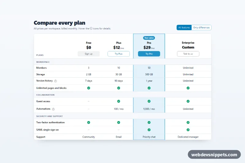
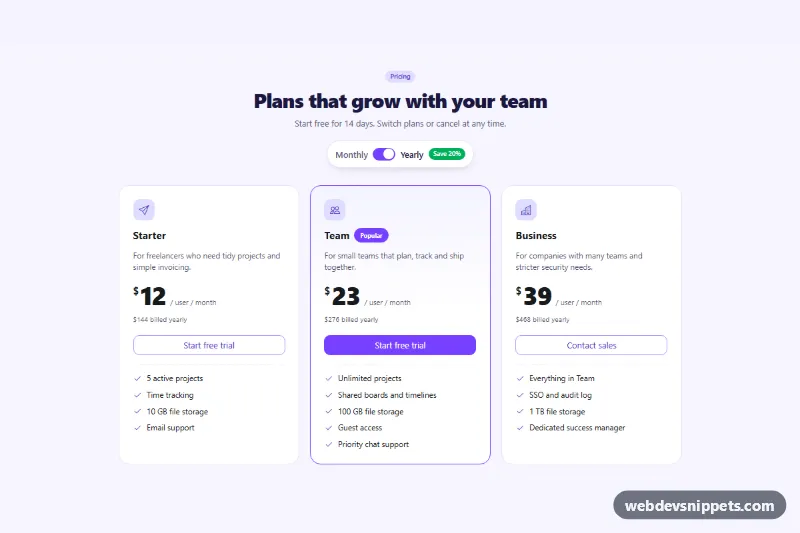
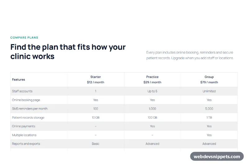
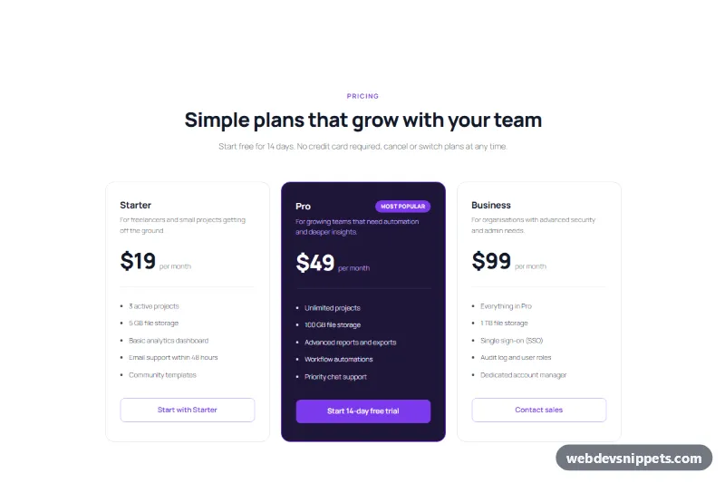
A detailed plan comparison table built with Bootstrap 6. It lists four plans side by side, marks included features with green check icons and missing ones with a dash, and highlights the recommended "Pro" column. A segmented control hides the rows that are identical in every plan.
How it works
The root .pct-root contains a header row and a Bootstrap 6 .table-card wrapper around a focusable .table-responsive region. Inside is table.table.pct-table. The header row holds the plan name, price and a call-to-action button for each plan. The body is split into groups by tr.pct-group rows. Values are plain text or icons with role="img" and an aria-label ("Included" / "Not included").
The Pro column cells carry .pct-hl, which paints a tinted background and draws a continuous border with inset box shadows. .pct-hl-top closes the frame at the top. The first column is position: sticky, so on phones the feature names stay visible while the plans scroll sideways.
The filter is a .btn-group of two Bootstrap 6 toggle labels (label.btn-check with the radio input inside). On load, script.js compares the value of every td in a row and stores the result in data-pct-same. When "Only differences" is chosen, those rows get the hidden attribute. Group headings with no visible rows are hidden too, and .pct-status reports how many rows were hidden. The .pct-info buttons use data-bs-toggle="tooltip", which Bootstrap 6 initialises on first hover or focus, with no setup code.
Customization
--pct-hland--pct-hl-edgeon.pct-root: change the fill and outline of the highlighted column. Move.pct-hlto other cells to highlight a different plan.--pct-yesand--pct-noon.pct-root: recolor the check and dash icons.--bs-info-bg,--bs-info-fgand--bs-info-borderon.pct-root: re-map the info role used by the filter, badge and plan buttons.--pct-feature-widthon.pct-root: sets the width of the sticky feature column (9.5rem on phones, 15rem from 768px).data-bs-titleon any.pct-infobutton: edits its tooltip text. Copy the button into other feature cells to add more hints.
Use cases
- SaaS pricing pages: four plans side by side with check icons for included features
- Software vendors: the recommended Pro column is highlighted for visitors
- Plan comparison: an Only differences filter hides rows that are identical in every plan
- Long feature lists: a sticky feature column keeps labels visible when the table scrolls
Accessibility
The table has a visually hidden caption, column headers with scope="col", row headers with scope="row" and group headers with scope="rowgroup". Icon cells expose their meaning through aria-label. The scroll region is focusable, labelled by the heading and shows a focus outline, so keyboard users can scroll it with the arrow keys. Tooltip triggers are real buttons with aria-labels and open on focus. Filter changes are announced through role="status".
Bootstrap 6 notes
Bootstrap 5's table-primary row colors are replaced by theme-* classes. table-card is a new rounded wrapper. Toggle buttons now put the input inside label.btn-check btn-outline theme-info, with no id/for pairs. Tooltips auto-initialise, so the old new bootstrap.Tooltip() loop is gone. Buttons use btn-solid, btn-outline and btn-subtle with a theme class, and badge theme-info replaces badge bg-info. Built on Bootstrap 6.0.0-alpha.1, so details may still change. Icons come from Bootstrap Icons.